Branding
Overview
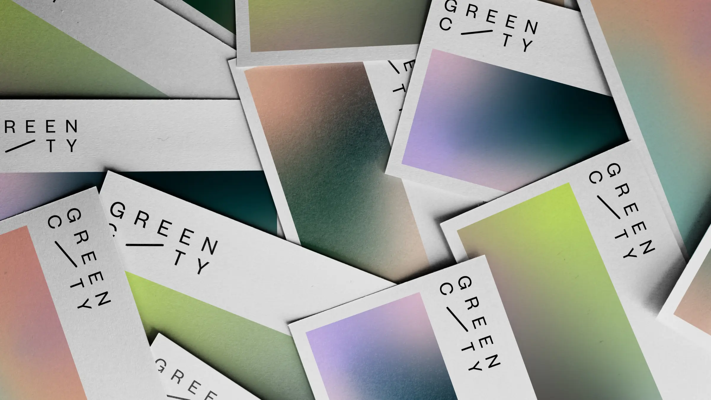
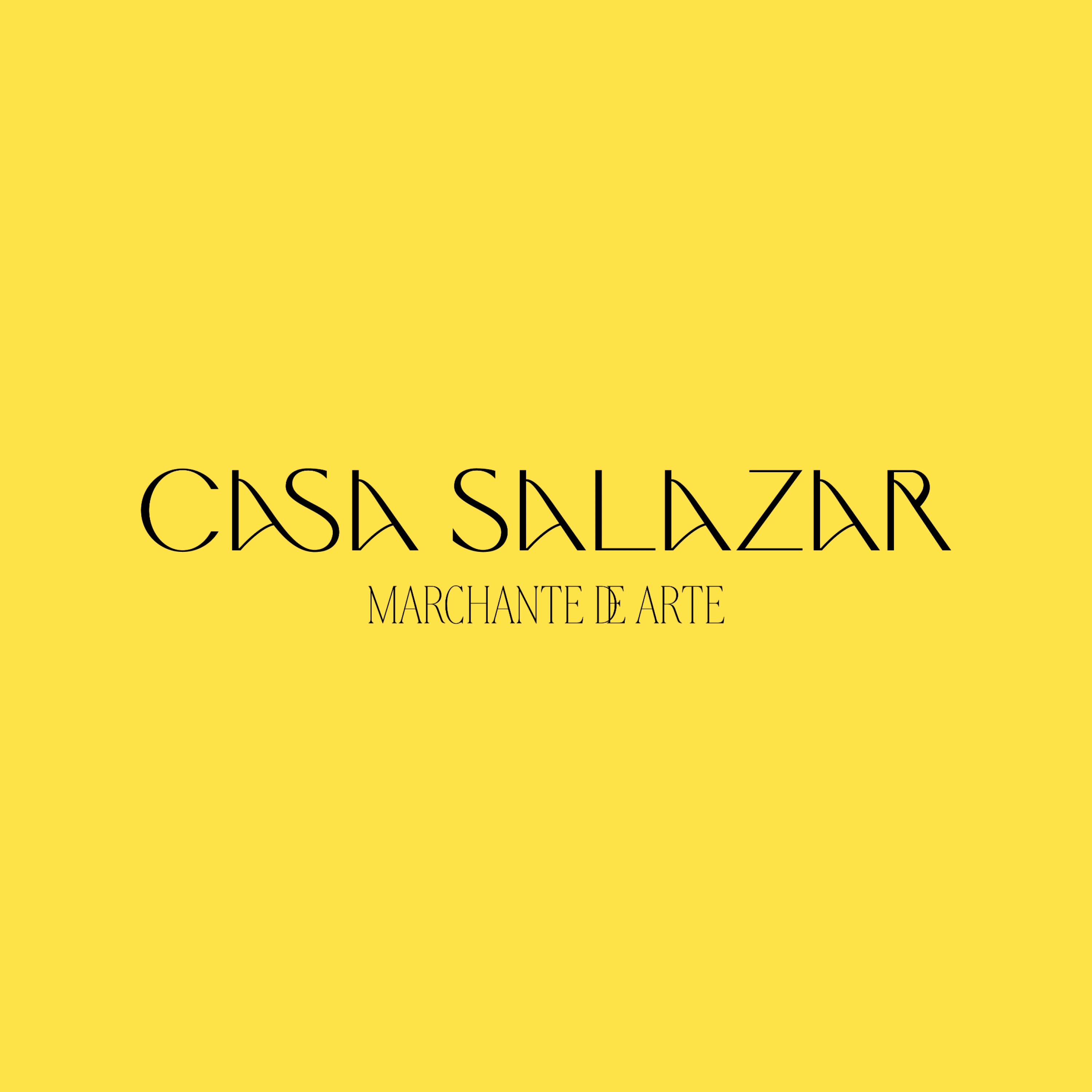
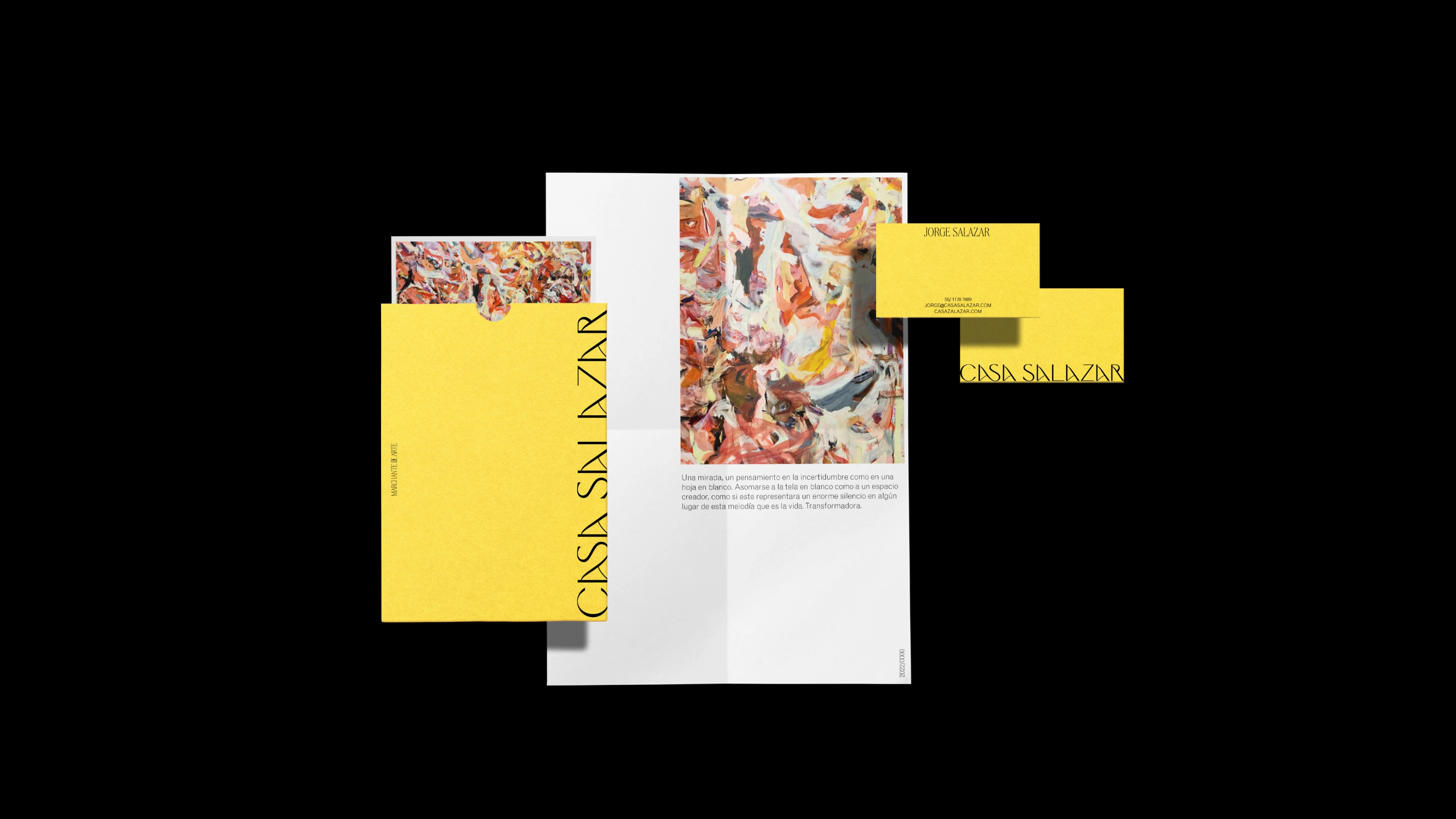
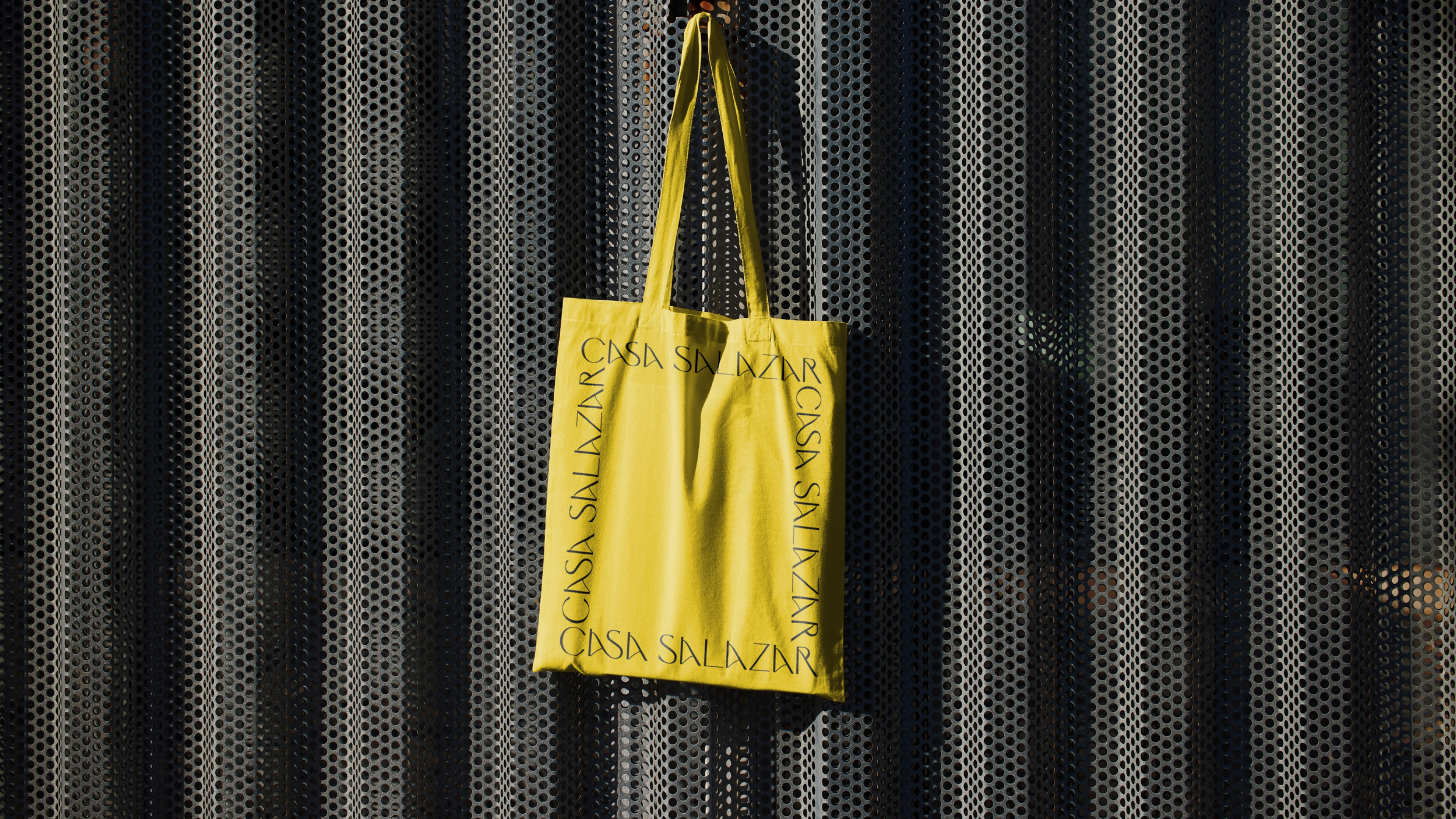
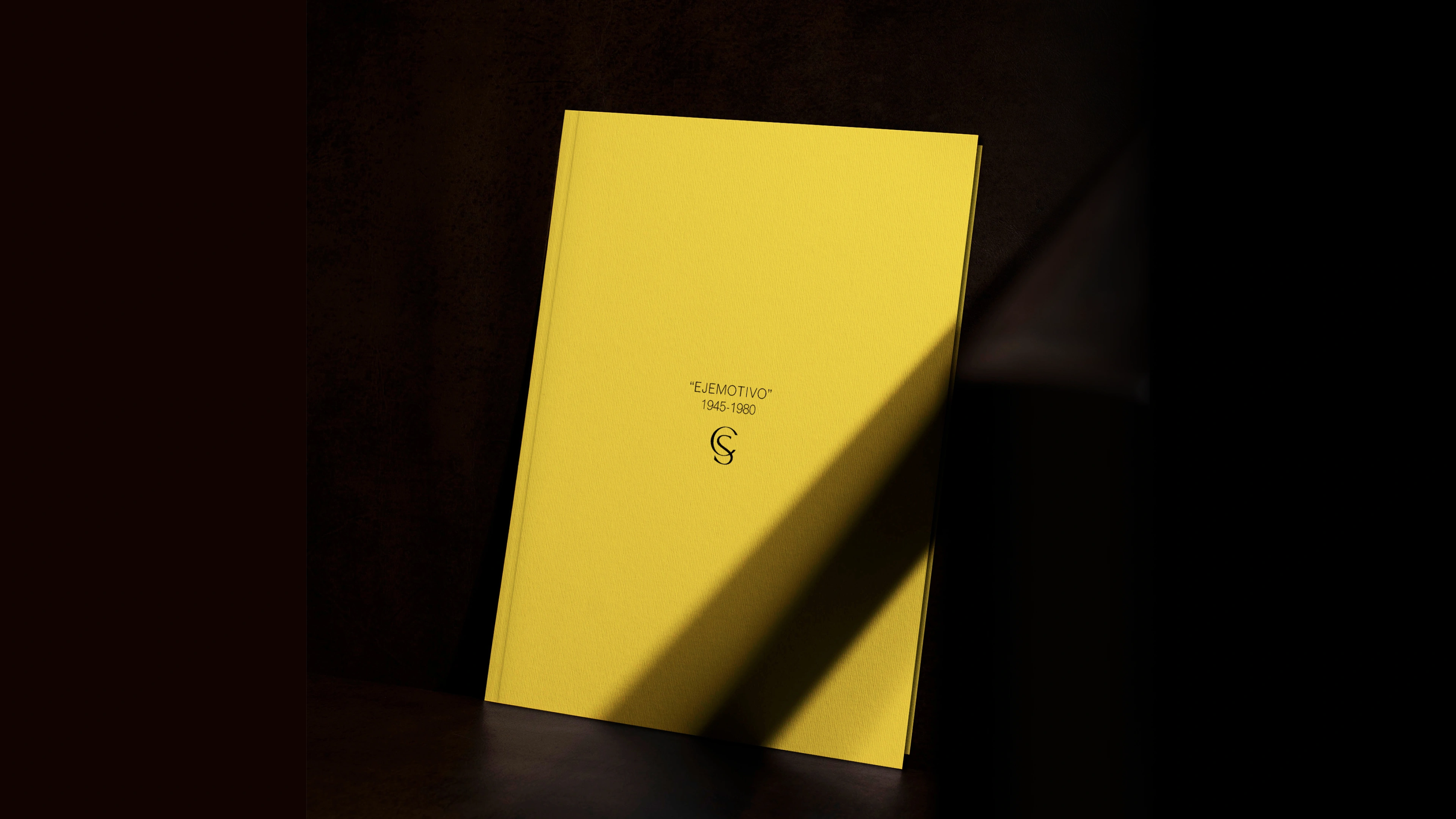
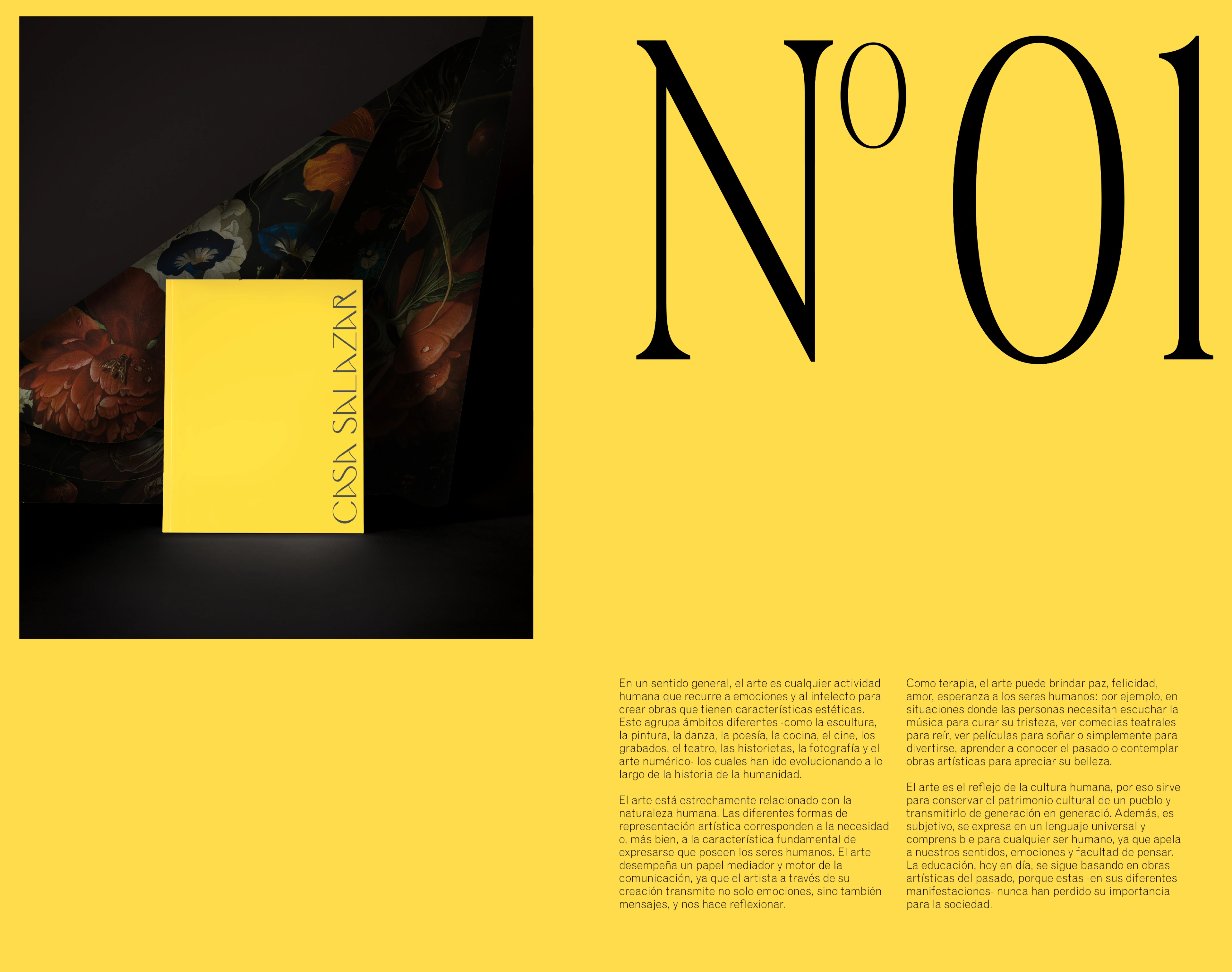
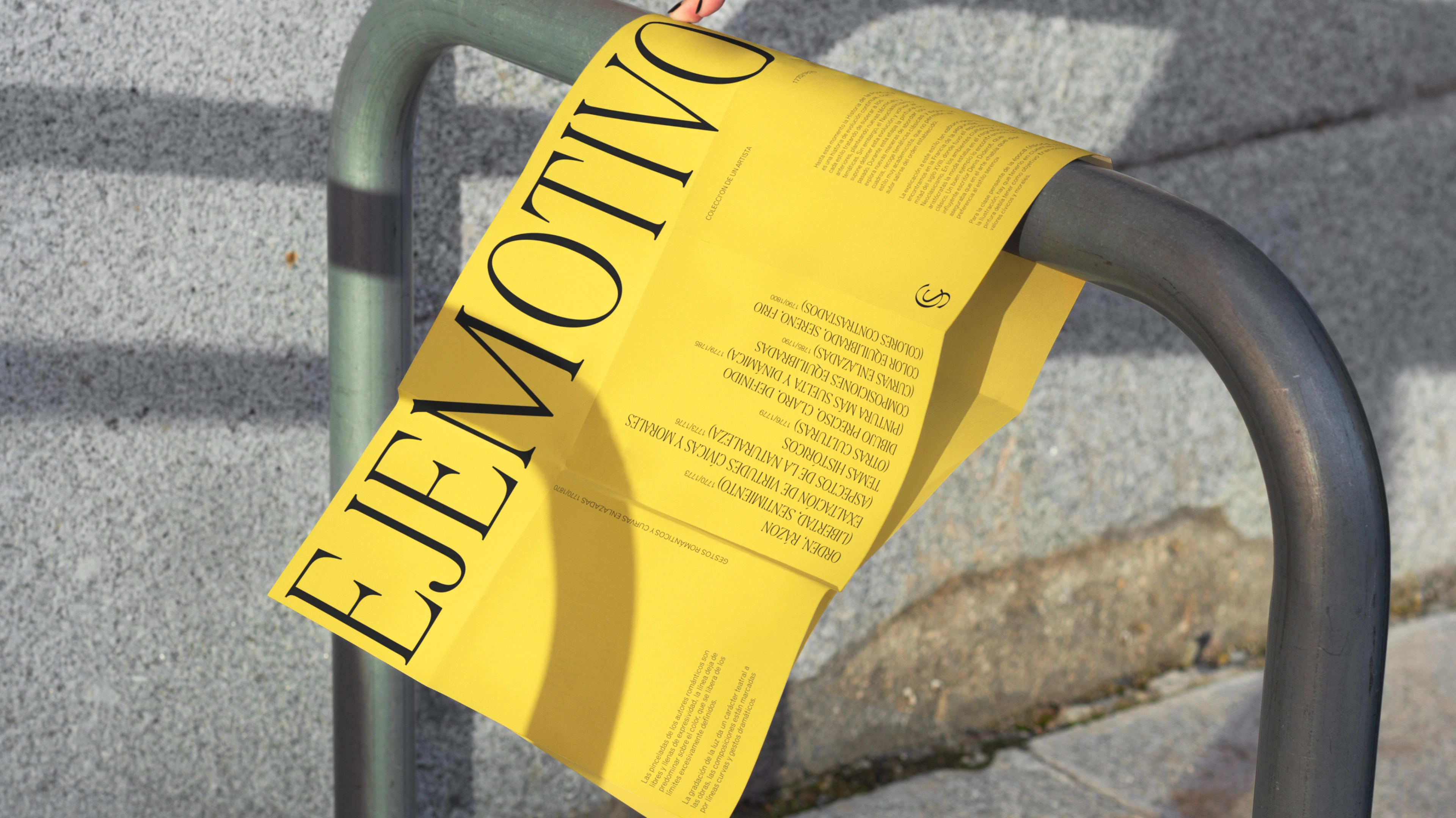
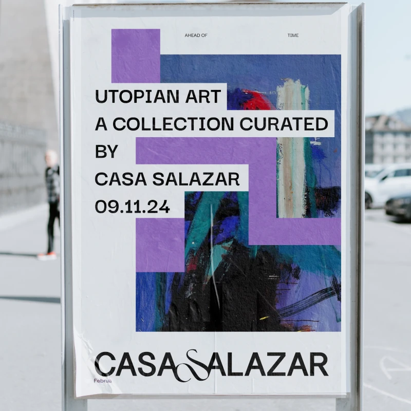
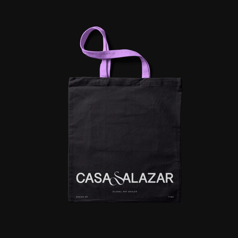
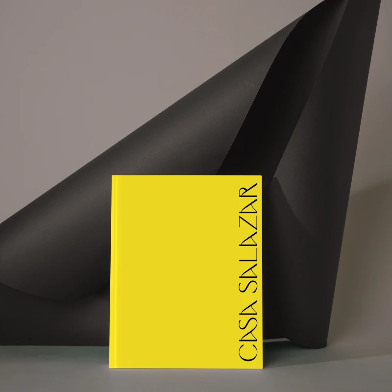
Casa Salazar blends traditional respect with contemporary appreciation, using vibrant yellow and black in its avant-garde design and logo.

No items found.
About
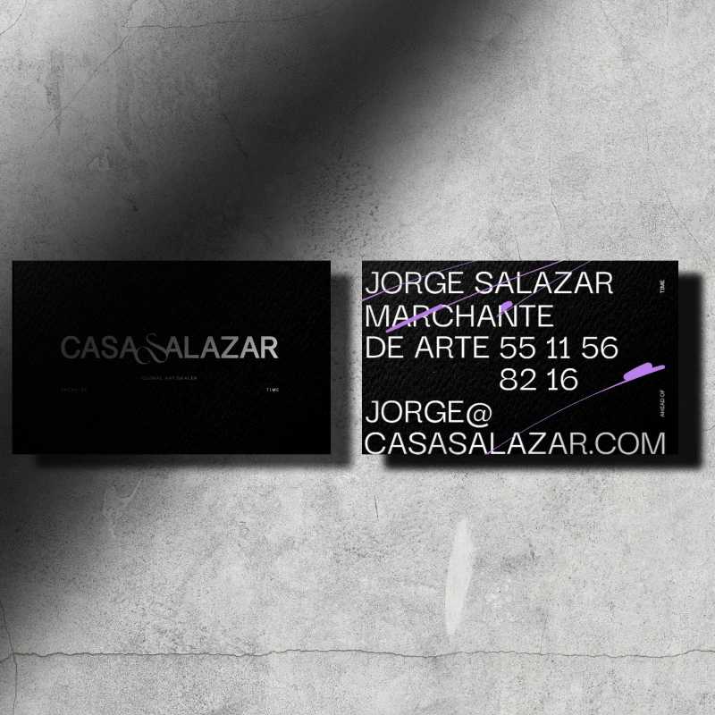
Casa Salazar was an art dealership and cultural platform founded by Jorge Salazar, a Mexican-Venezuelan businessman who viewed art as a powerful catalyst for personal and societal transformation. Driven by a lifelong desire to build a career centered around artistic expression, Salazar established the house to bring art closer to the public and bridge the gap between creators and collectors. The institution dedicated itself to showcasing art as an essential portrait of our times and society, acting as an open window for creative freedom and cultural dialogue.
Visual Narrative
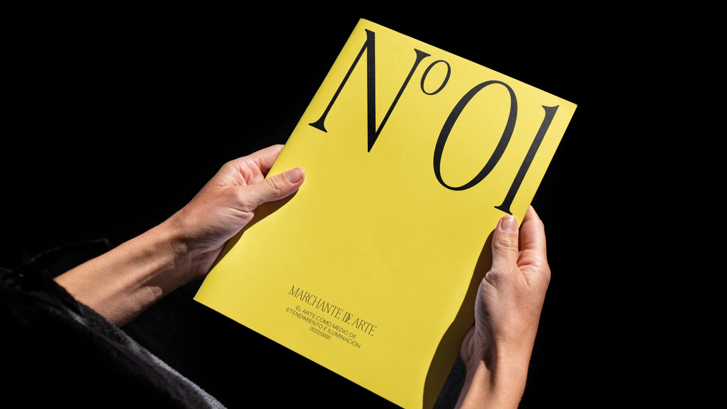
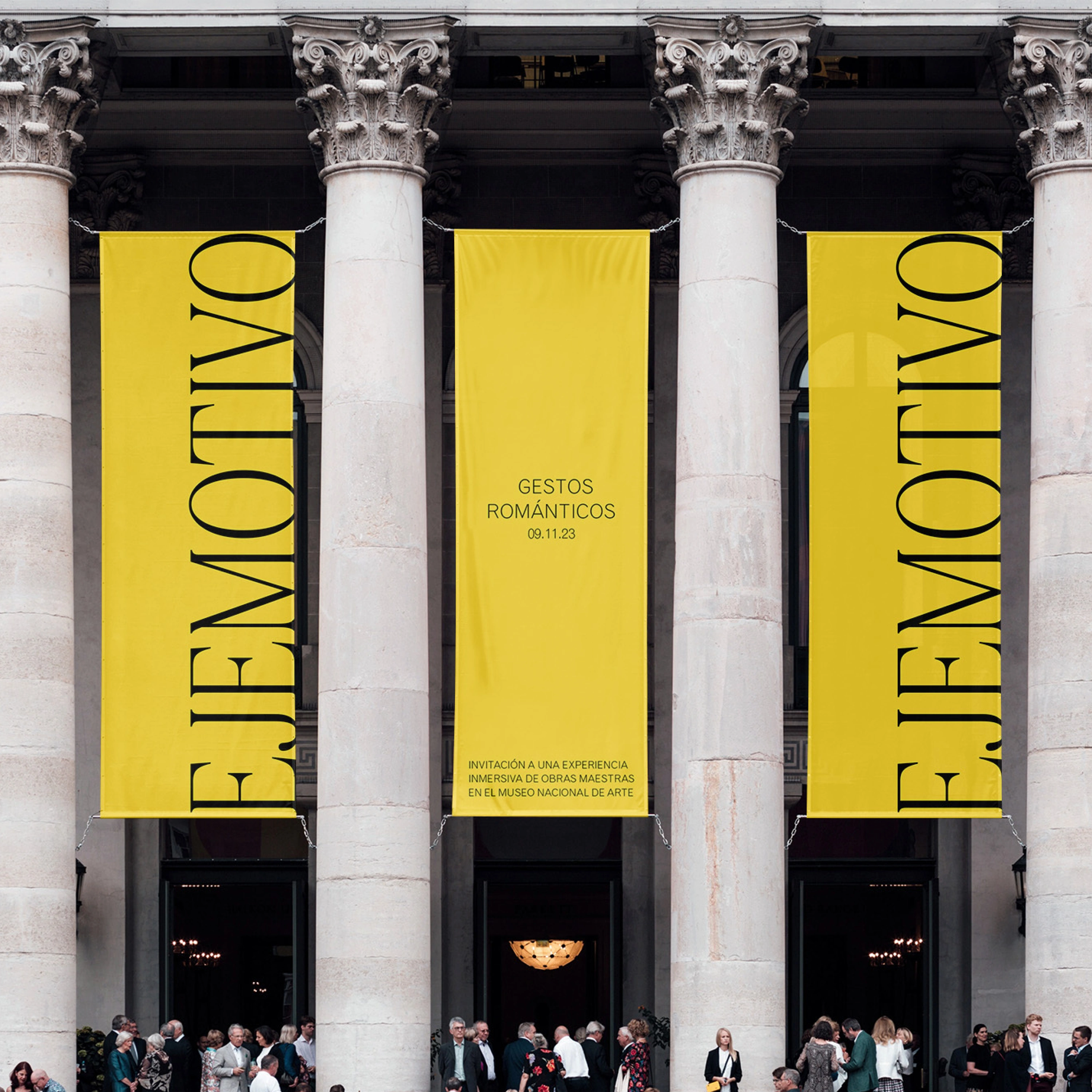
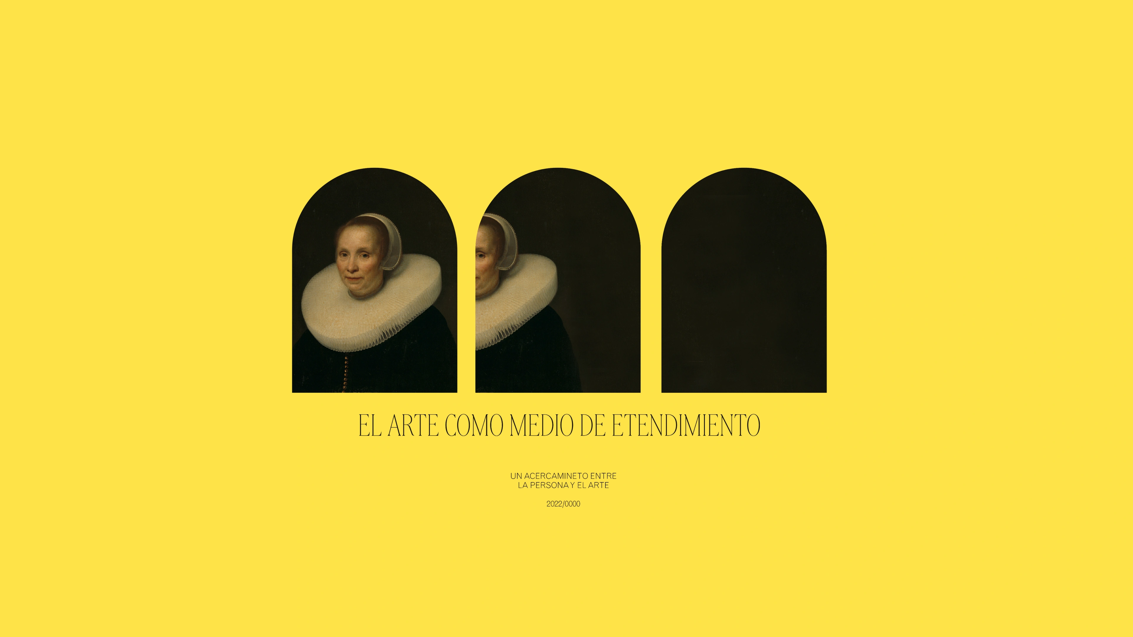
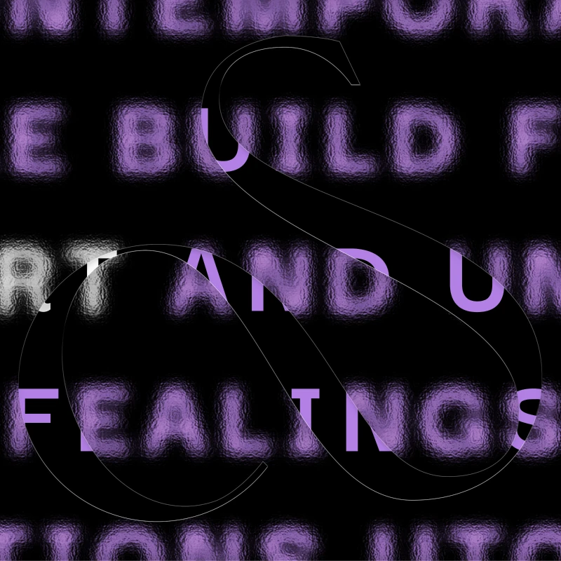
The visual narrative for Casa Salazar focused intensely on the pursuit of beauty, using visual elements to express how artistic heritage can serve as a tool for comprehension and enlightenment. The identity established a compelling tension by balancing deep respect for traditional art history with a sharp appreciation for contemporary, avant-garde movements. Color played a fundamental role in this storytelling; a deep, authoritative black provided structural depth, while a vibrant yellow was strategically introduced as a brilliant light resource, symbolizing a literal light in the darkness and the uncovering of truth through art.
Design Evolution & Strategy
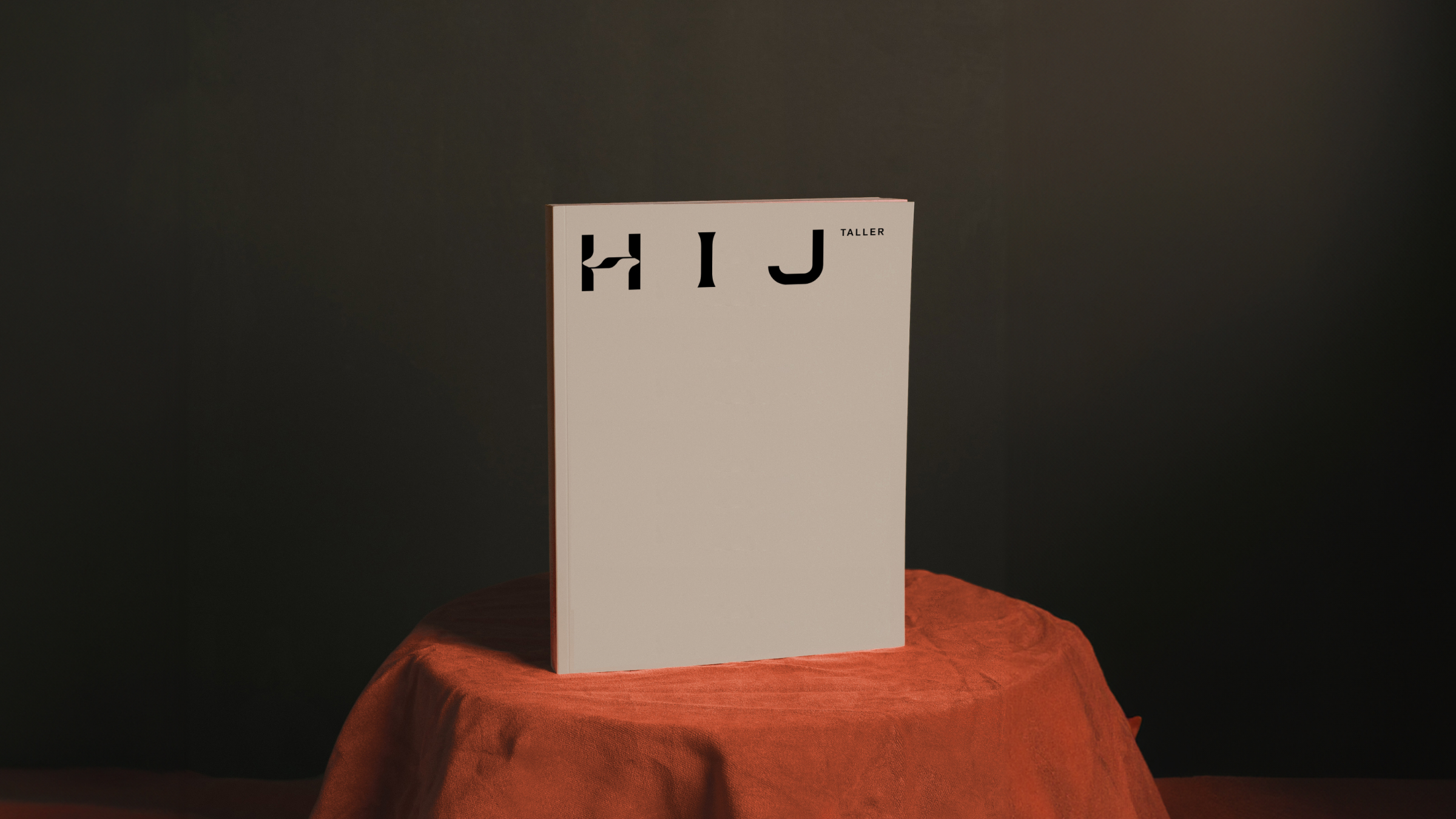
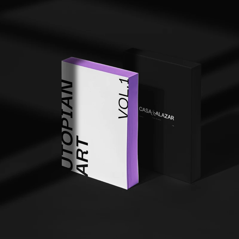
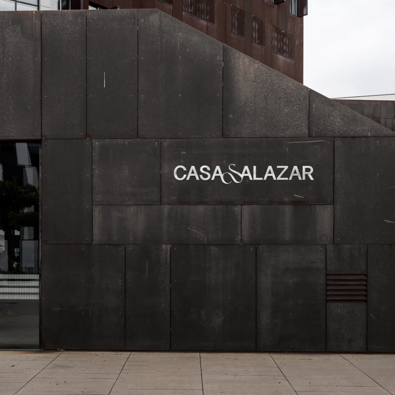
The design process evolved by translating the vast weight of art history into a sleek, provocative, and modern brand system. The cornerstone of this evolution was the logo, which emerged through delicate, organically shaped lines that offered a decidedly avant-garde expression. Designers traced the letters in commanding uppercase forms to structurally illustrate the richness and permanence of artistic heritage. By stripping away conventional, conservative gallery layouts and layering classic letterforms with organic, fluid strokes, the final design successfully evolved into an identity that felt both deeply rooted in history and boldly futuristic.


No items found.