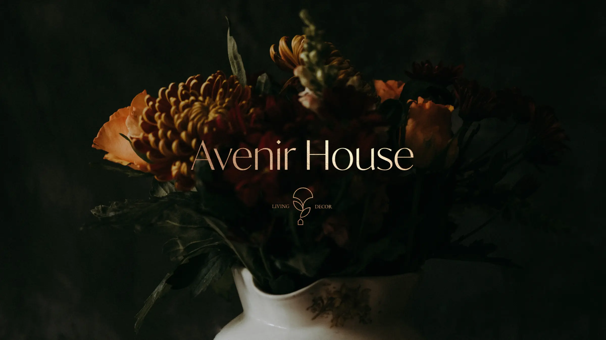
Branding

A contemporary jewelry brand that weaves stories to materialize them into unique pieces.

Overview

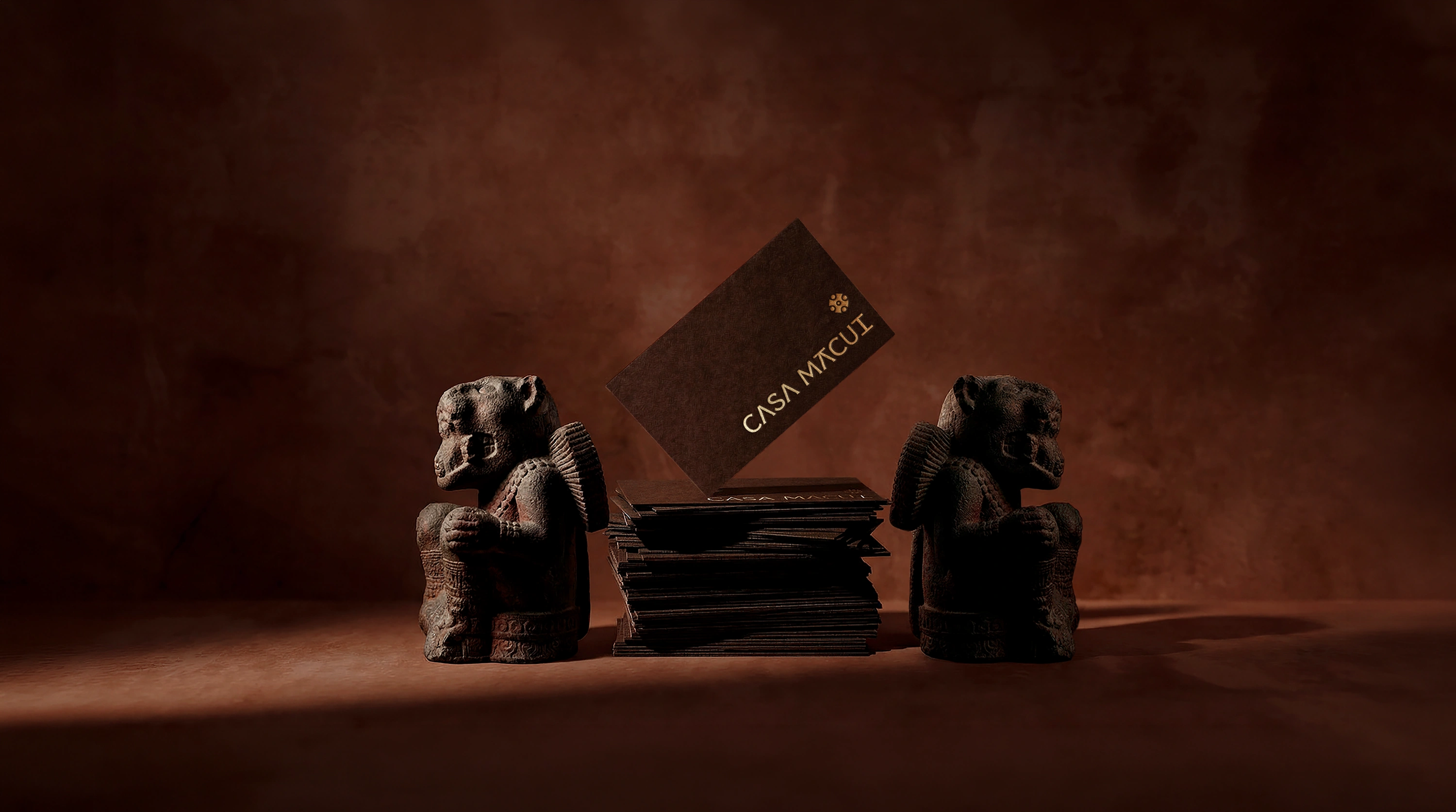
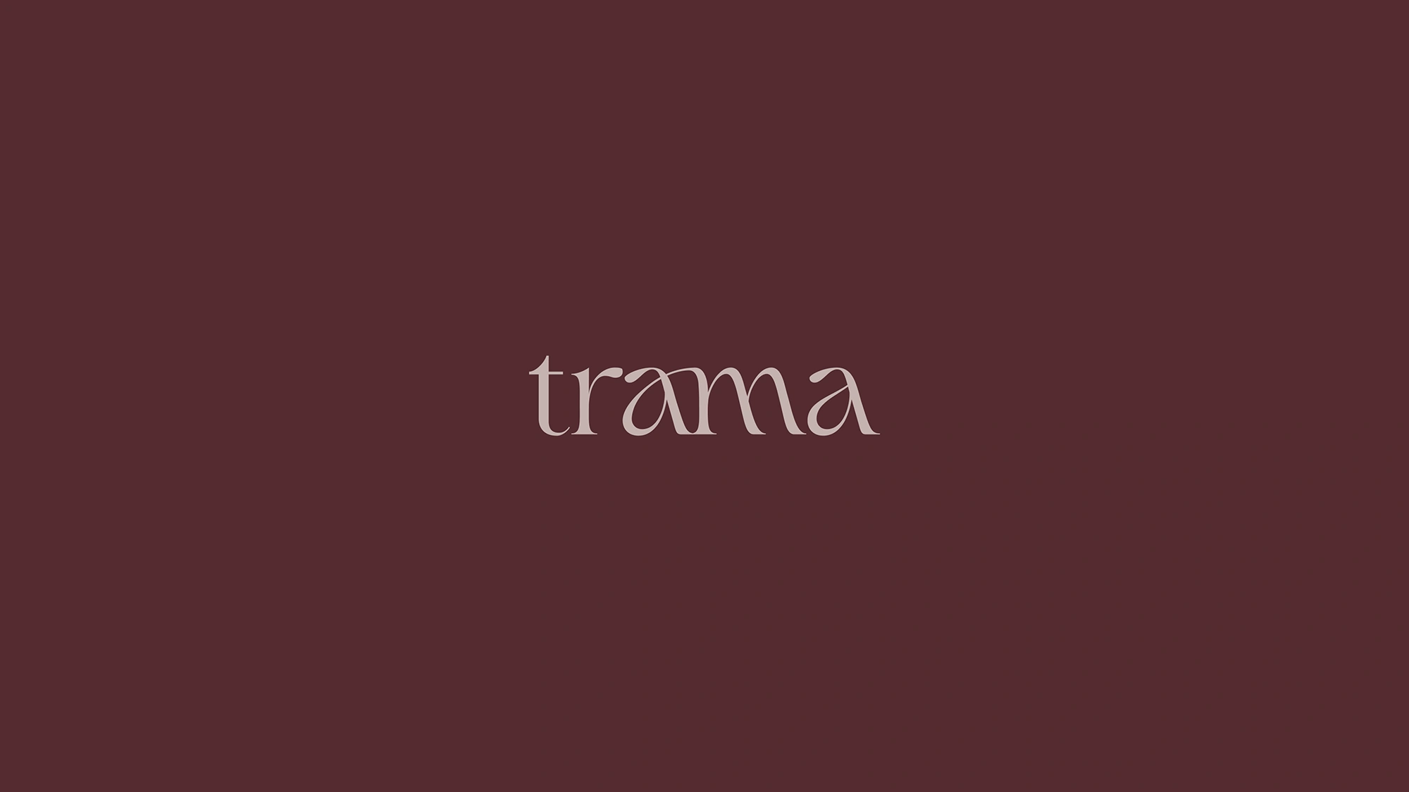
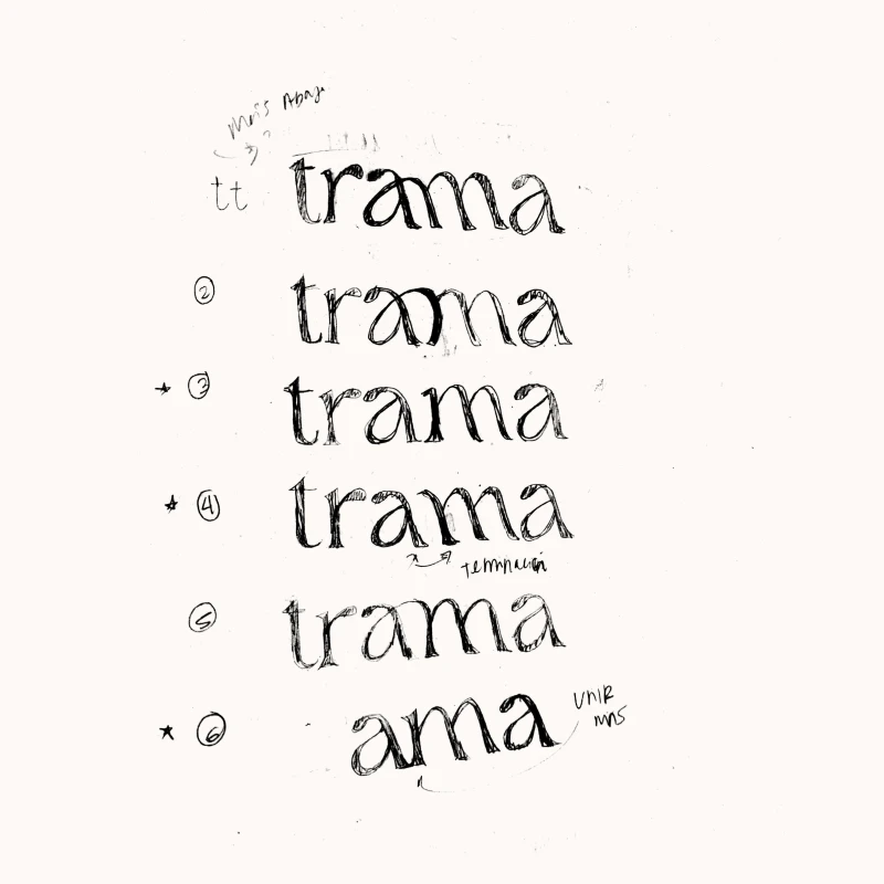
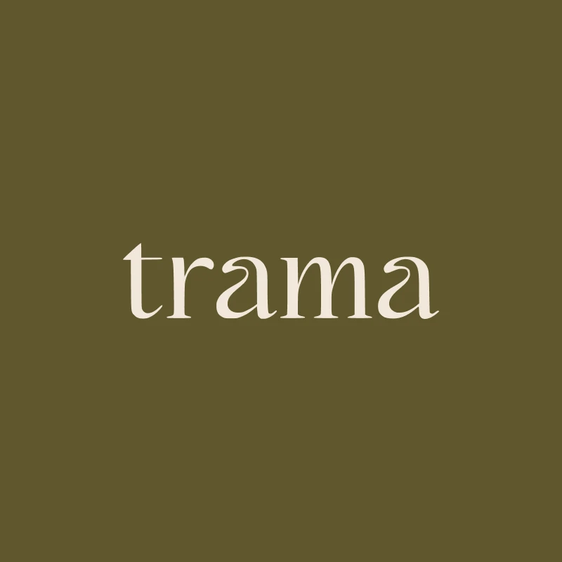
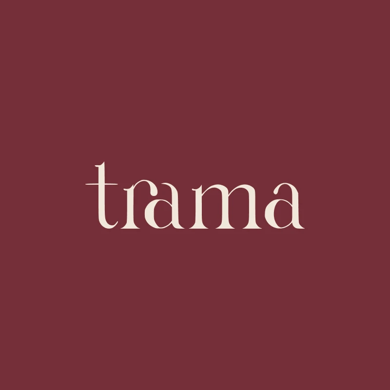
The Trama logotype features delicate, organic characters, intertwining the "a" and "m" to symbolize connected narratives. The system includes a dynamic monogram that forms the letter “T” while abstractly revealing the founder's initials, “C” and “P.” To build an intimate, editorial feel, the color palette contrasts deep plum, earth brown, and moss green backgrounds with clean linen and bone tones.

Client
Trama
Category
Branding
Date
Jun 22, 2026
No items found.
About

Trama is a Mexican fine jewelry studio led by Carlos Pelayo. The name conceives the designer as a contemporary troubadour who weaves stories to materialize them into unique pieces. We developed a comprehensive rebranding to align the brand with its values, projecting the delicacy and artisanal precision of its craft.

Visual Narrative

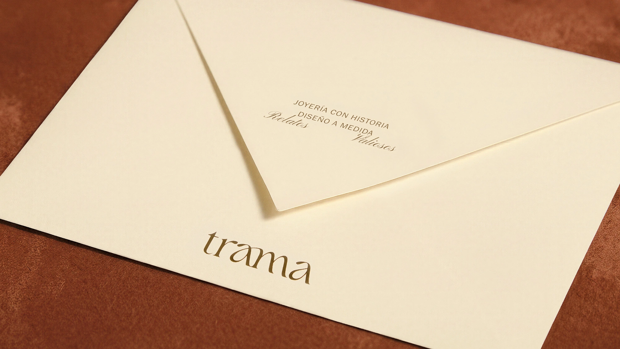
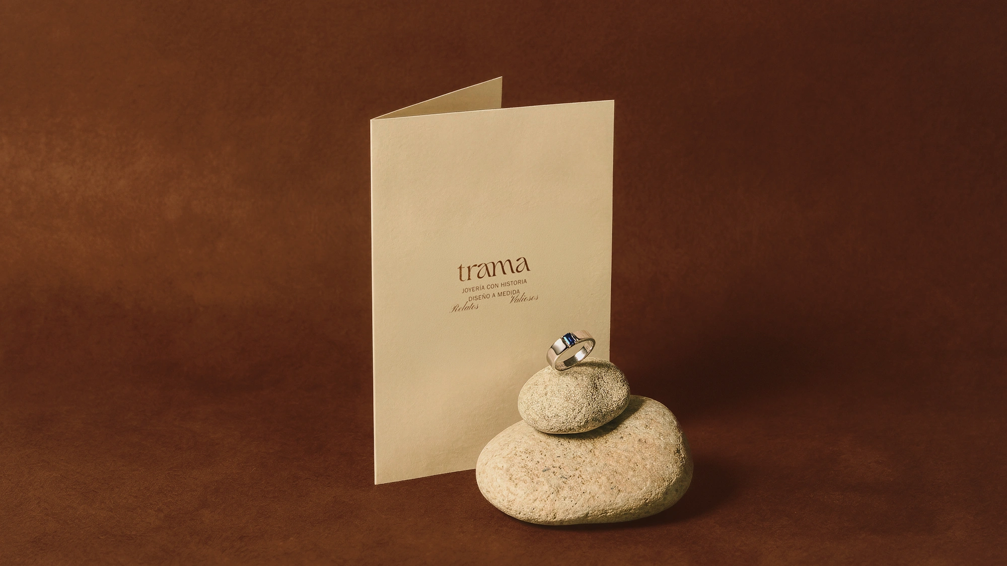
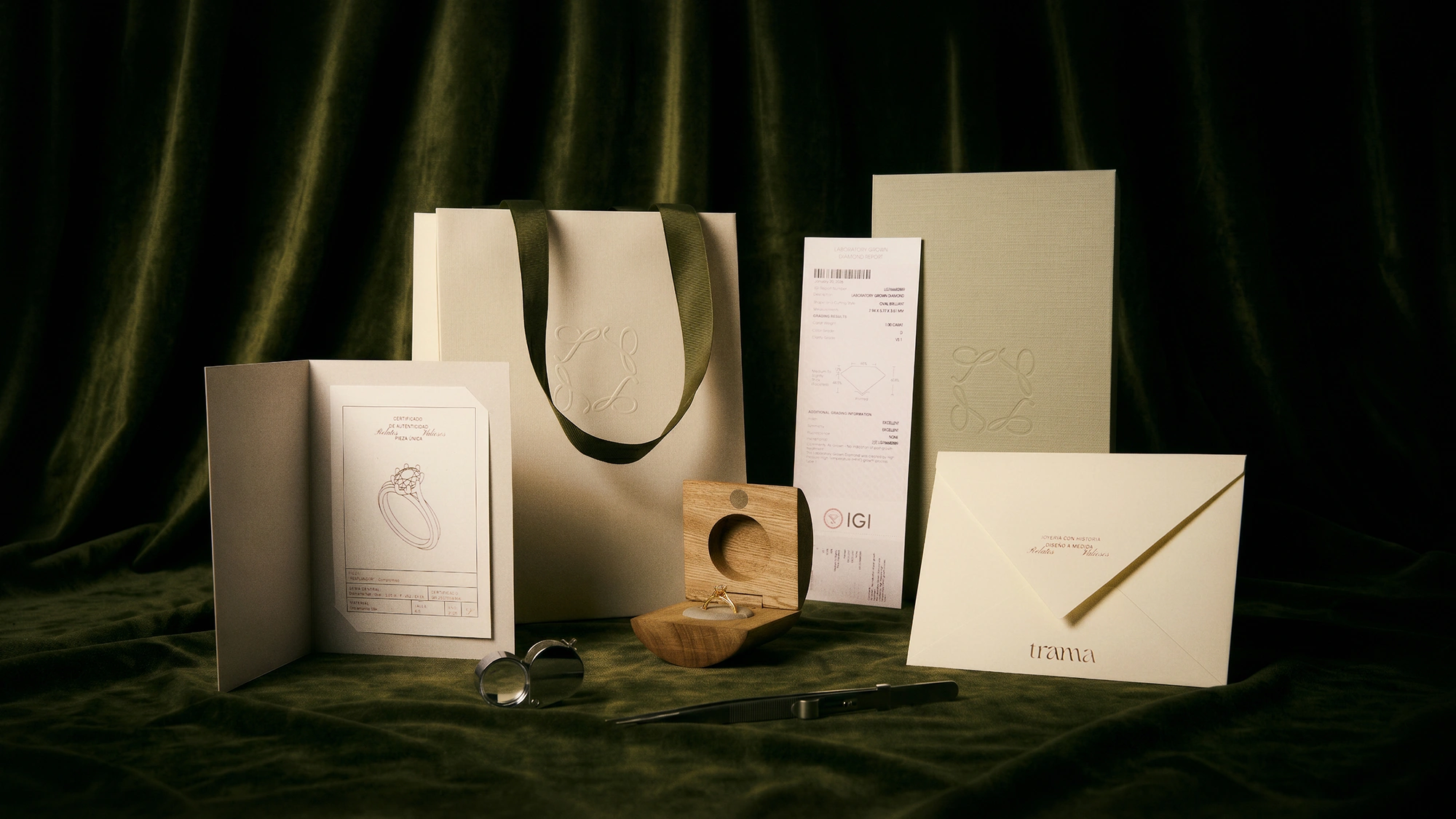
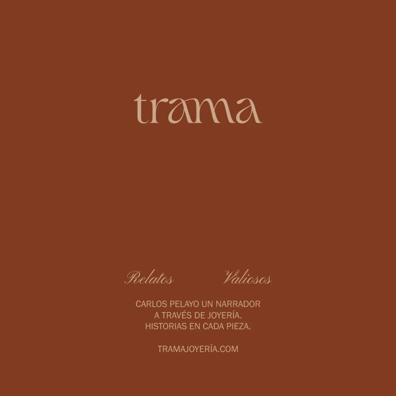
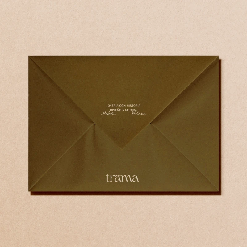
The logotype endows each character with a unique, organic, and delicate body. Reflecting the brand's essence, the letters “a” and “m” intertwine to symbolize the union of the narratives behind each piece. The identity unfolds into two configurations: one where the logotype is accompanied by the descriptive tag “Joyería con historia. Diseño a medida” (Jewelry with history. Custom design) in a light sans-serif typeface, and another composition that adds the slogan “Relatos valiosos” (Valuable tales) in a script typeface with curved strokes to accentuate its artistic character.

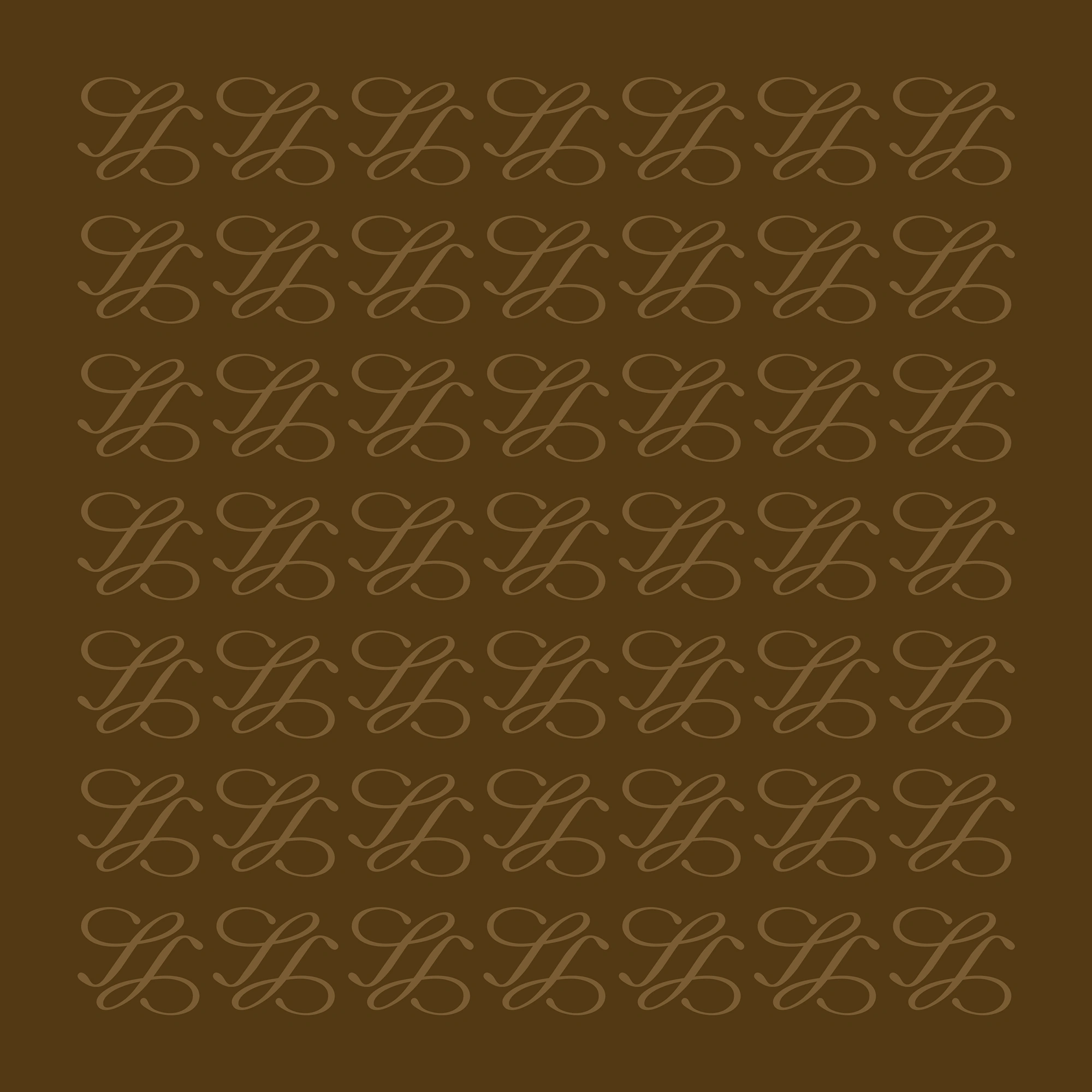
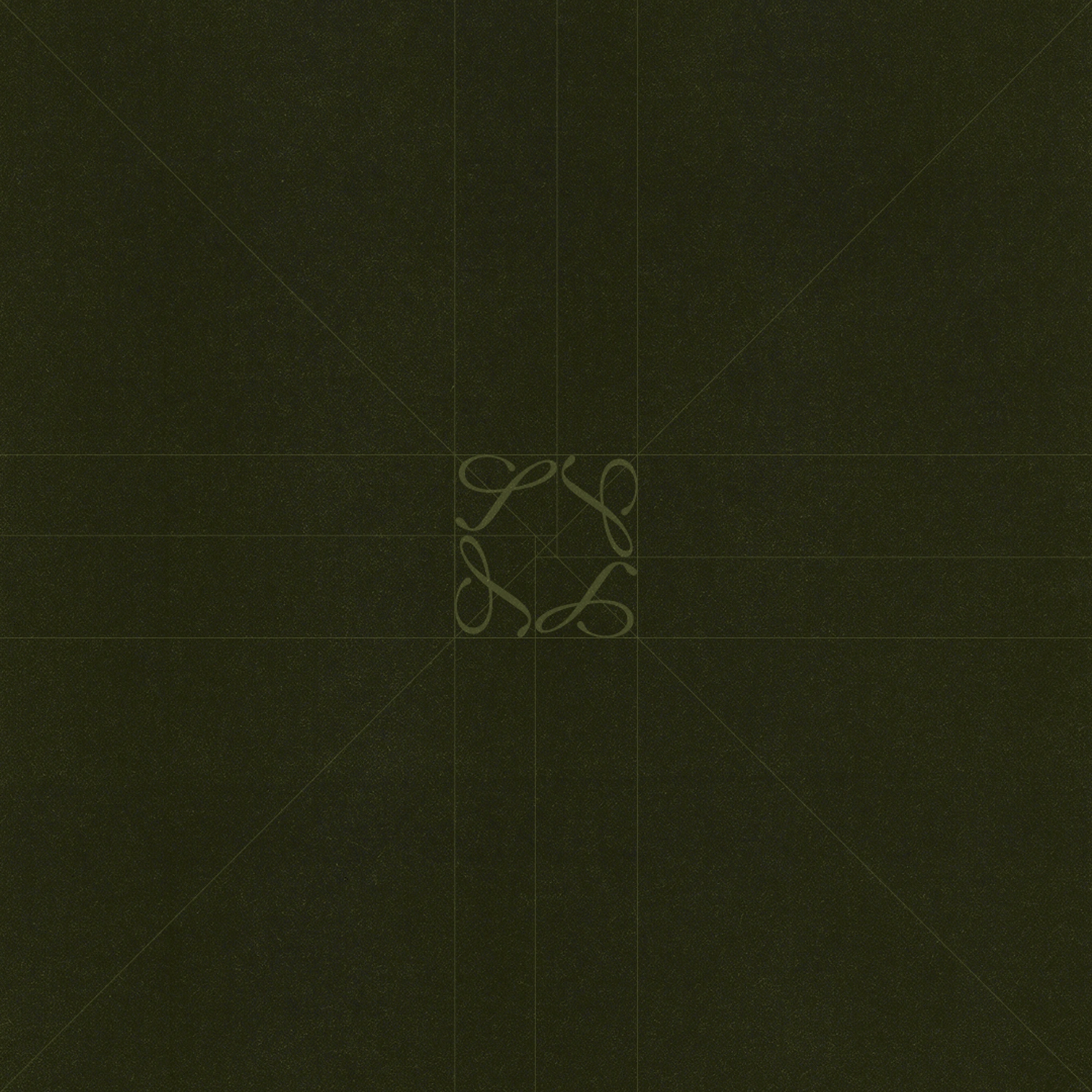
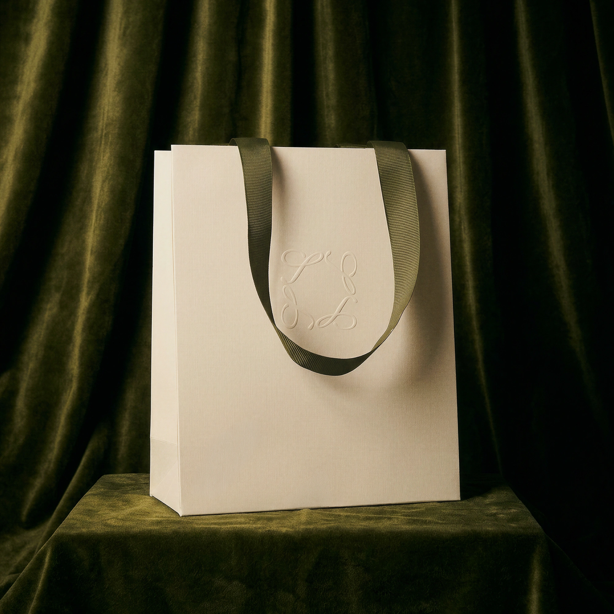
The system is complemented by a dynamic, double-reading monogram. Individually, it functions as the “T” for Trama, balancing robust and light strokes, while its curves abstractly reveal the initials “C” and “P” of the founder. It can be used isolated, mirrored, or repeated four times to create a grid that frames the jewelry pieces.

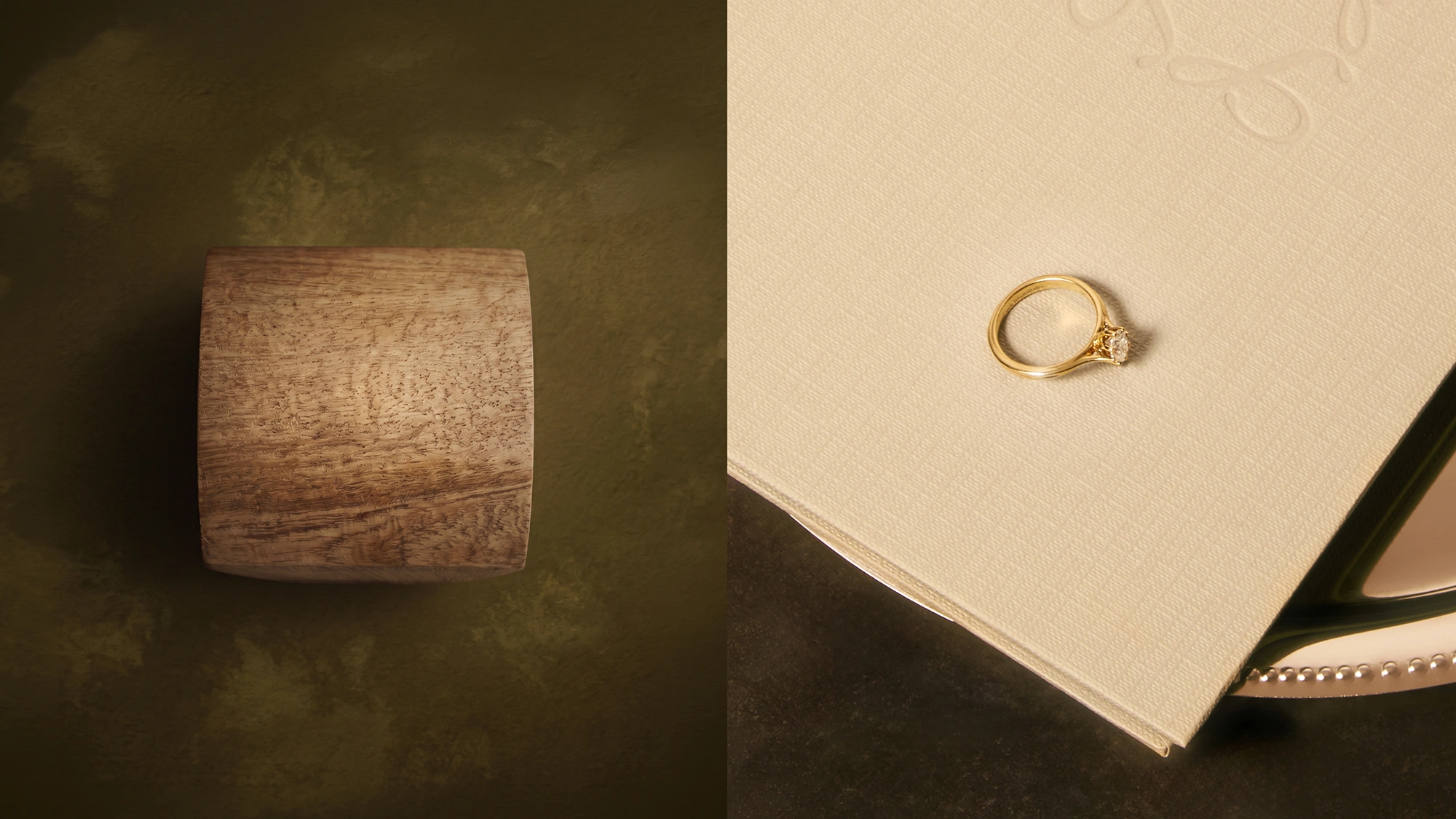
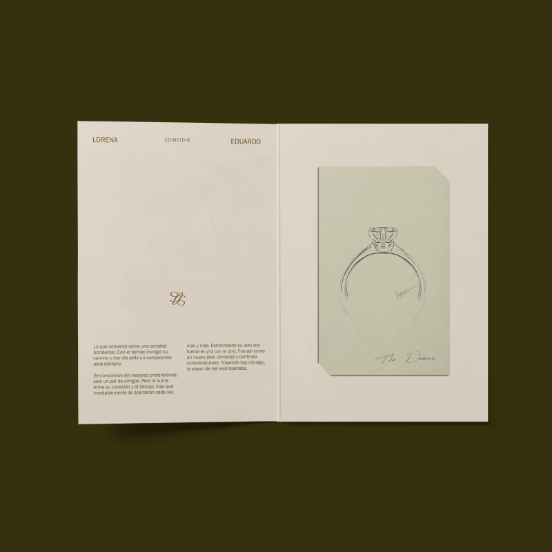
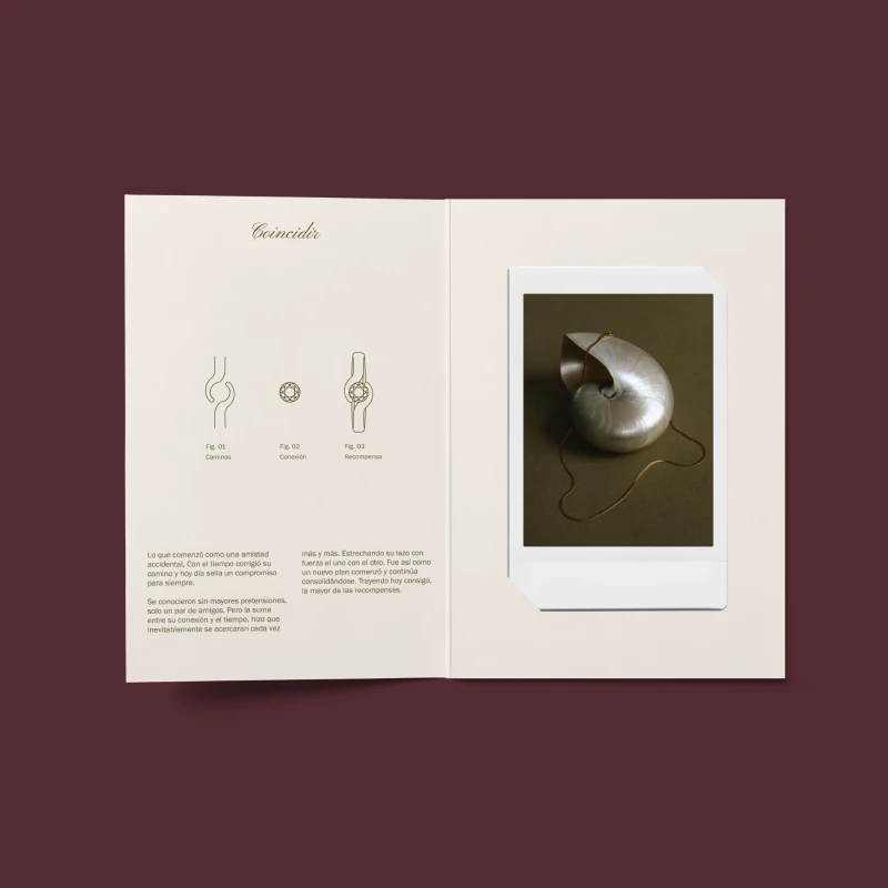
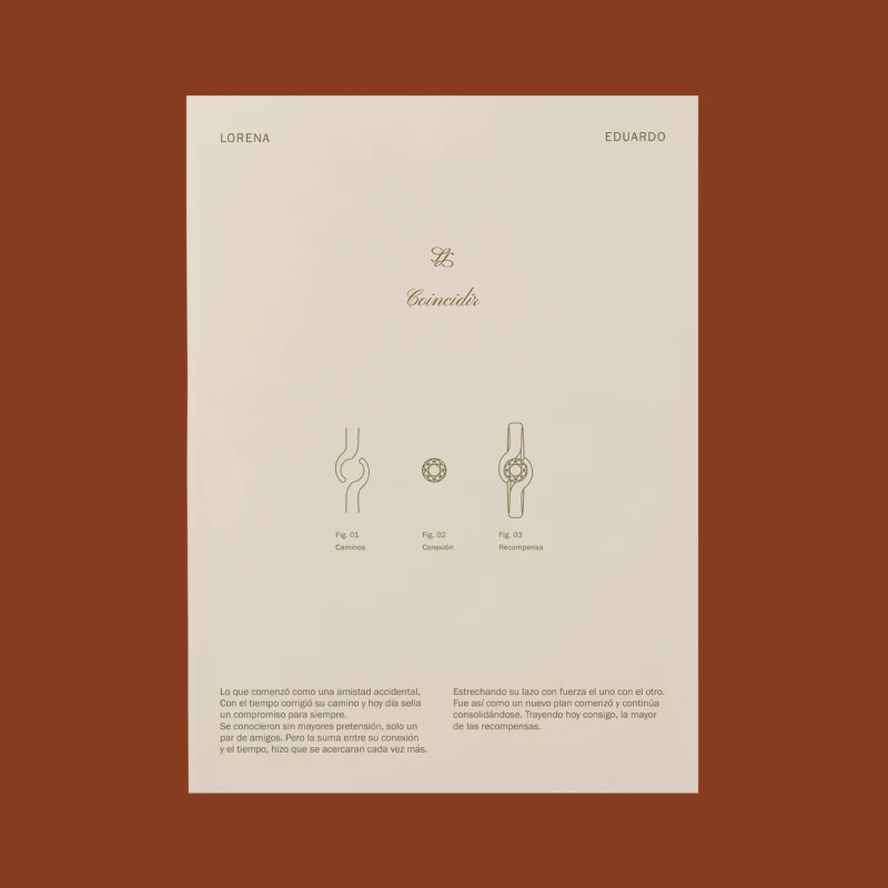
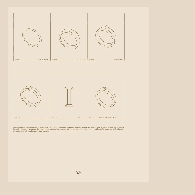
The color palette contrasts enveloping backgrounds in plum burgundy, earth brown, and moss green—building an intimate, editorial atmosphere—with the tactile lightness of linen and bone tones in the stationery. The editorial design acts as the core of the identity; the intentional use of white space and the curated composition express the elegance of a brand entirely dedicated to signature design and tangible narrative.

Design Evolution & Strategy

For Trama, we began with the logo sketching process, aligning it with the brand's vision and conceptualizing its shapes and strokes. In parallel, we developed the monogram to create a signature mark that serves as a distinctive symbol of the identity. The color selection was the subsequent step, chosen with the clear intention of creating a warm and harmonious identity that conveys delicacy.

Trama logo exploration
Trama monogram exploration
Trama composition exploration
Trama envelope exploration
Trama jewelry card exploration
Trama letter head exploration
Trama jewelry blueprints exploration
Trama photography archive
Trama monogram archive
No items found.
Gradient background blending dark green and beige colors.
Let's get started

Run away with us

Escape from the superfluous to reach the most valuable.

Schedule a call
Gradient background blending dark green and beige colors.
Logos are dead web view
Spread of bananas with Foodback QR code stickers
Large-scale illuminated wall installation with the logo and the phrase inspire and connect
Probike logo on a drawstring pouch
Brócoli envelope
Avenir House logo in gold foil with flowers in a vase photo background
Scattered business cards for Green City showcasing the logo and diverse gradients.
A green plastic crate filled with long, textured green citrus fruits, likely finger limes, set against a minimalist beige background. The front center of the crate is labeled with the text "THE CURIOUS LIME" in a clean, white serif font.
Humani business card
HIJ publication
Empty stadium seats with the word Above spelled out in the seats
A minimalist olive-green A-frame sign stands on a sunlit gravel surface against a dark, slatted wooden wall, casting a sharp shadow to the left. The hanging white poster displays the brand name "FORT" in brown text—with a distinctive raised "O"—alongside "
Green envelope design for Becoming, an architecture studio in Dominican Republic
ROOM A-Frame Sidewalk Sign
Minimalist outdoor signage for Es Ala featuring white sans-serif typography on a dark cubic structure integrated into modern architecture.
box with cookies on top and Illustration of a chef and a cookie on a cookie bag packaging
Green baseball cap with 'PROSECCO & PIZZA CLUB' embroidered in white resting on two white T-shirts draped over a wooden chair.
Gemini said Three CUATRO CIELOS food pouches—blue (pancake flour), maroon (spiced cashews), and yellow (granola)—are displayed in a tiered arrangement against a neutral tan backdrop, featuring elegant typography and geometric patterns.
Magazine or catalog cover with Casa Salazar branding, featuring a yellow background and stylized black lettering, indicating edition no. 1