
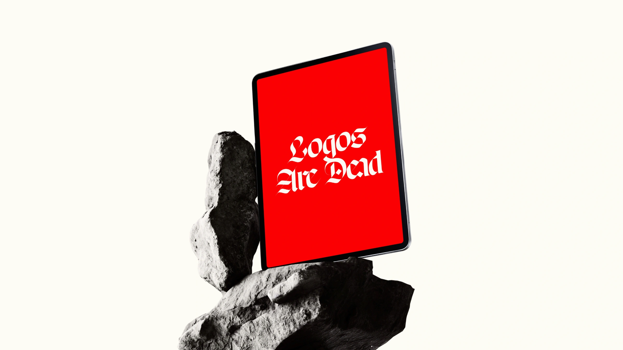
Deconstructing the icon to reveal the brand’s true spirit
Logos are Dead is an internal project born from a growing frustration with traditional branding. The "logo dynasty" is over. In its place, we are building brands that transcend visual symbols, prioritizing powerful messaging, authentic essence, and meaningful human experiences over simple icons.


The challenge
In contemporary design practice, brand identity often suffers from outdated expectations where clients demand that a single logo encapsulate the entire essence of a business. This overvaluation leads to overly complex symbols and cluttered visual markers. The challenge was to challenge this traditional obsession with static logotypes, educating clients and the industry on how branding has evolved toward dynamic, multi-sensory brand ecosystems without adopting an overly dense or academic tone.
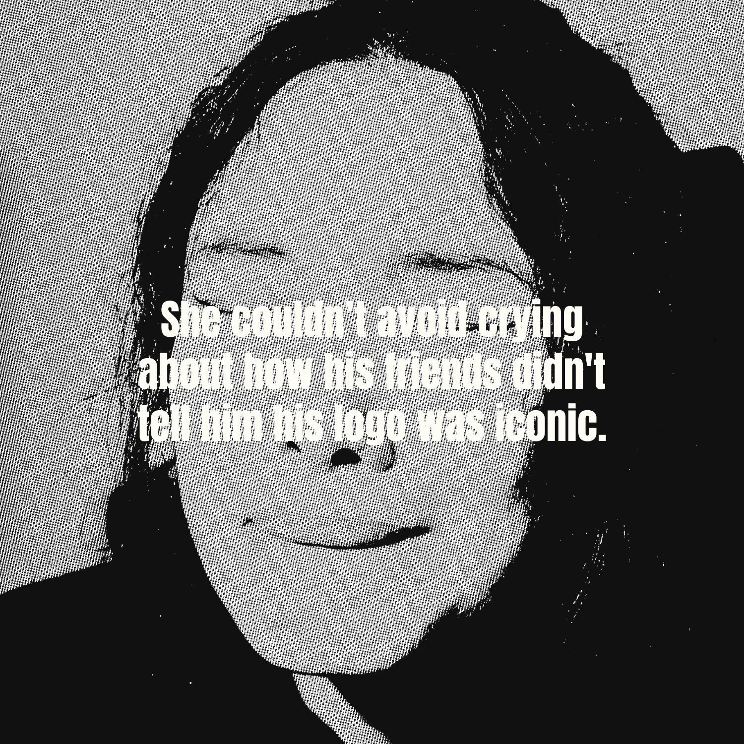
The strategy framed the shift from static logotypes to flexible brand worlds through the lens of a dramatic news investigation: "The logo as we knew it is dead". Designed as both a digital sandbox and a marketing tool for the studio, the vision used satire, irony, and interactive web tools to communicate complex brand architecture concepts. By framing the project around a newspaper theme, the narrative guides users through the collapse of the logo's central dominance and introduces the "Brand World"—an overarching ecosystem built on emotions, experiences, and cohesive touchpoints—as the true driver of modern brand recognition.
Strategy & Insight


The Solution & Visual Narrative
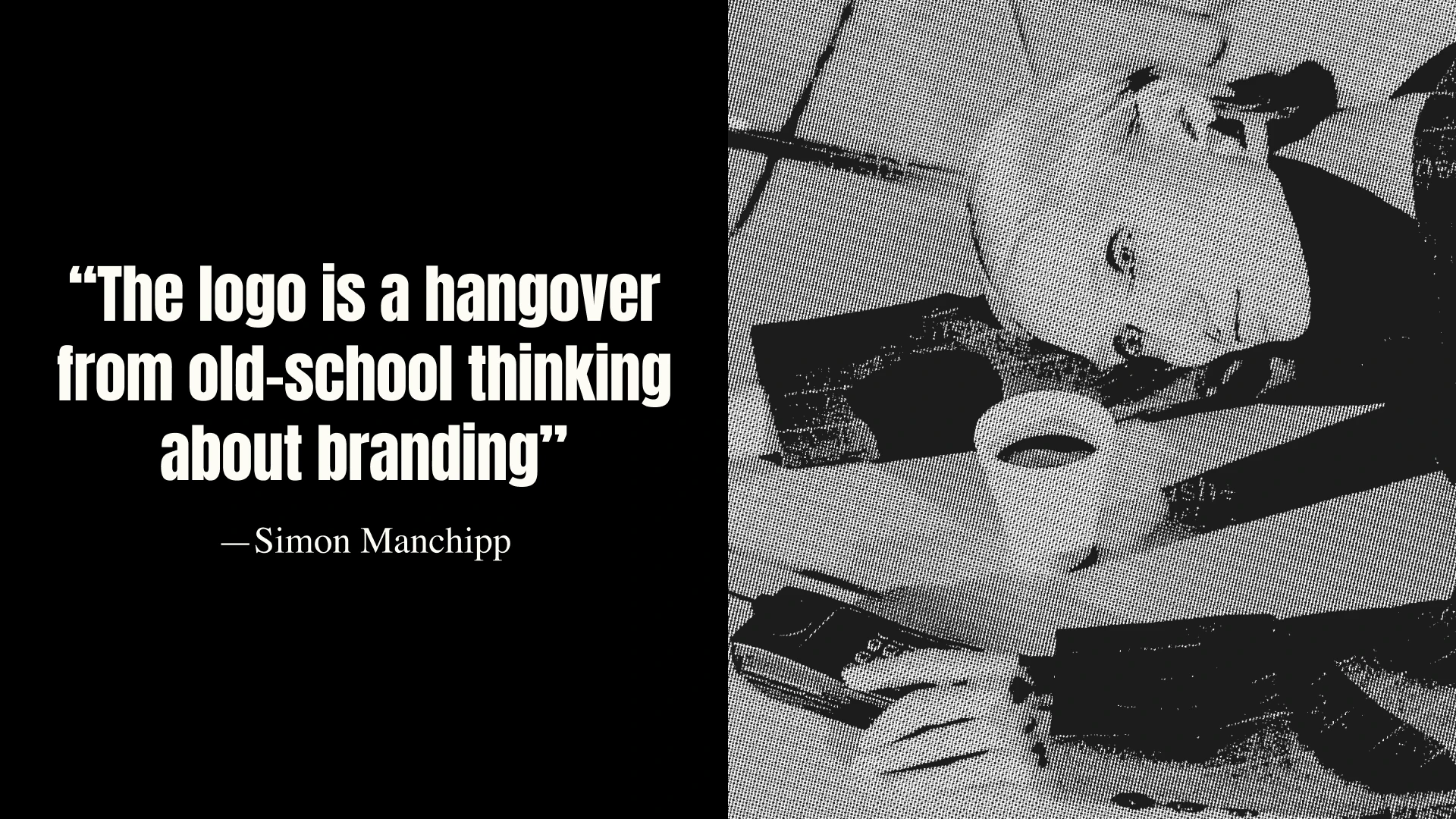
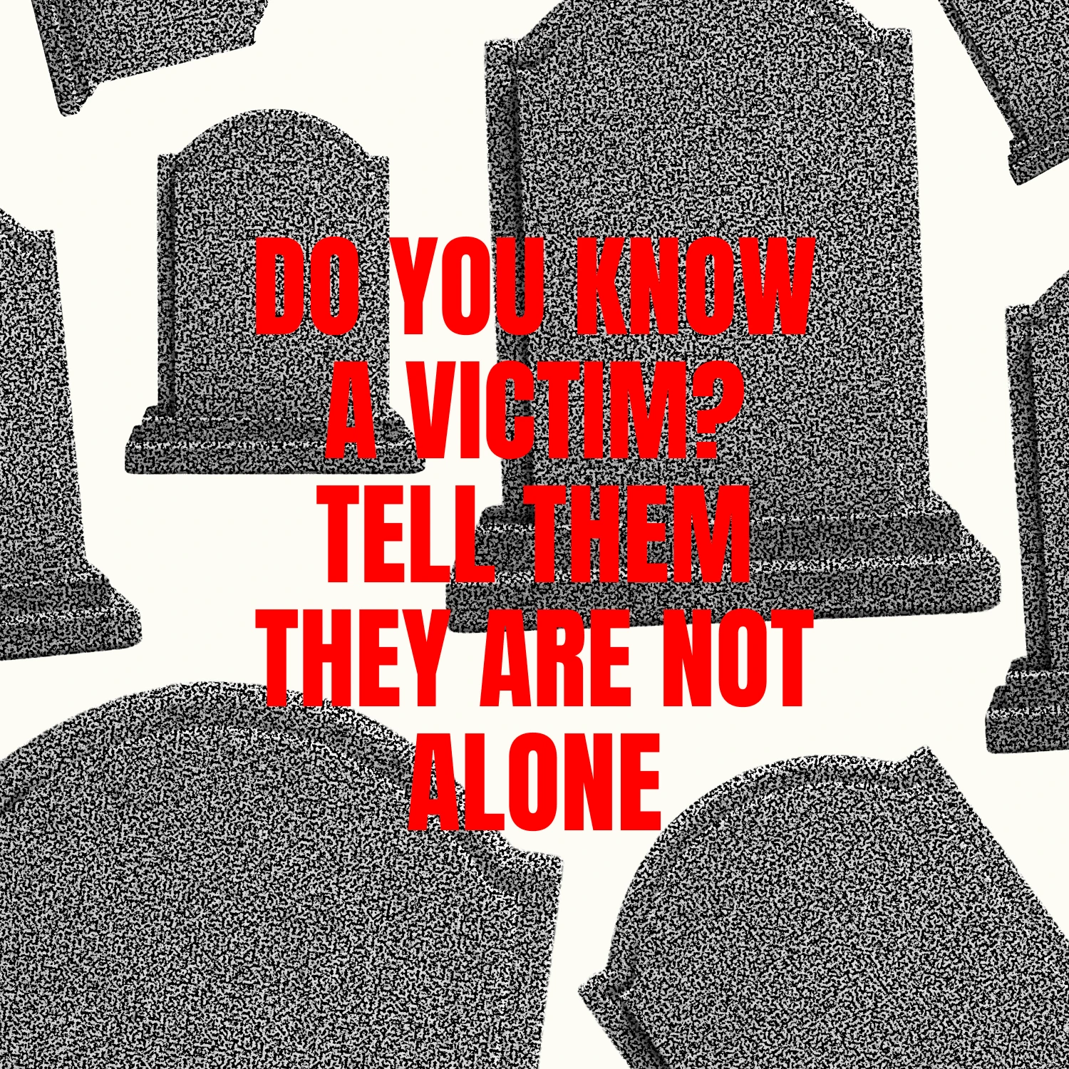
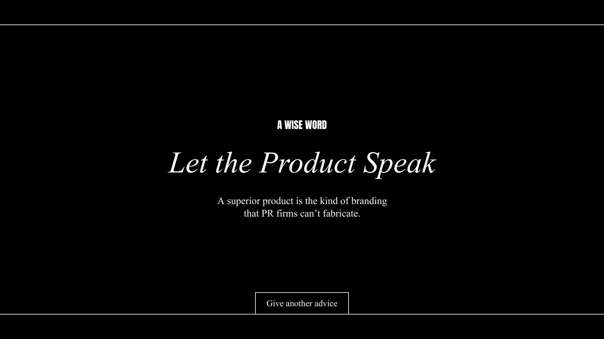
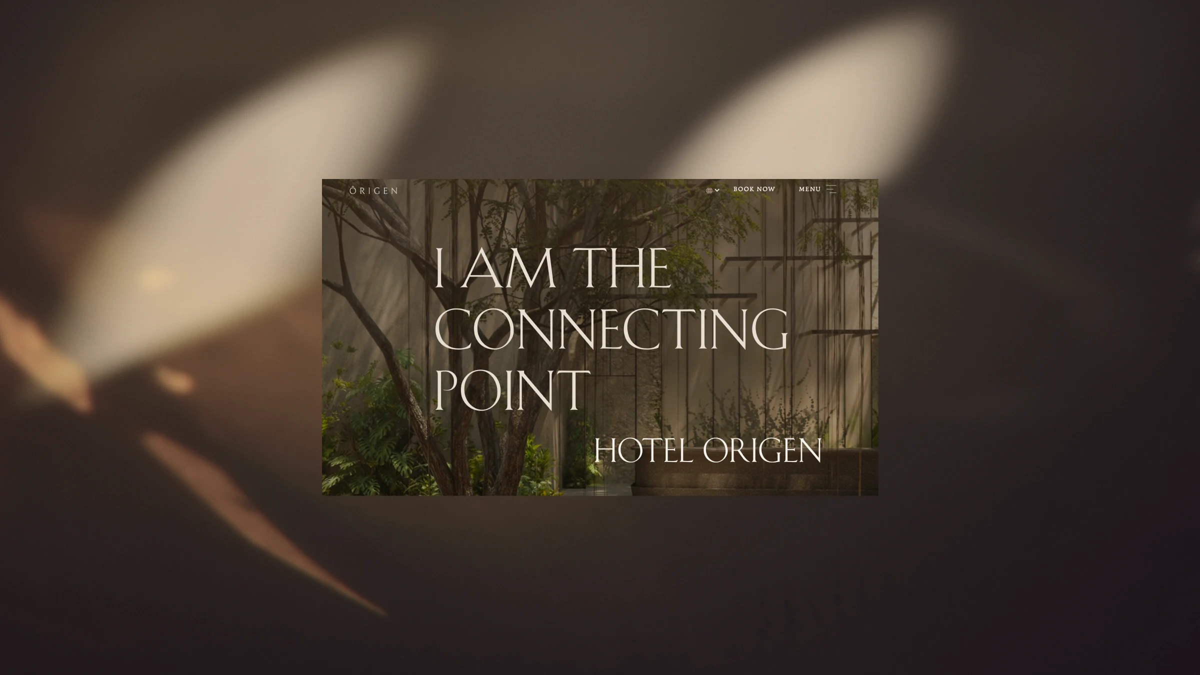
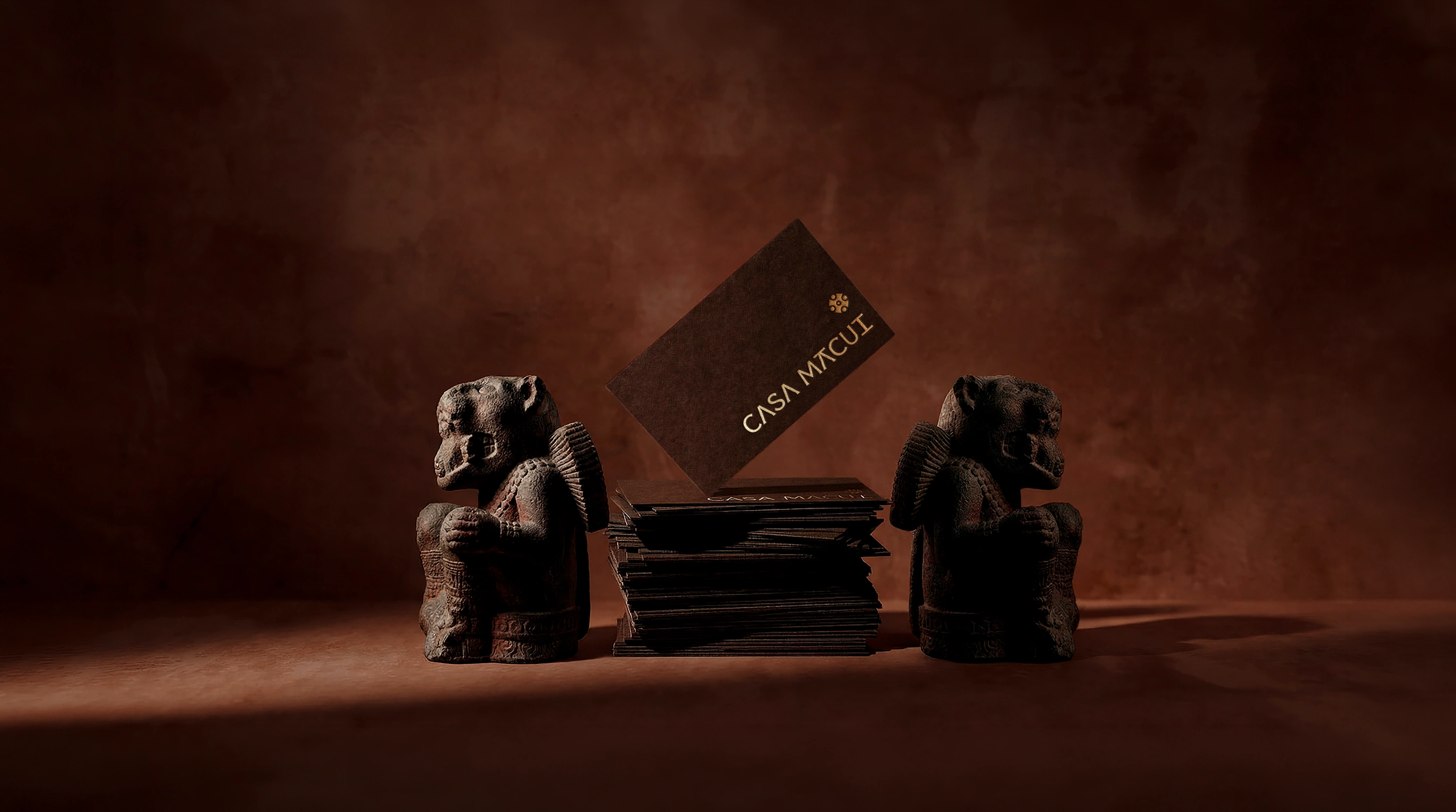
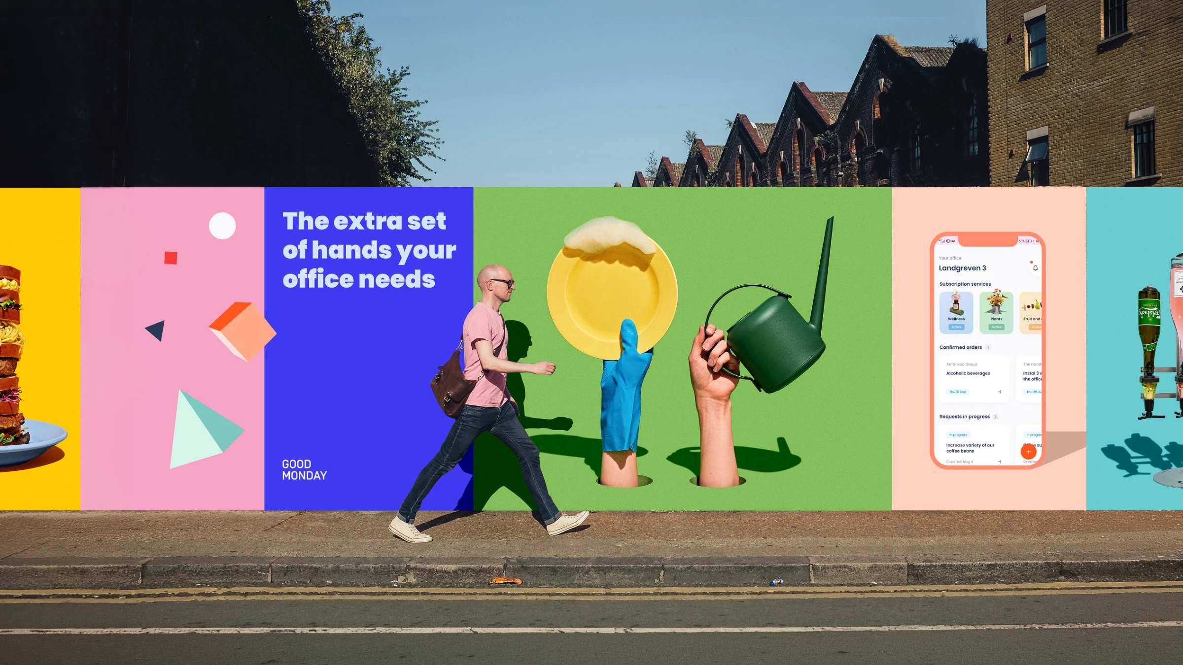
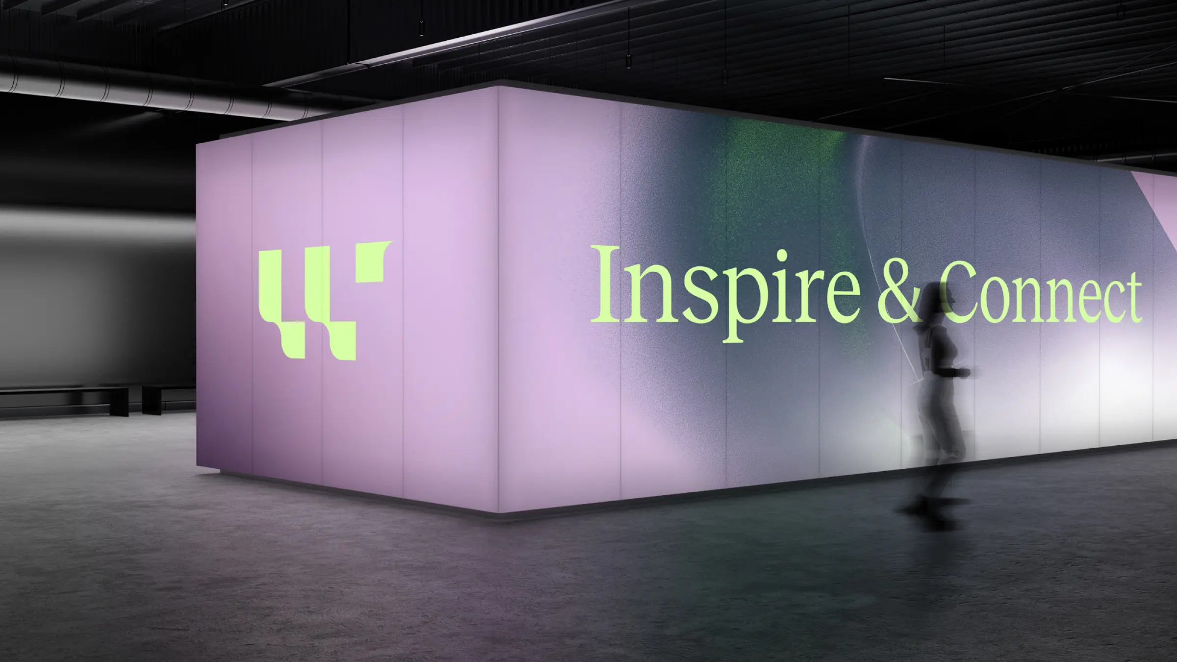
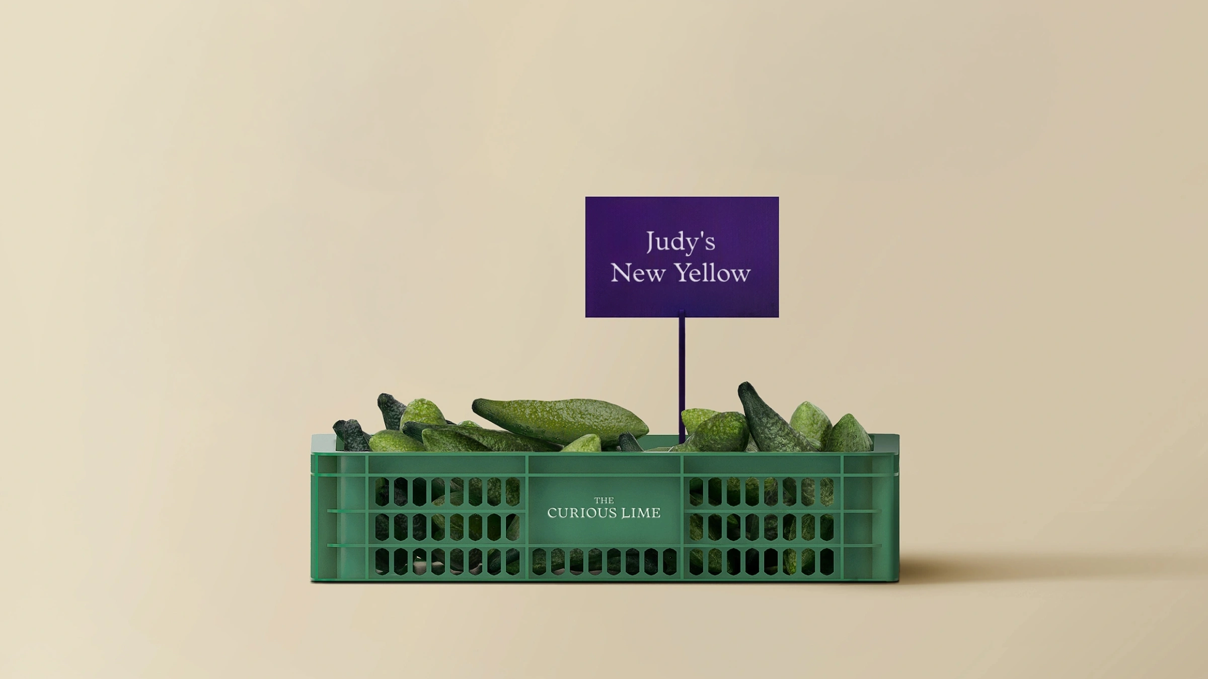
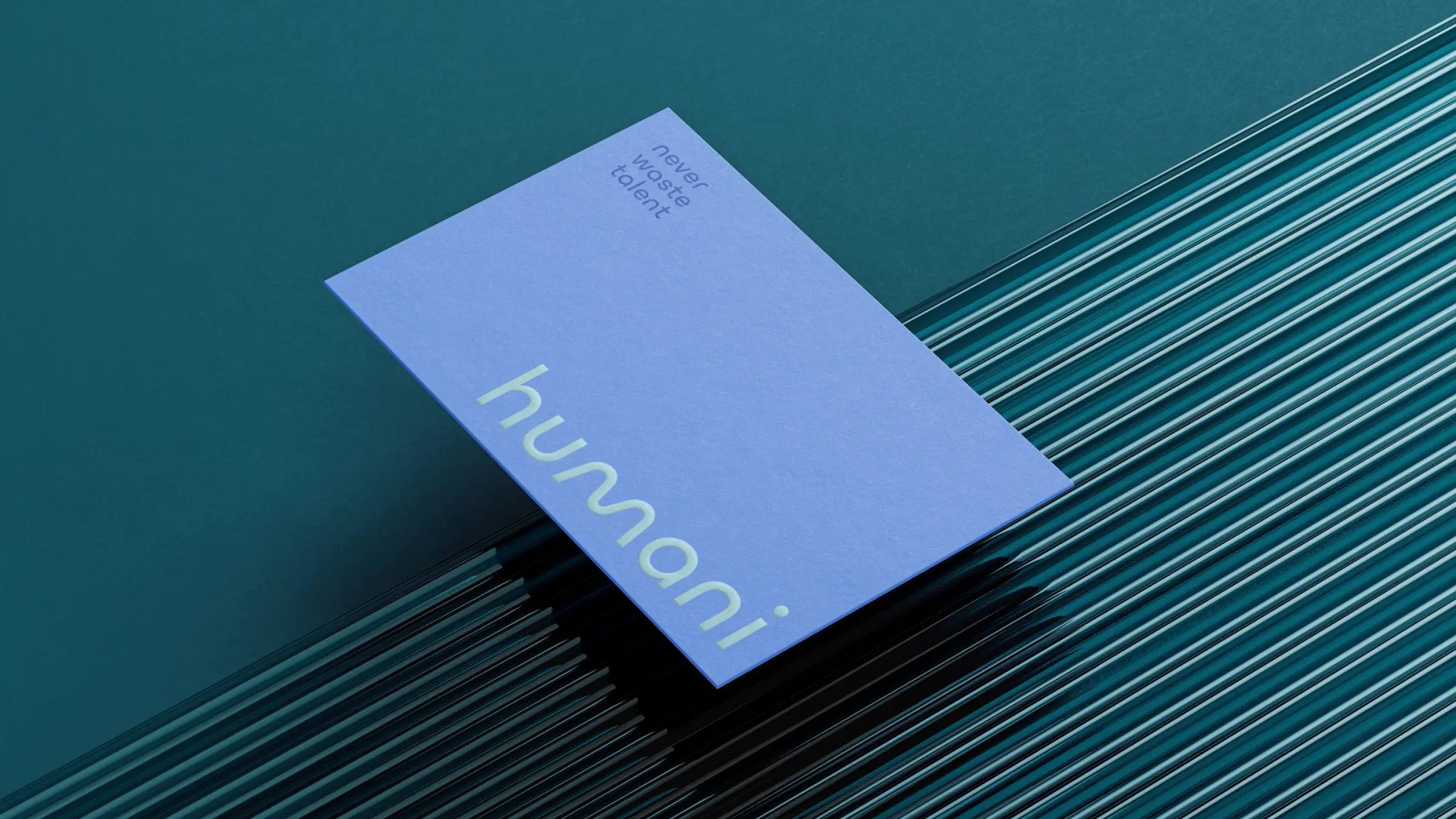
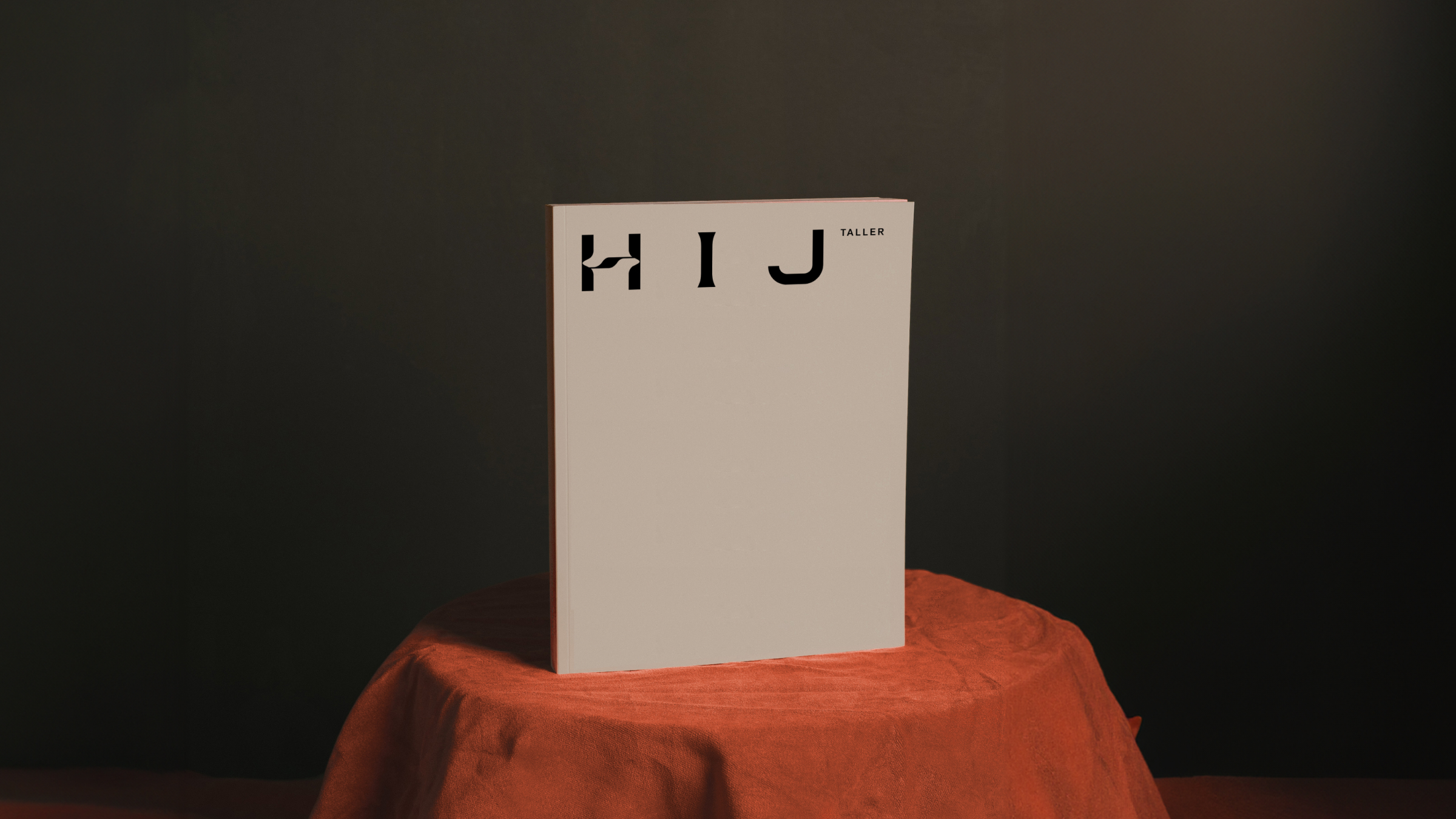
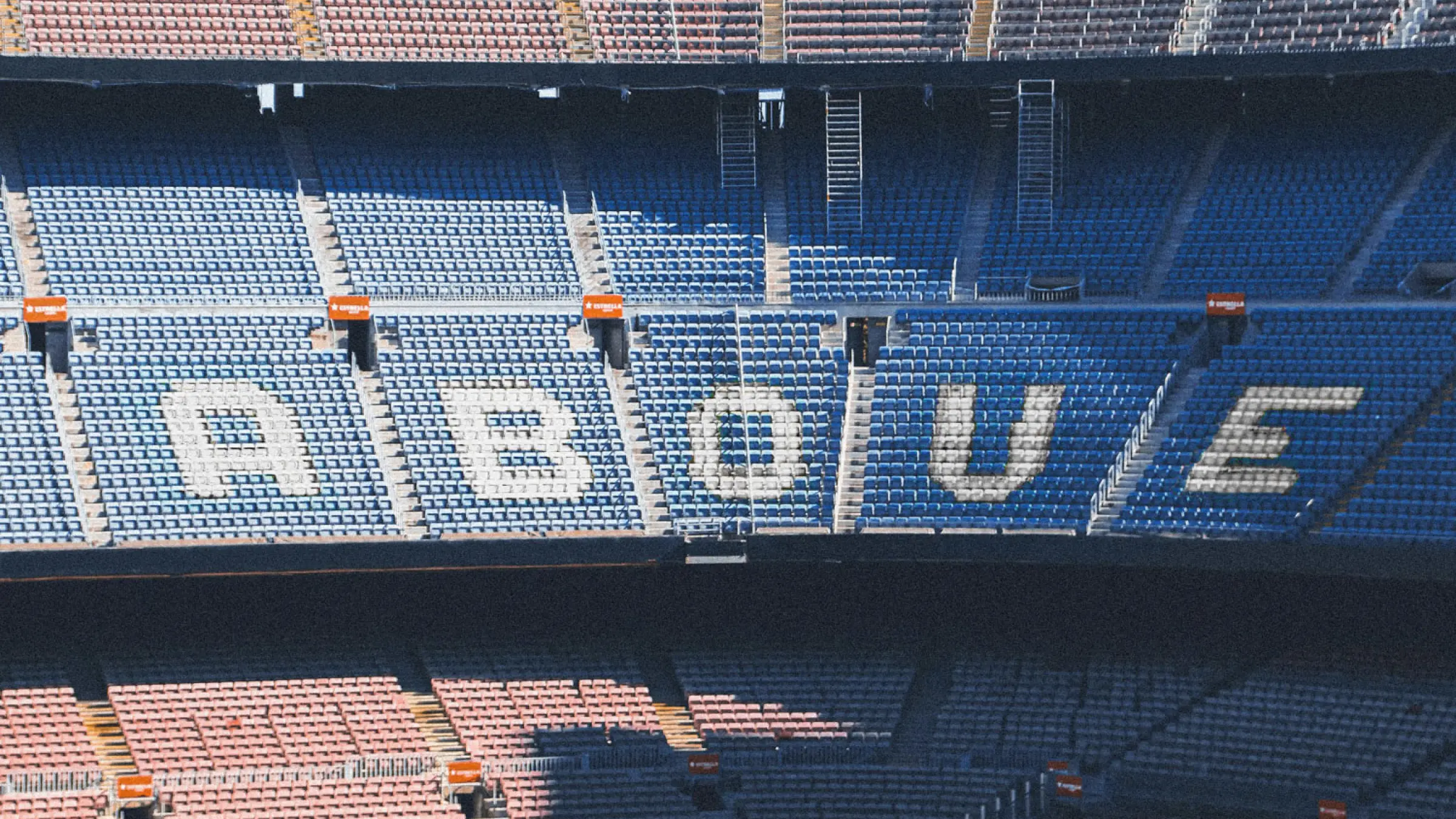
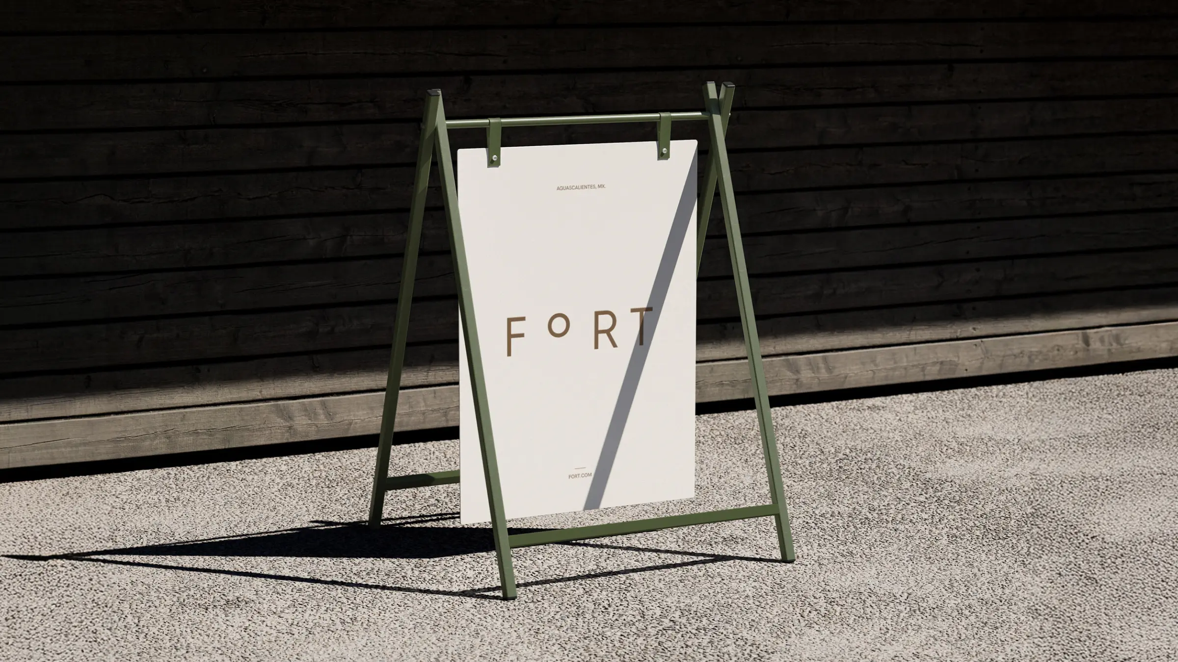
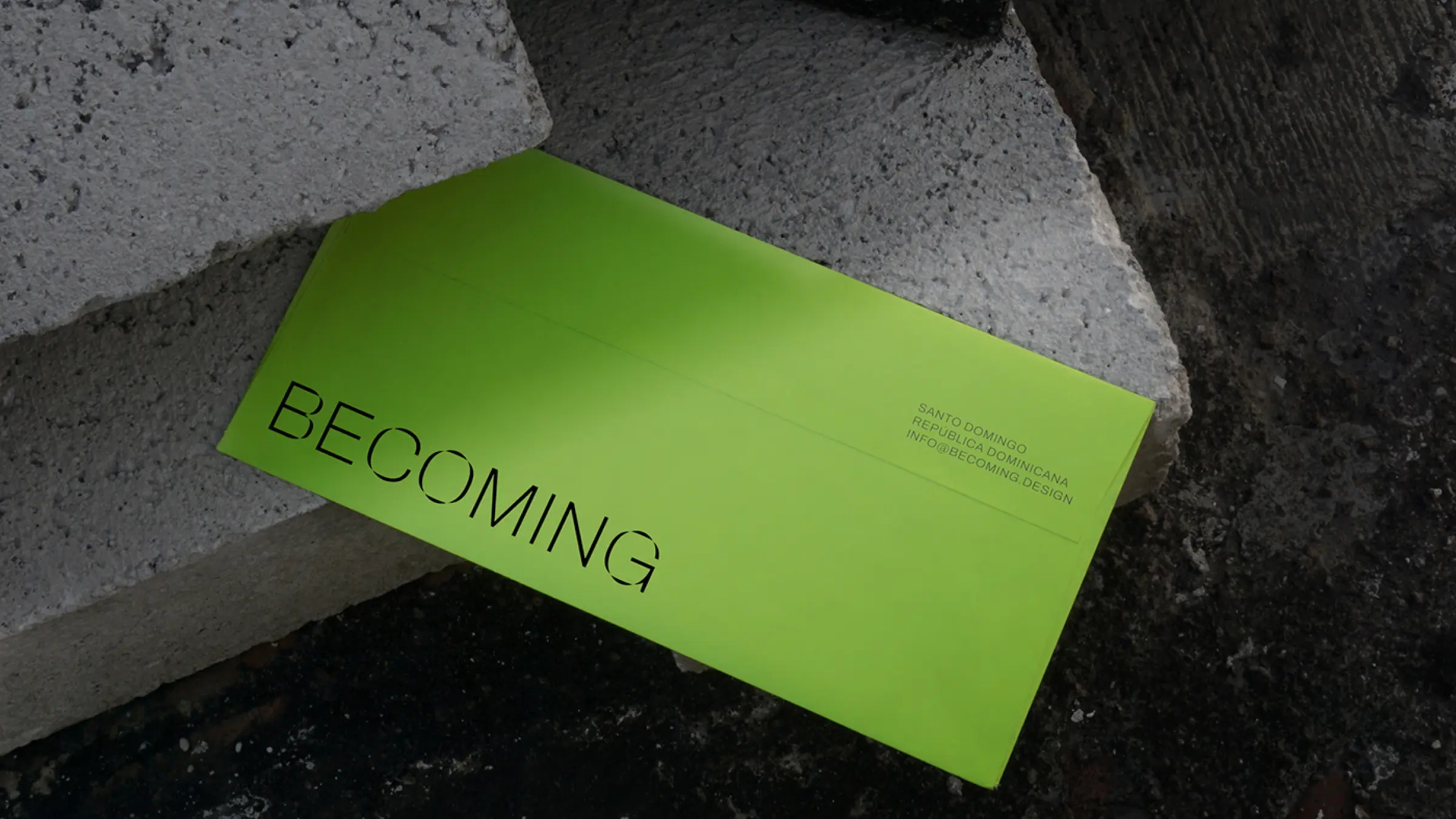
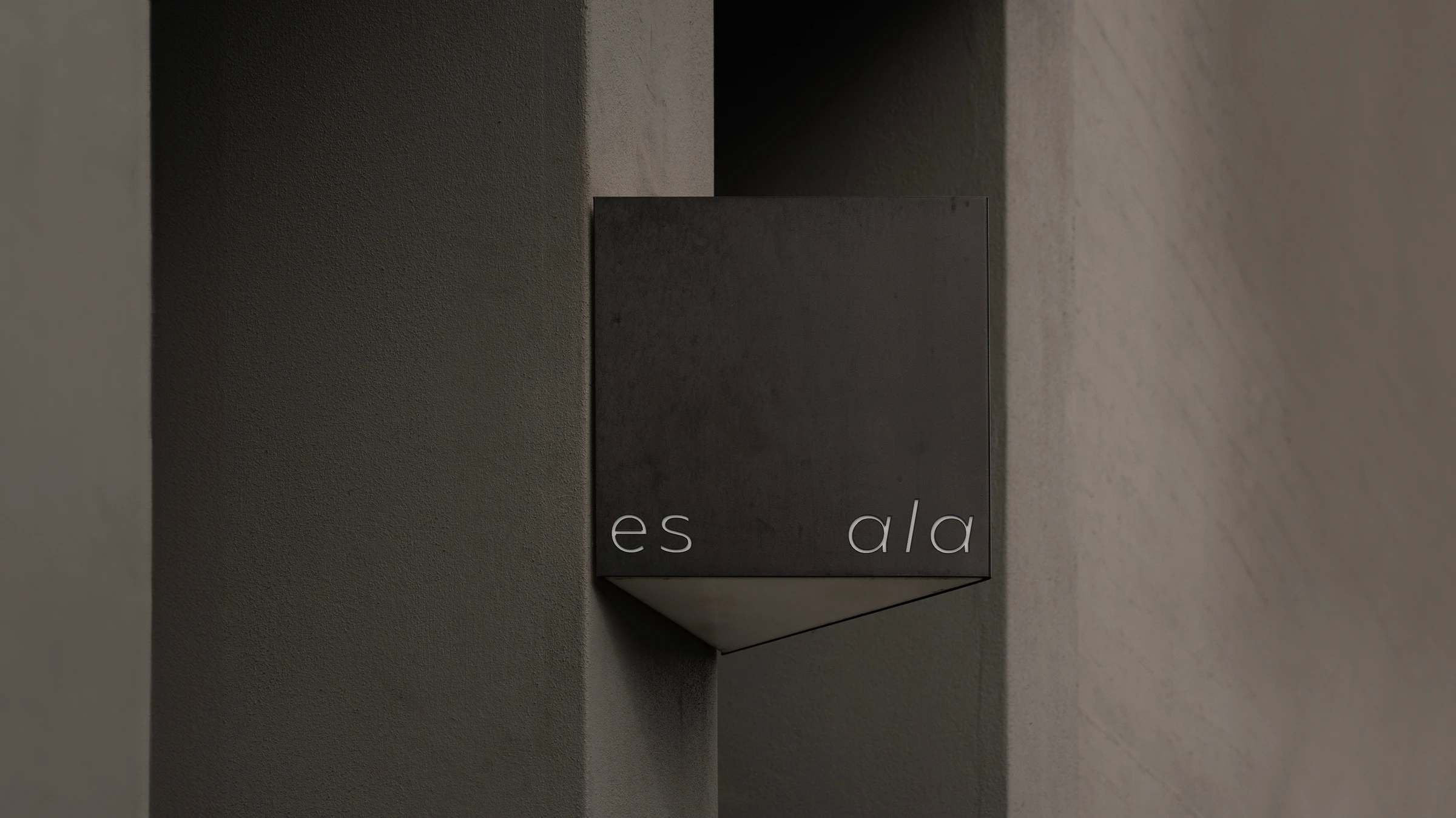
The experience unfolds through an interactive editorial microsite designed like an online newspaper. The digital narrative opens with animated typography depicting falling letters to symbolize the end of the logotype's reign, followed by a interactive grid of "dead logos" where user hover actions trigger cemetery crosses. As users scroll through investigative chapters, they encounter witness accounts of branding failures, interactive text tools that demonstrate how typography outperforms complex symbols, and an interactive builder where visitors can generate text-based logos. The experience concludes with practical advice on restoring the logo to its proper place within a holistic identity system, transforming an industry critique into a memorable digital experience






Escape from the superfluous and reach the valuable.

