
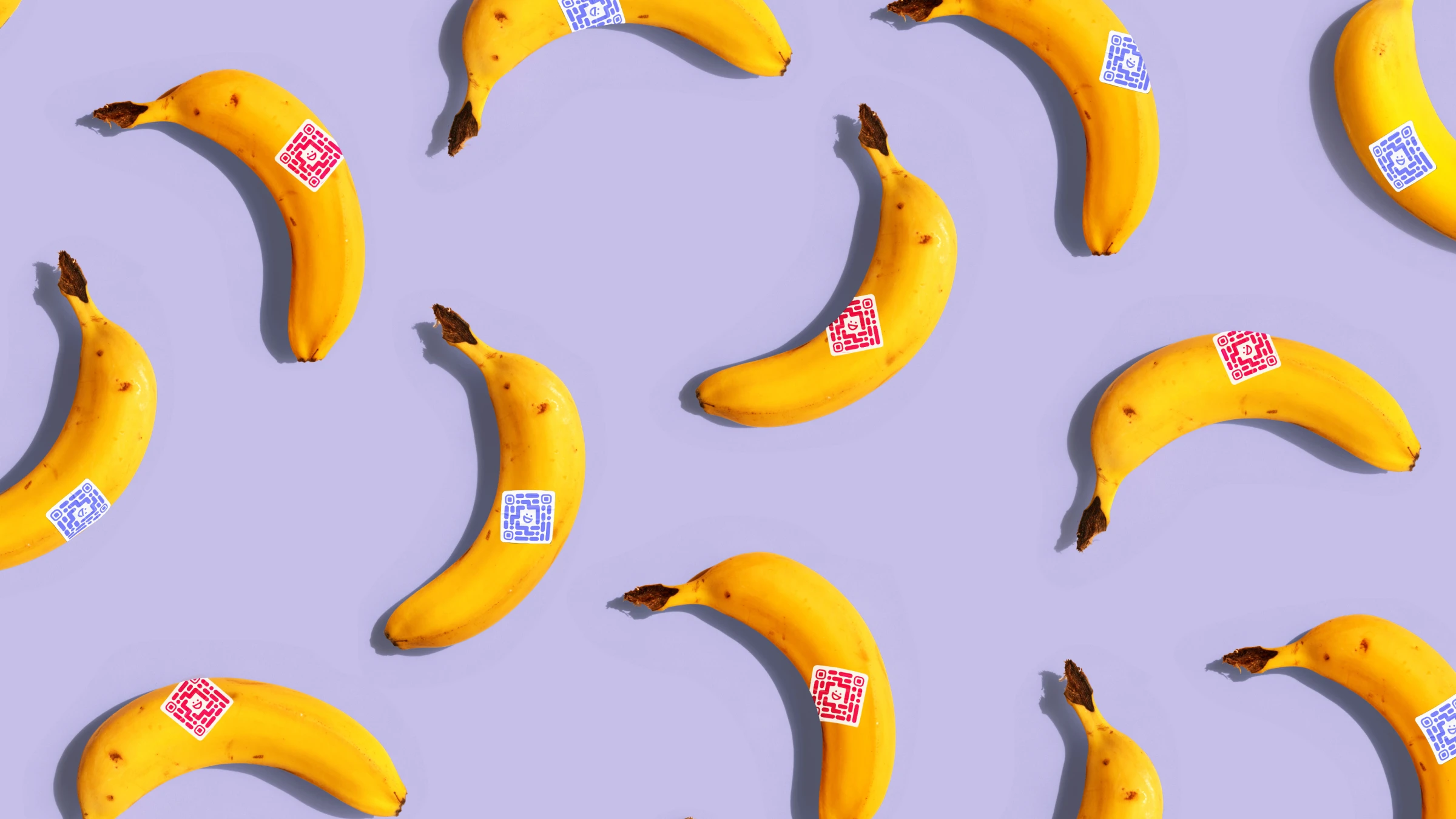
Designed multiple faces using one consistent languaje
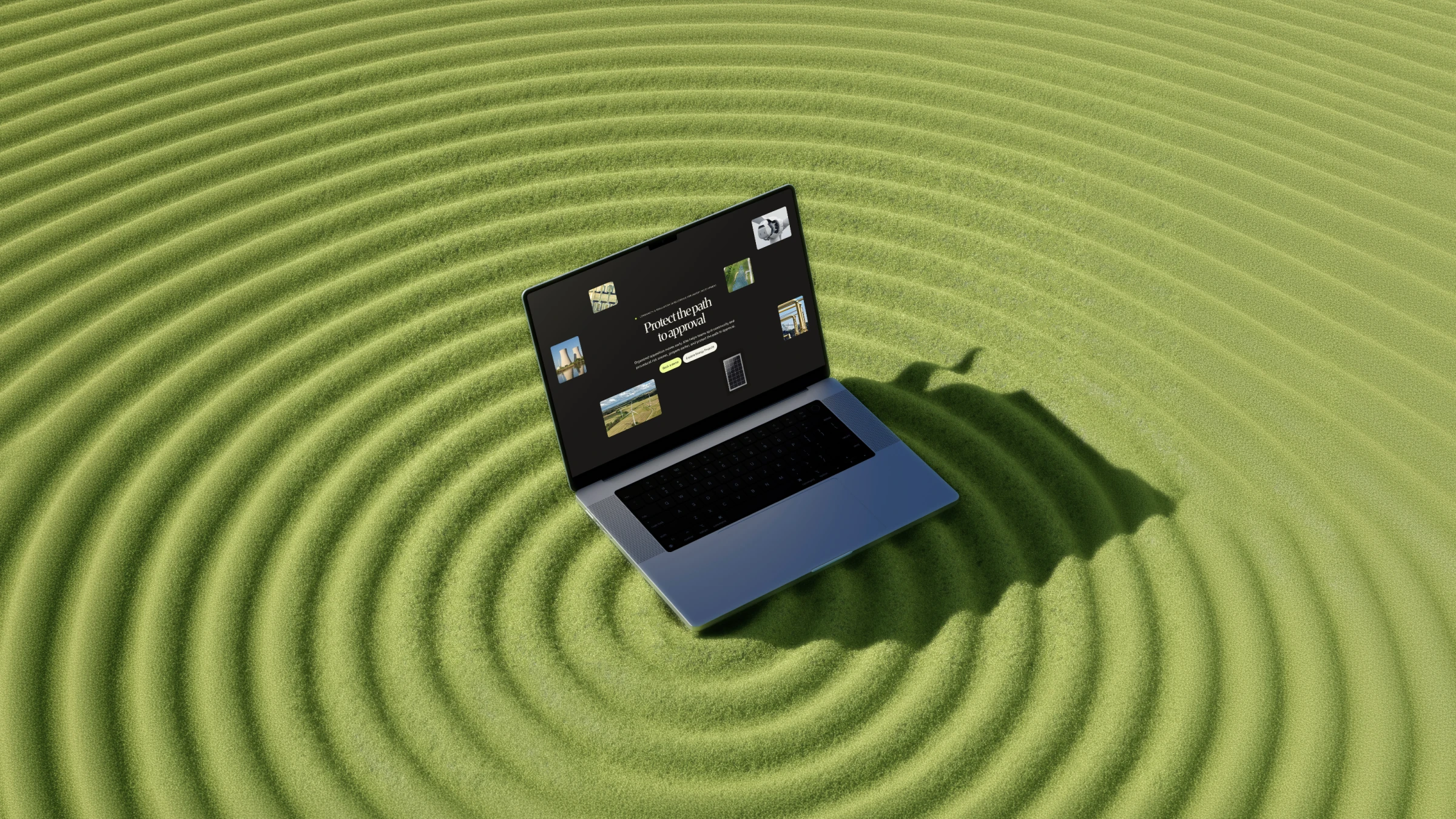
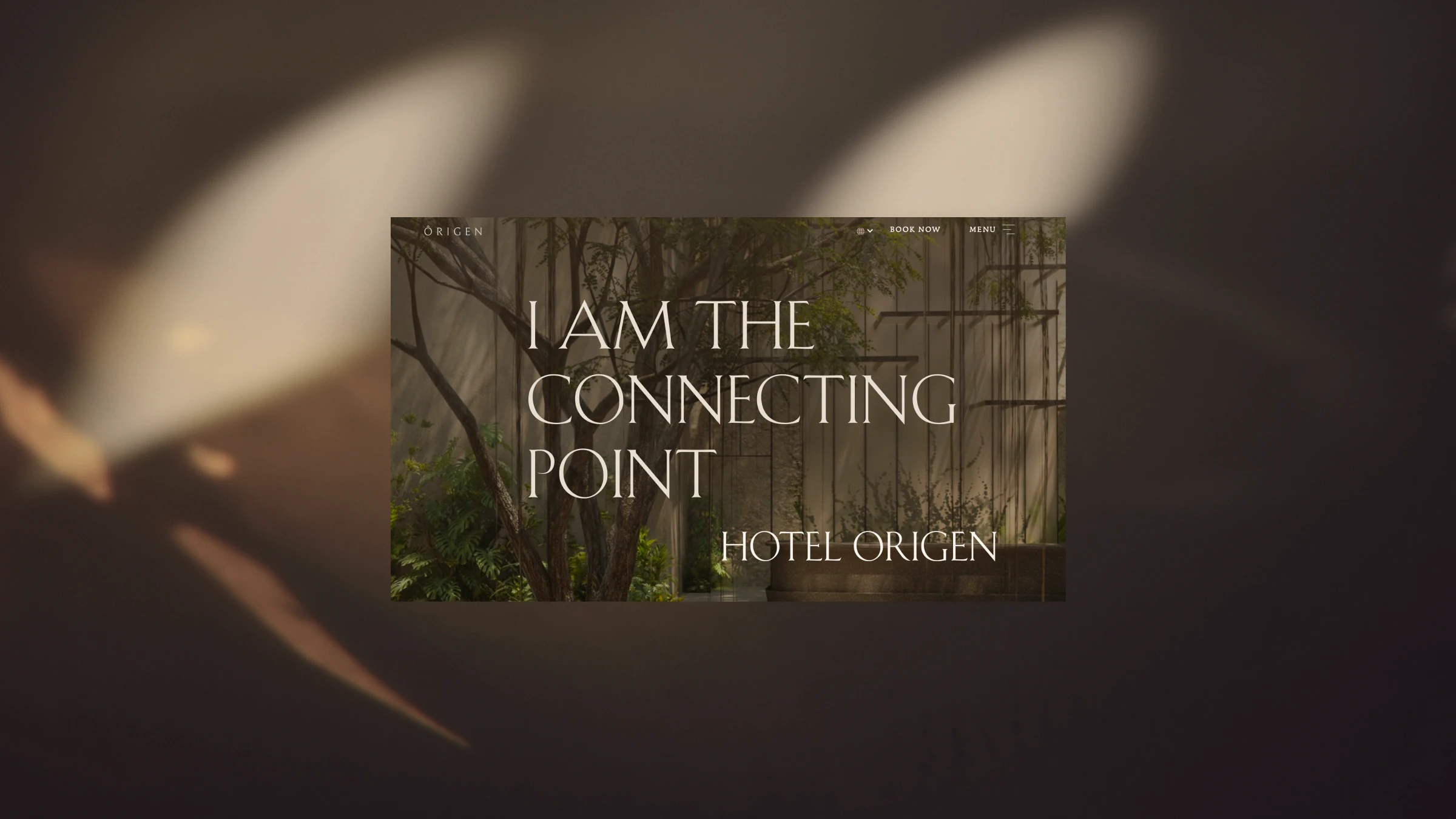
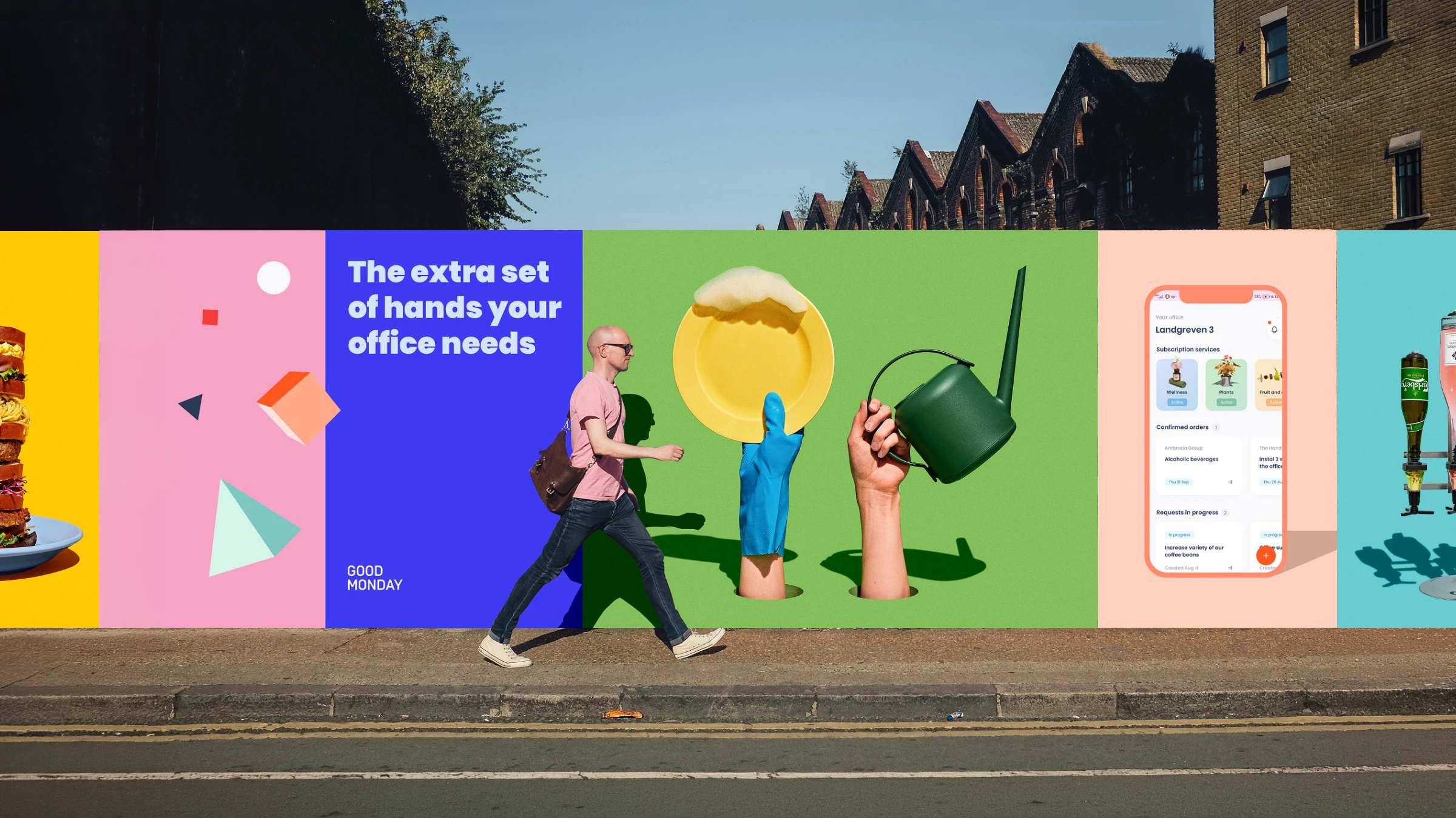
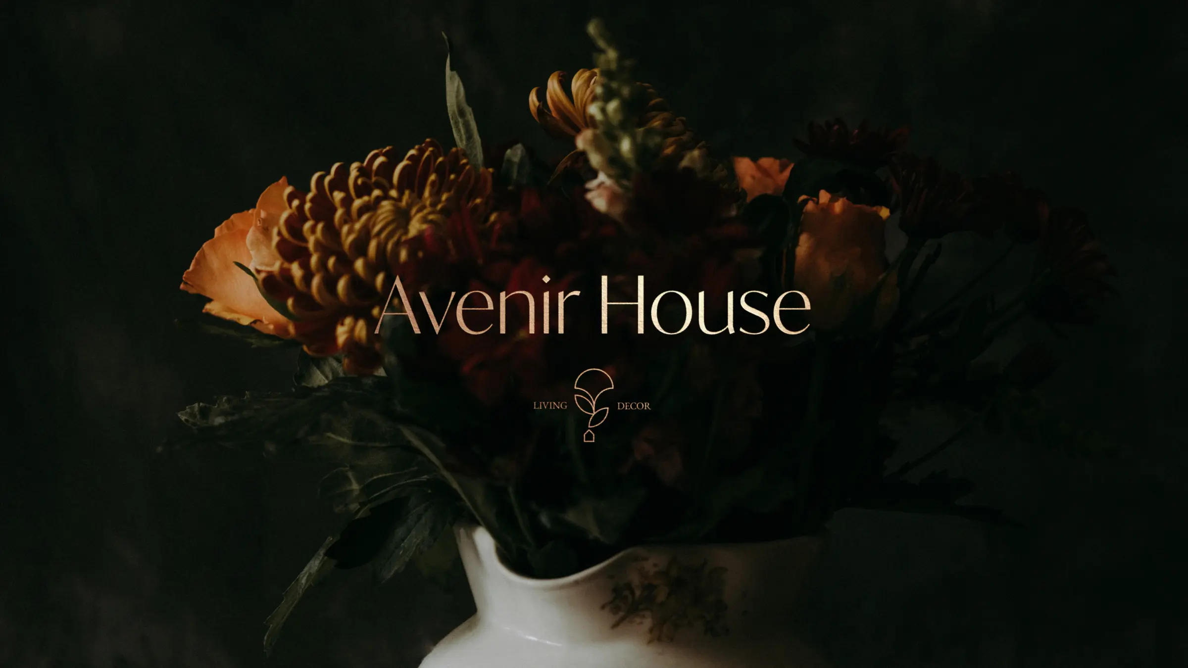
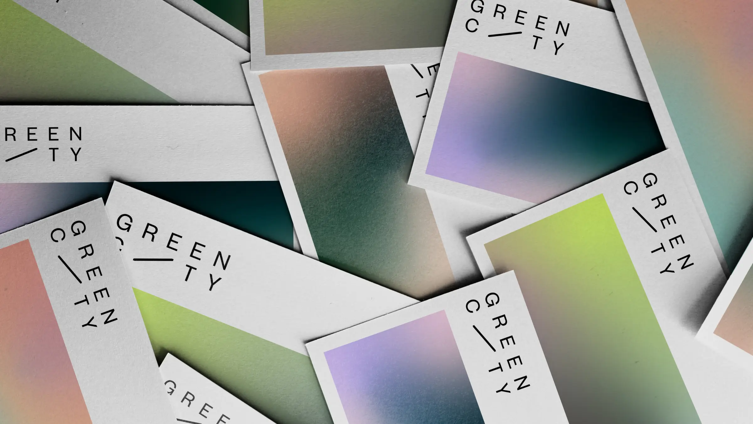
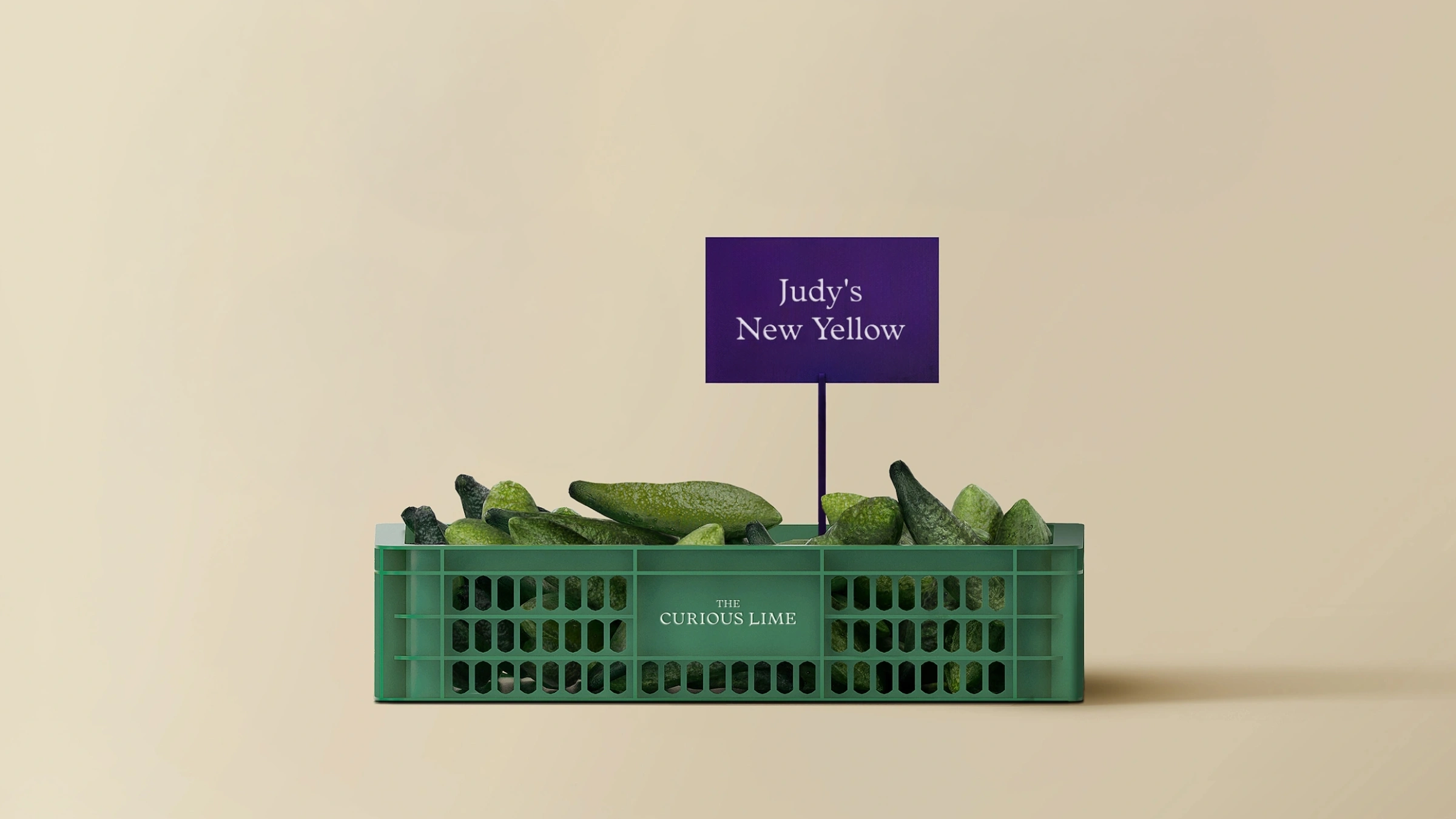
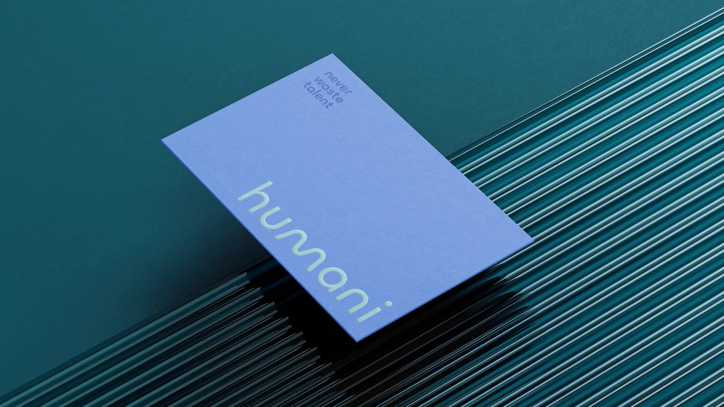
We transformed Foodback’s digital presence by engineering a high-impact, six-section ecosystem within a single, streamlined template. Each section has its own visual characteristics, such as logo, typography, footer graphics, and other visual elements; each of these was carefully studied and selected according to the industry it represents. The sections are united under a single color scheme, defined by the brand language that encompasses them: Foodback. For the website, we used a single template, ensuring consistency across the brand's design language.


The challenge
As Foodback expanded its reach across six verticals, it faced a complex branding dilemma: how to build an expansive, multi-faceted ecosystem without fracturing the brand’s core identity. Each vertical needed enough independence and unique personality to resonate deeply with its specific target audience, yet they all had to feel clearly connected under the primary Foodback umbrella. The central objective was to transform a varied collection of services into a unified, scalable portfolio, avoiding a fragmented user experience while honoring the nuances of each segment.

Our strategy focused on establishing a flexible parent-child brand architecture that allowed for structured adaptability. We envisioned Foodback as an overarching platform of excellence, where shared foundational elements—such as typographic hierarchy, grid systems, and core messaging tone—guaranteed instant brand recognition. Around this baseline, we defined tailored sub-identities for each of the six verticals, assigning dedicated color accents, specific imagery guidelines, and distinct narrative nuances. This approach provided each vertical with its own strategic positioning while strengthening the value and reach of the master brand.
Strategy & Insight


The Solution & Visual Narrative
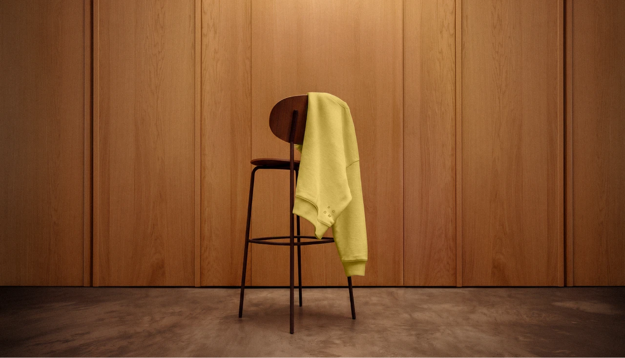
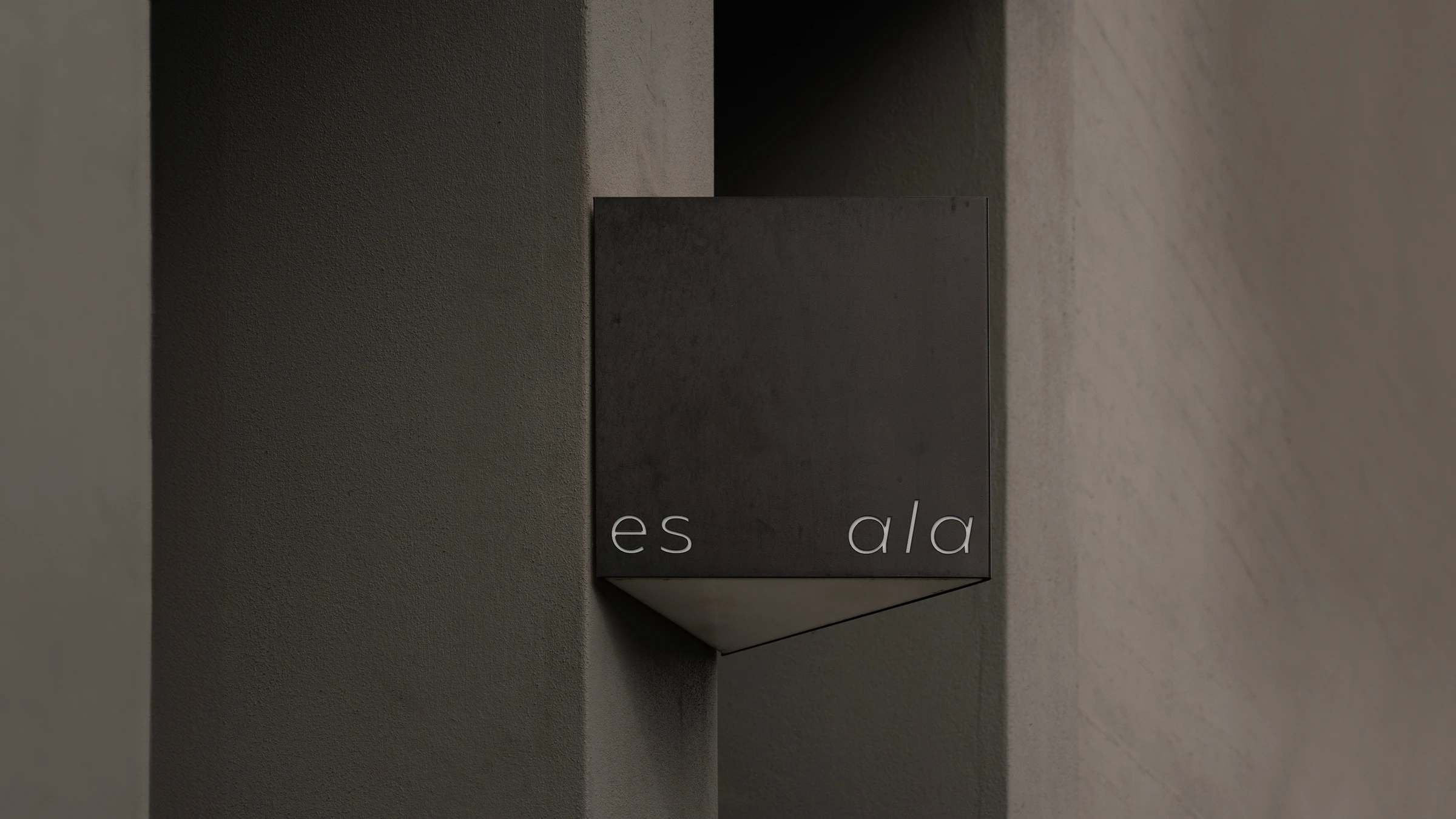
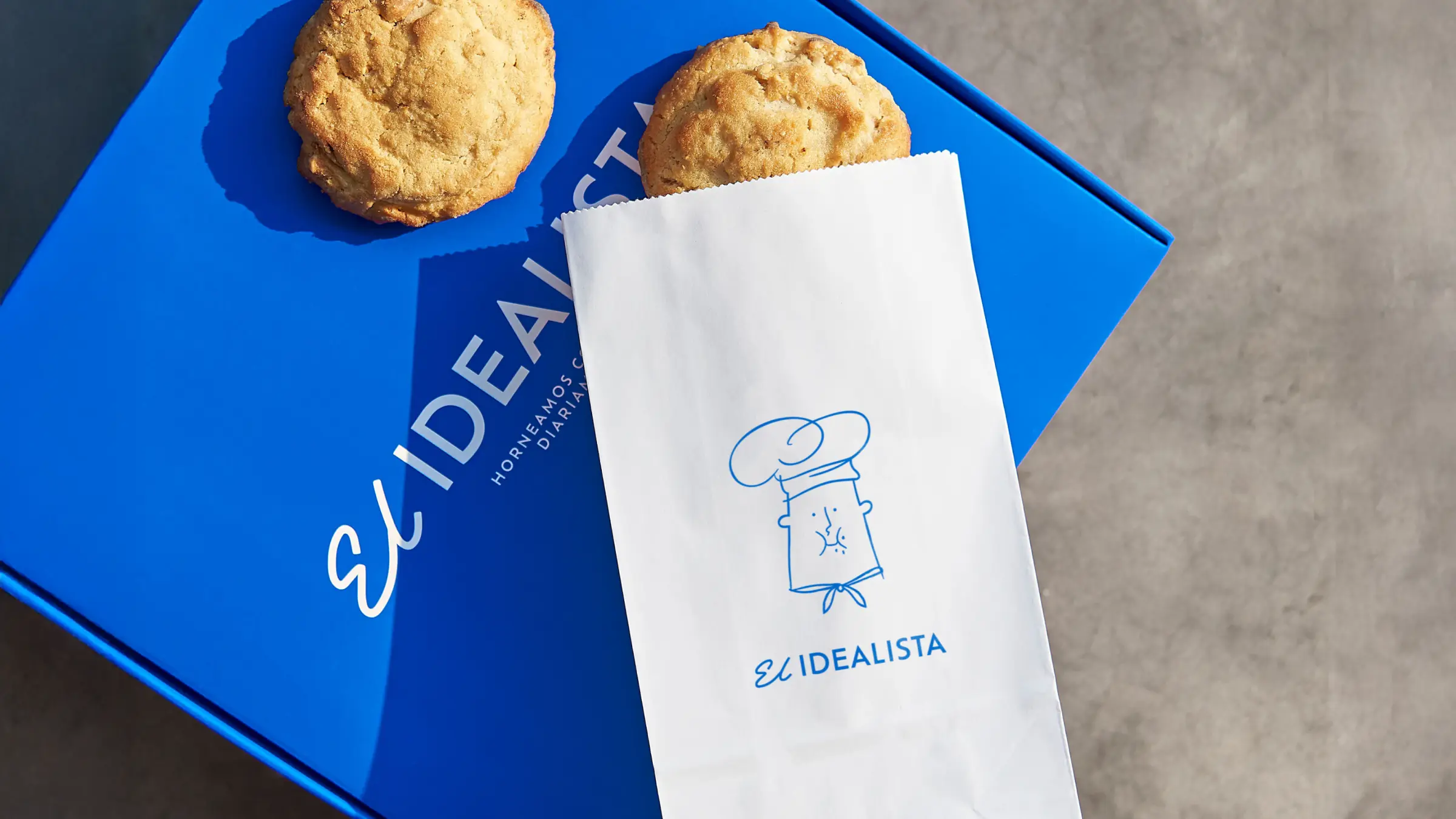
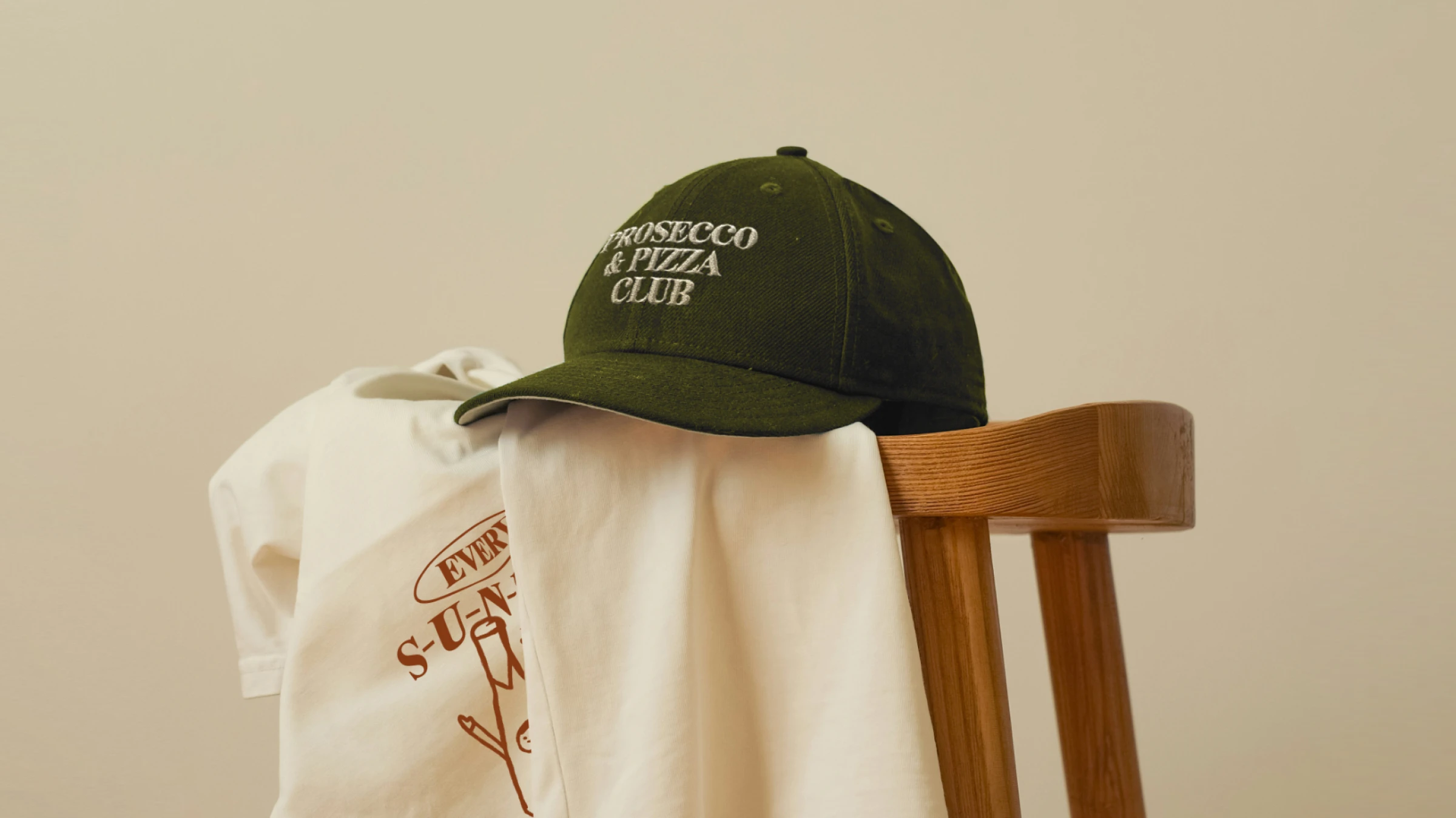
To bring this vision to life, we crafted dedicated micro-identities and built custom microsites for each of the six verticals. Each microsite operates as an immersive landing page tailored to its specific audience, featuring bespoke visual narratives, targeted copy, and curated imagery that express its individual personality. Through modular UI design and intuitive navigation, users can effortlessly explore each vertical's unique offer while remaining grounded in the overarching Foodback experience. The result is a cohesive digital ecosystem where six distinct brand stories exist in perfect harmony, reflecting the versatility, quality, and unified spirit of Foodback.



Escape from the superfluous and reach the valuable.

