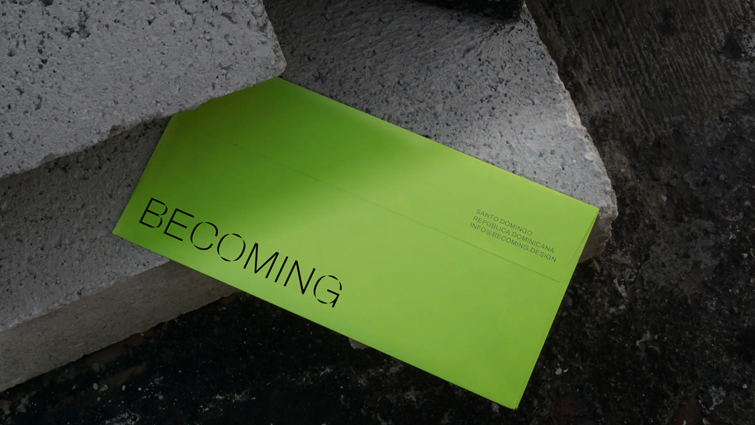
Branding
Overview
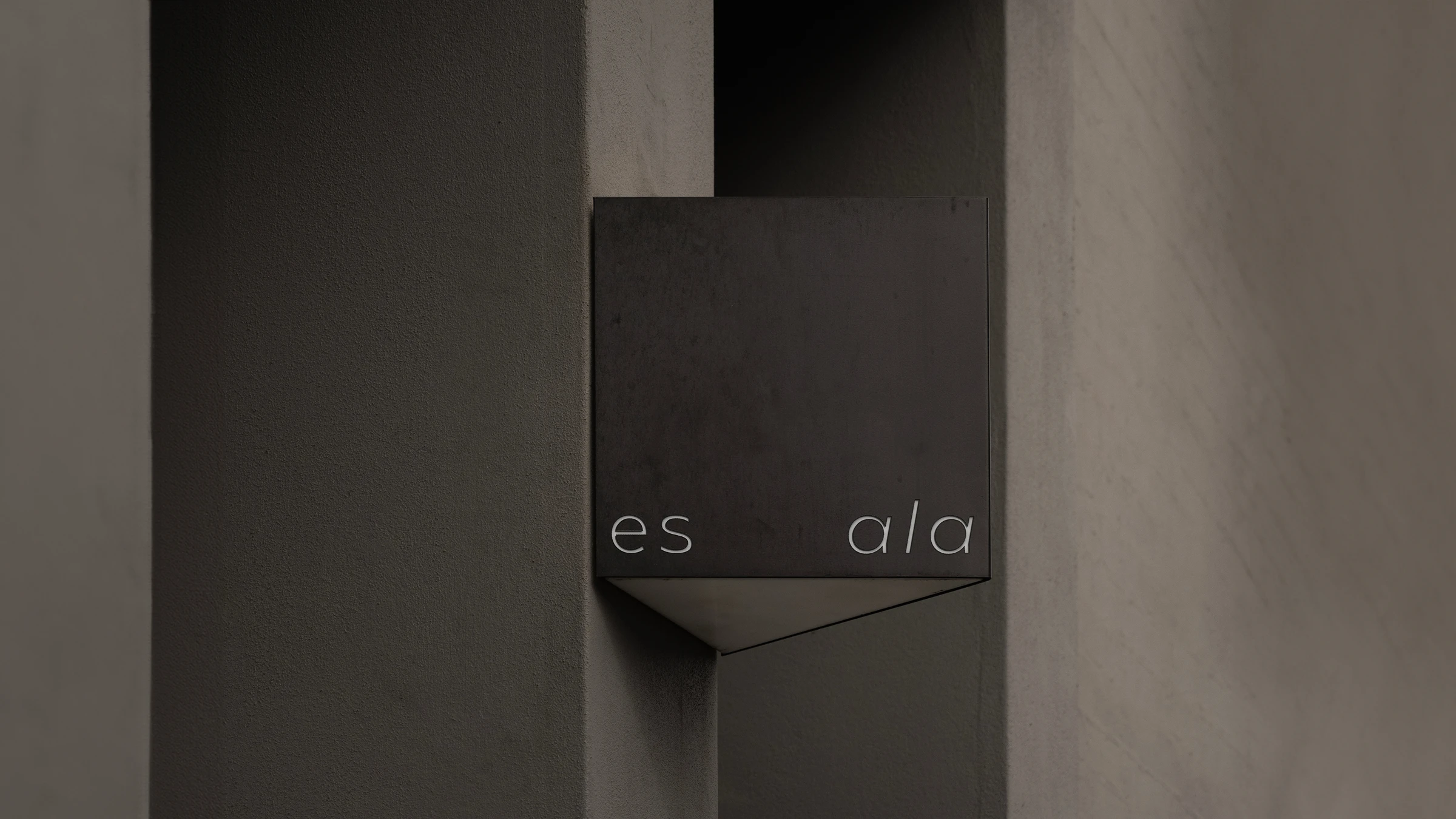
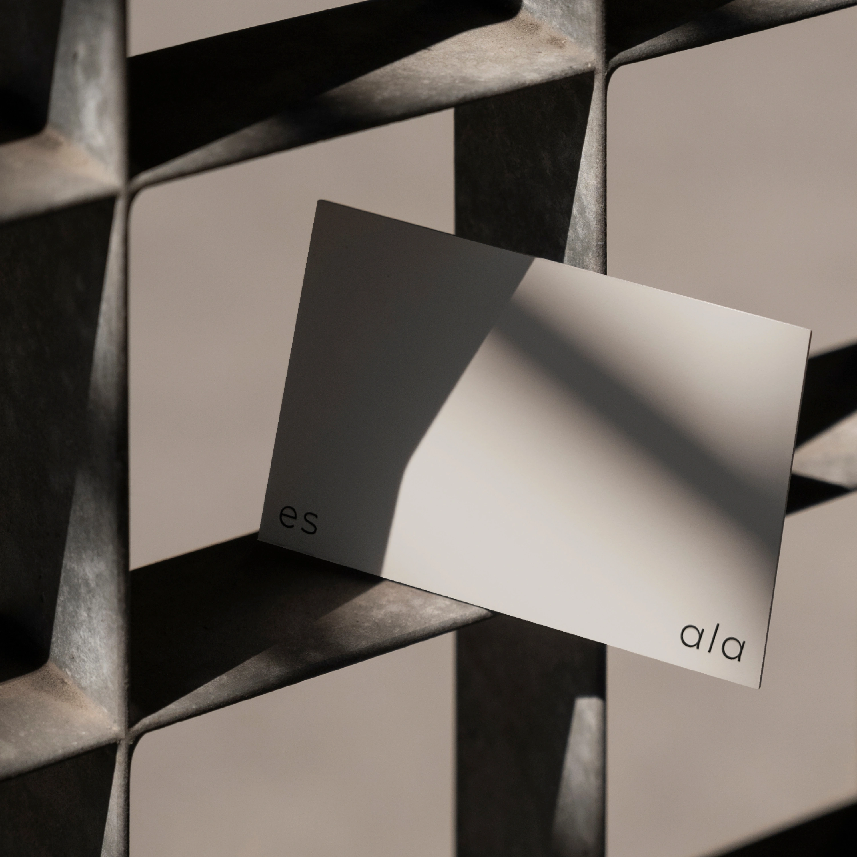
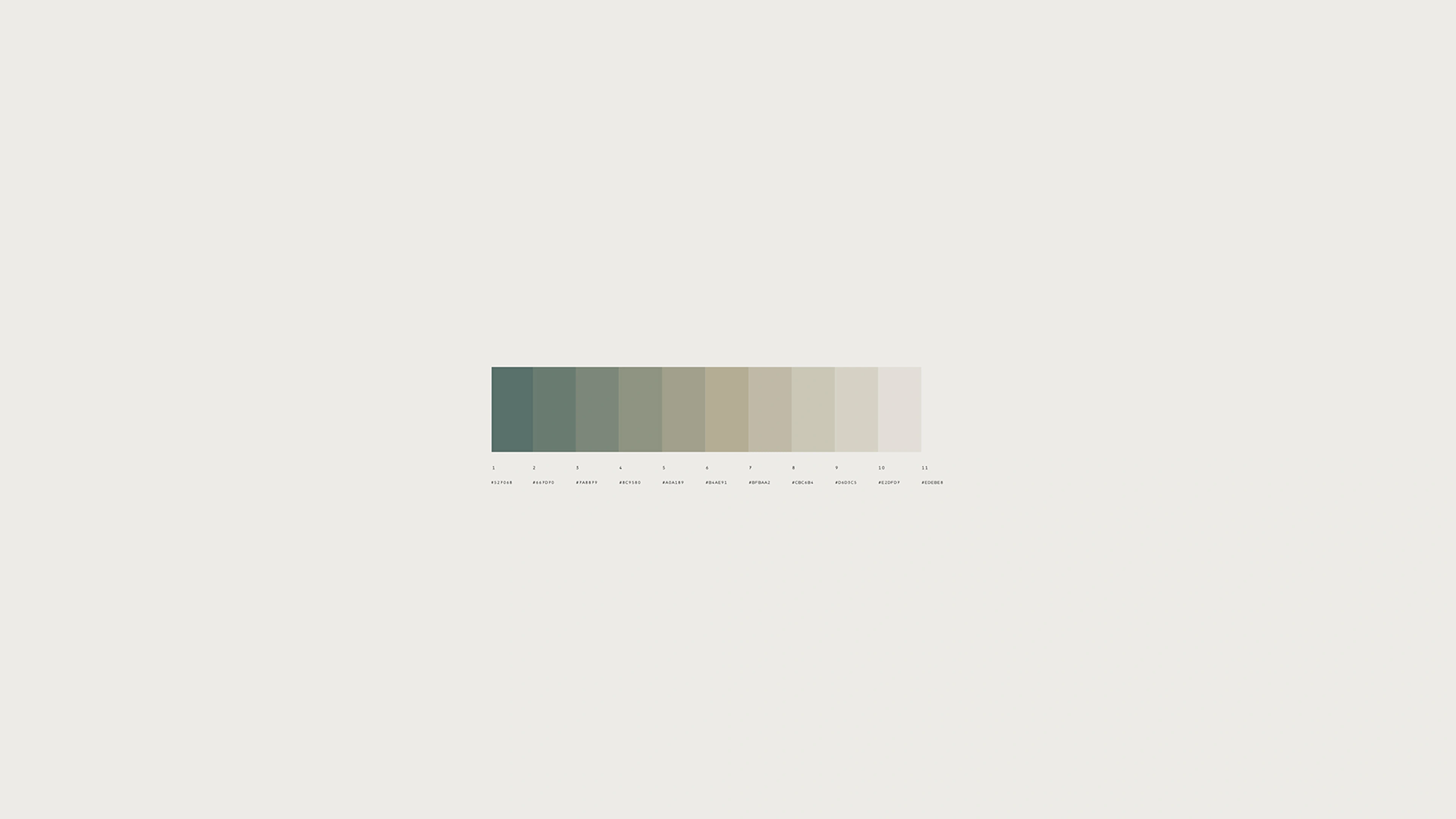
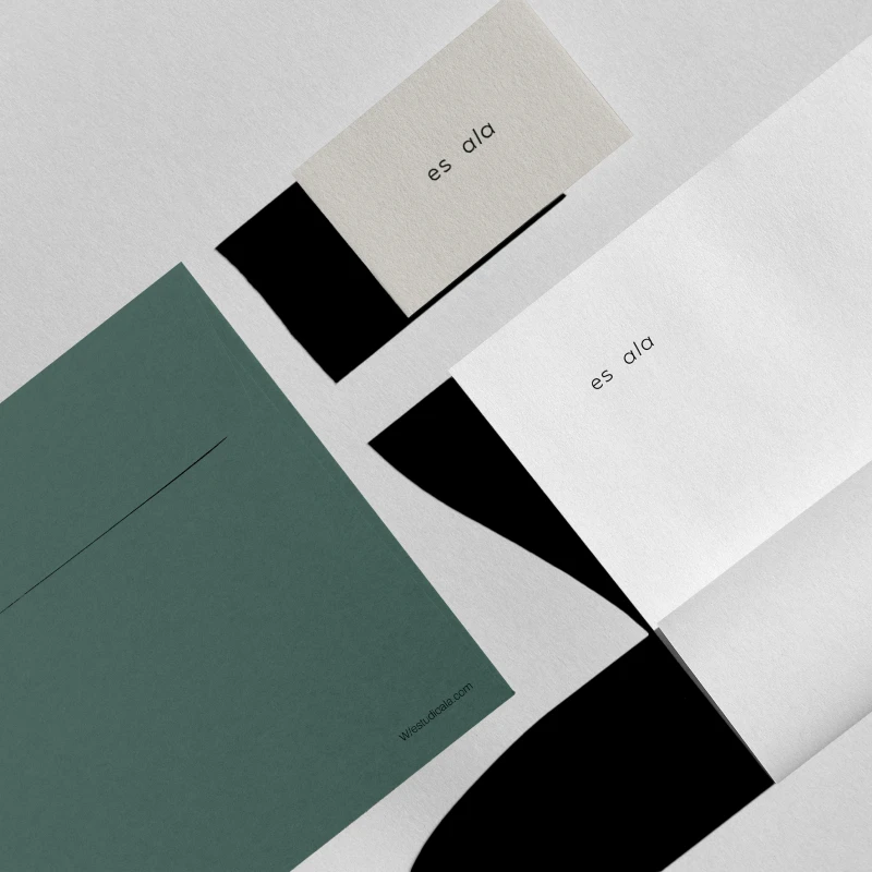
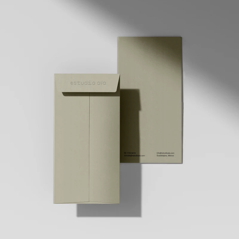
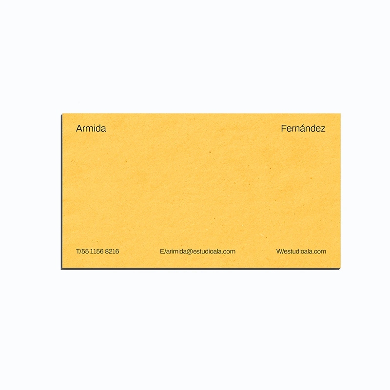
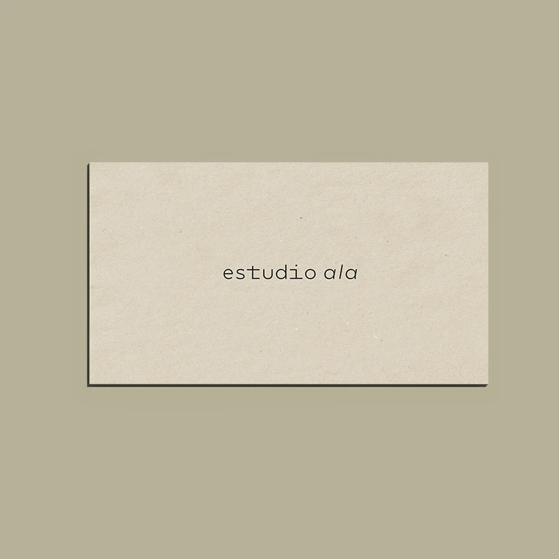
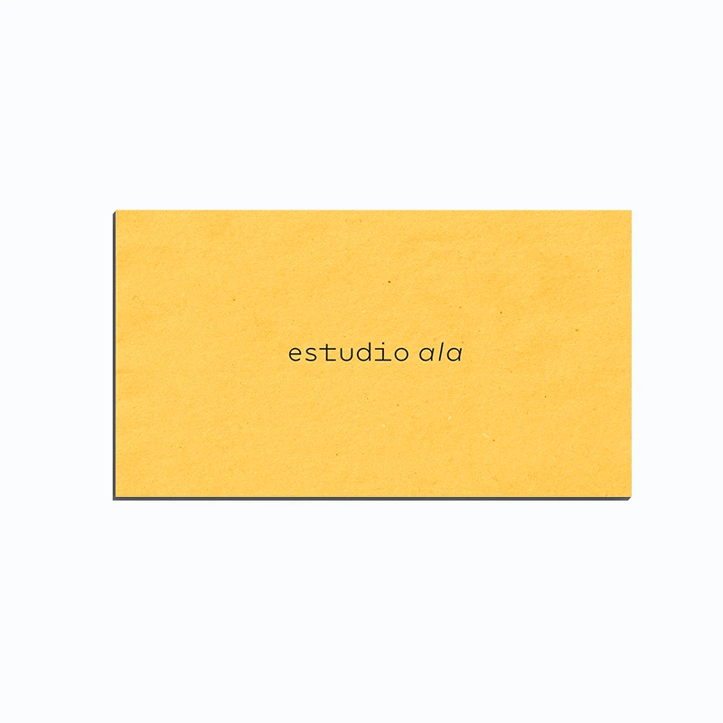
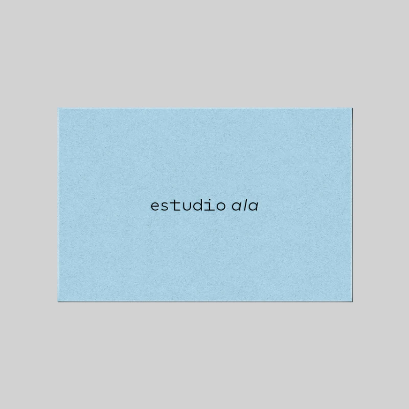
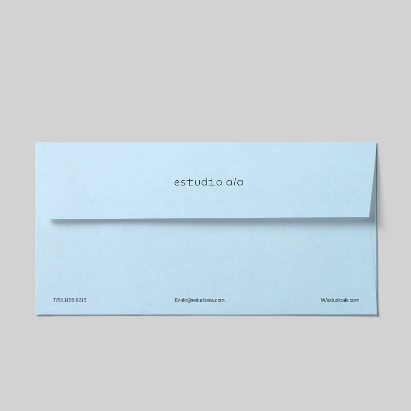
Es Ala's architectural vision inspired us to create an ethereal logo, airy layouts emphasizing negative space, and an earthy color palette reflecting regional materials.

No items found.
About
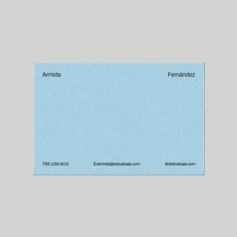
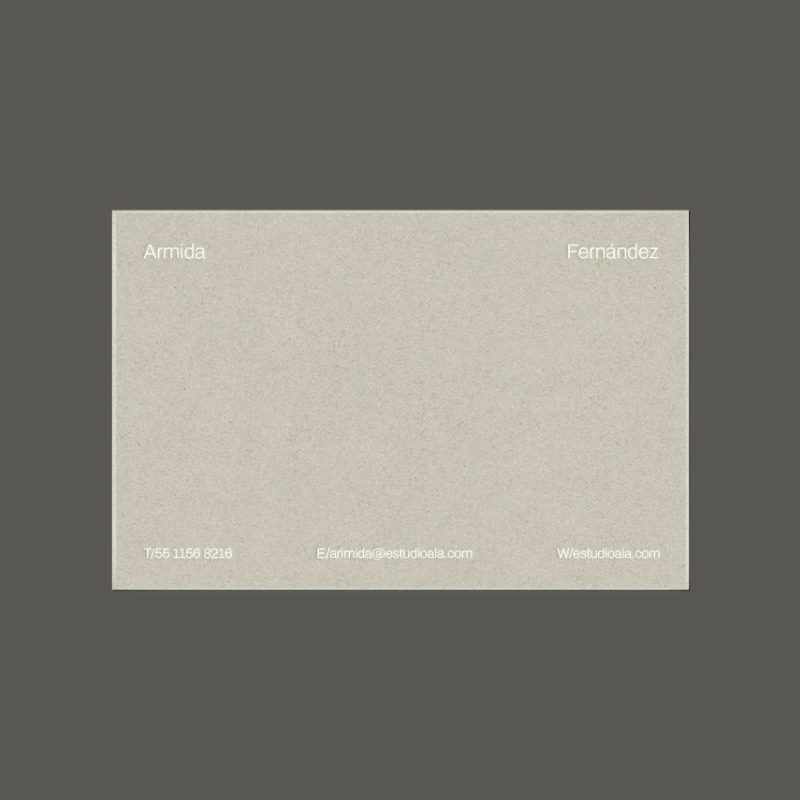
Es Ala is an interdisciplinary architectural practice based in GDL, Mexico, funded by Armida Fernandez and Luis Flores.The firm, in its own words, seeks to “honor culture and tradition while still questioning the significance of programs, methodologies, and materialities.”
“Architecture must be able to fade away established boundaries and conventional hierarchies, allowing the freedom to generate new forms of behavior.” —es ala
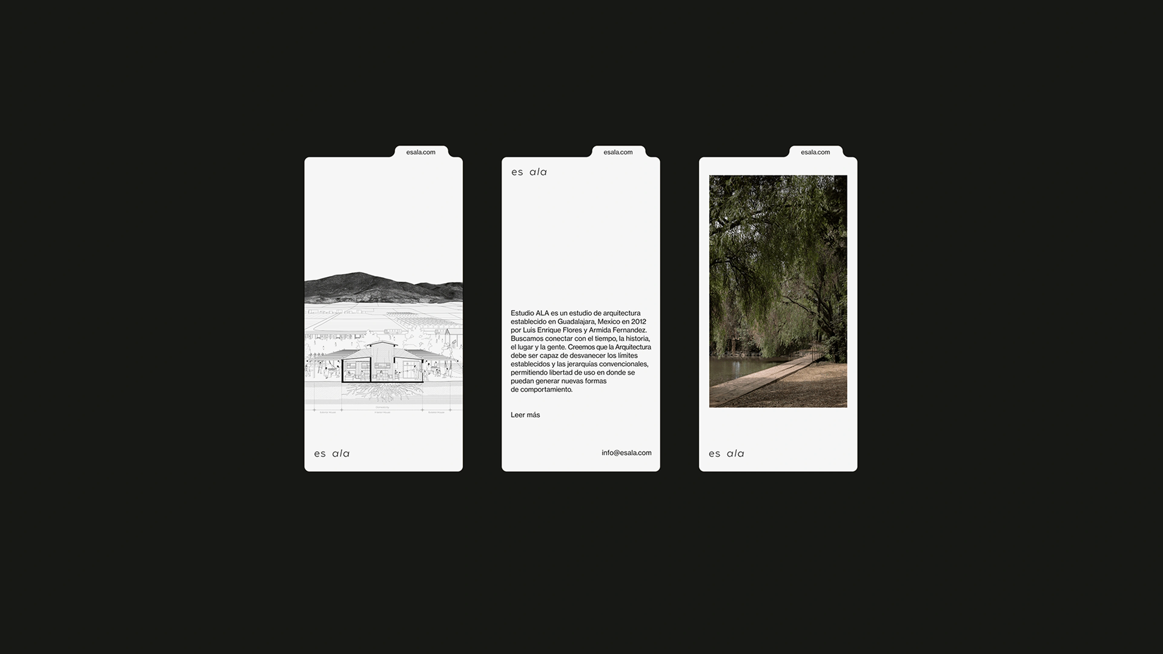
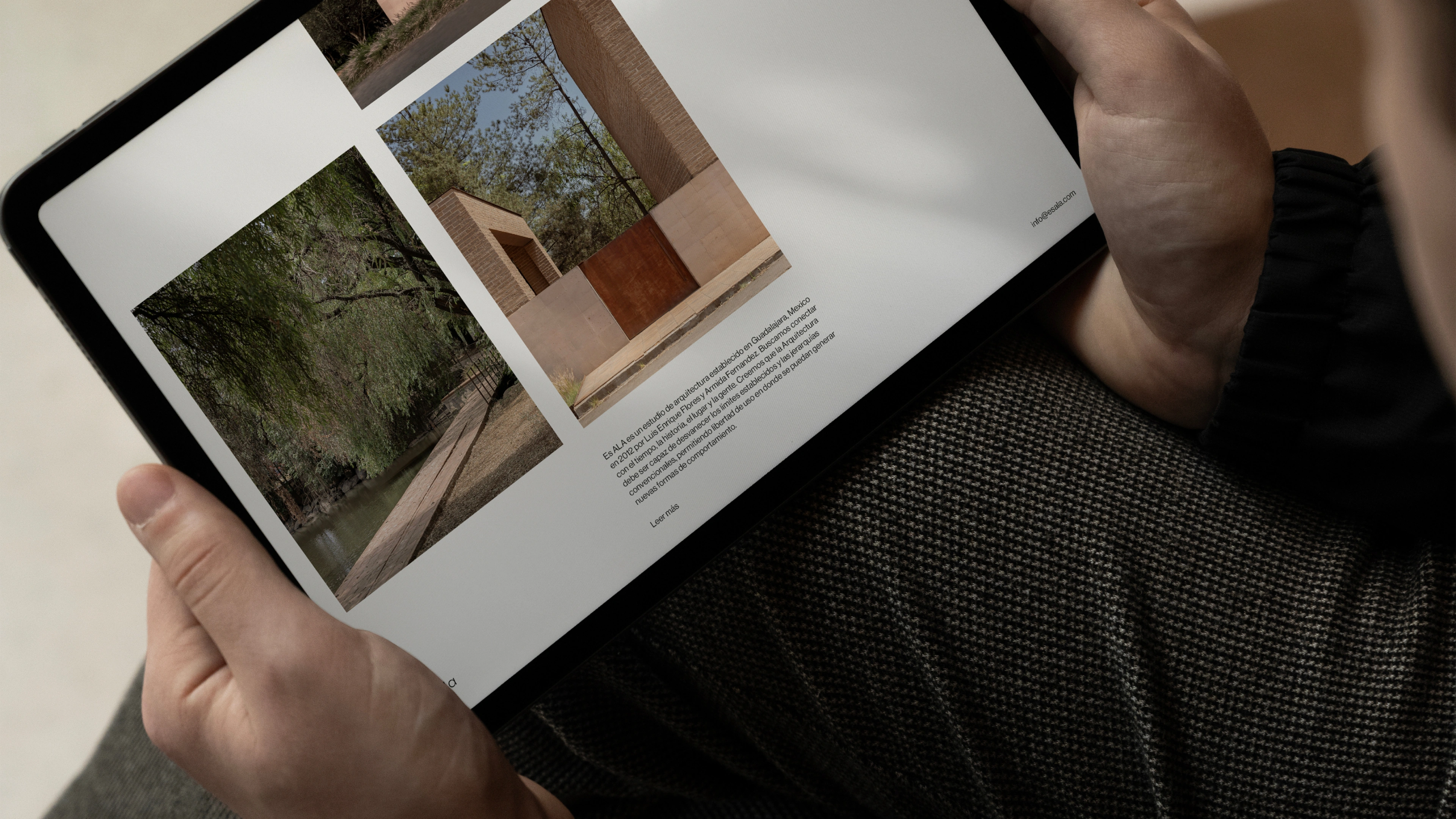
Visual Narrative
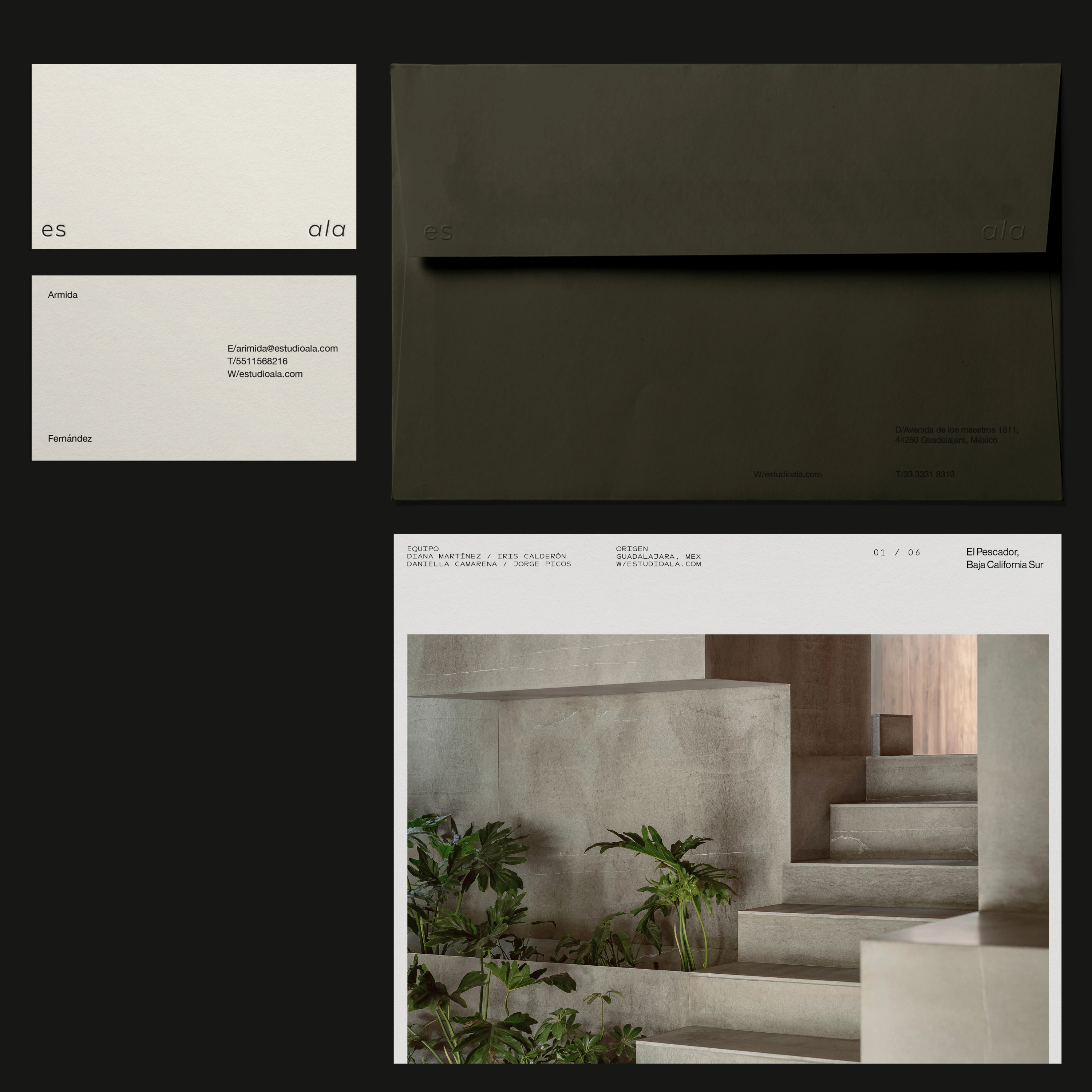
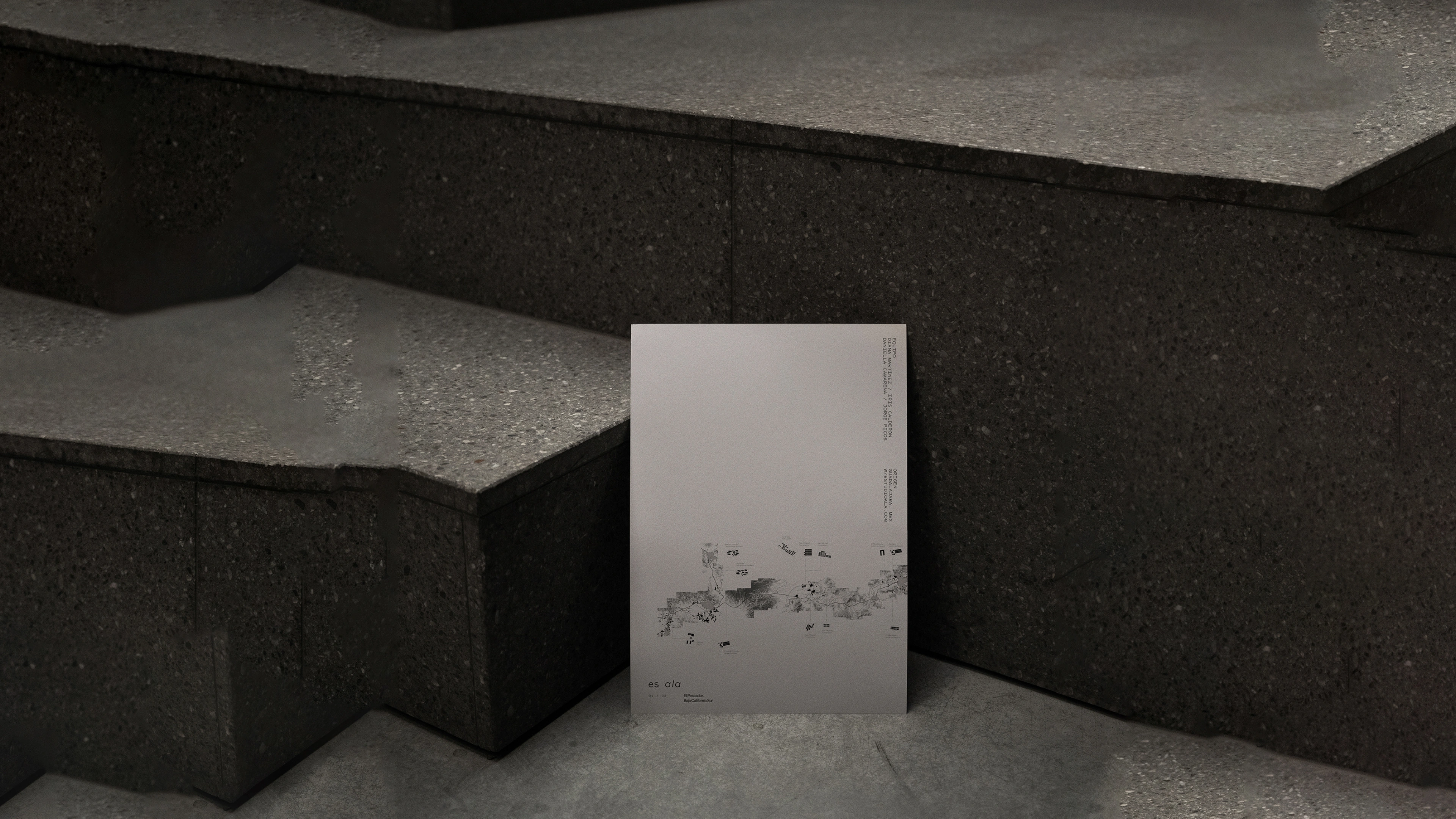
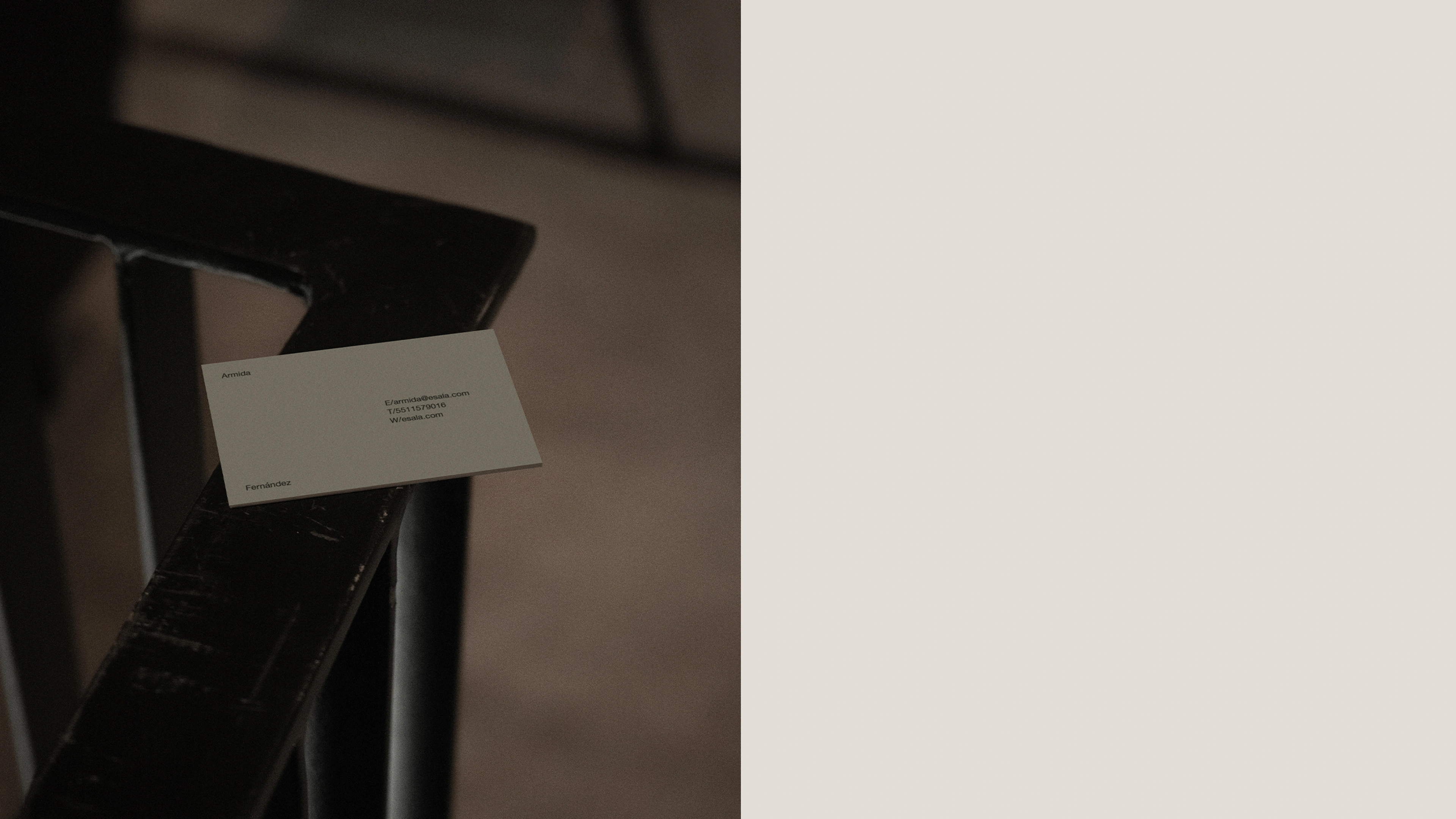
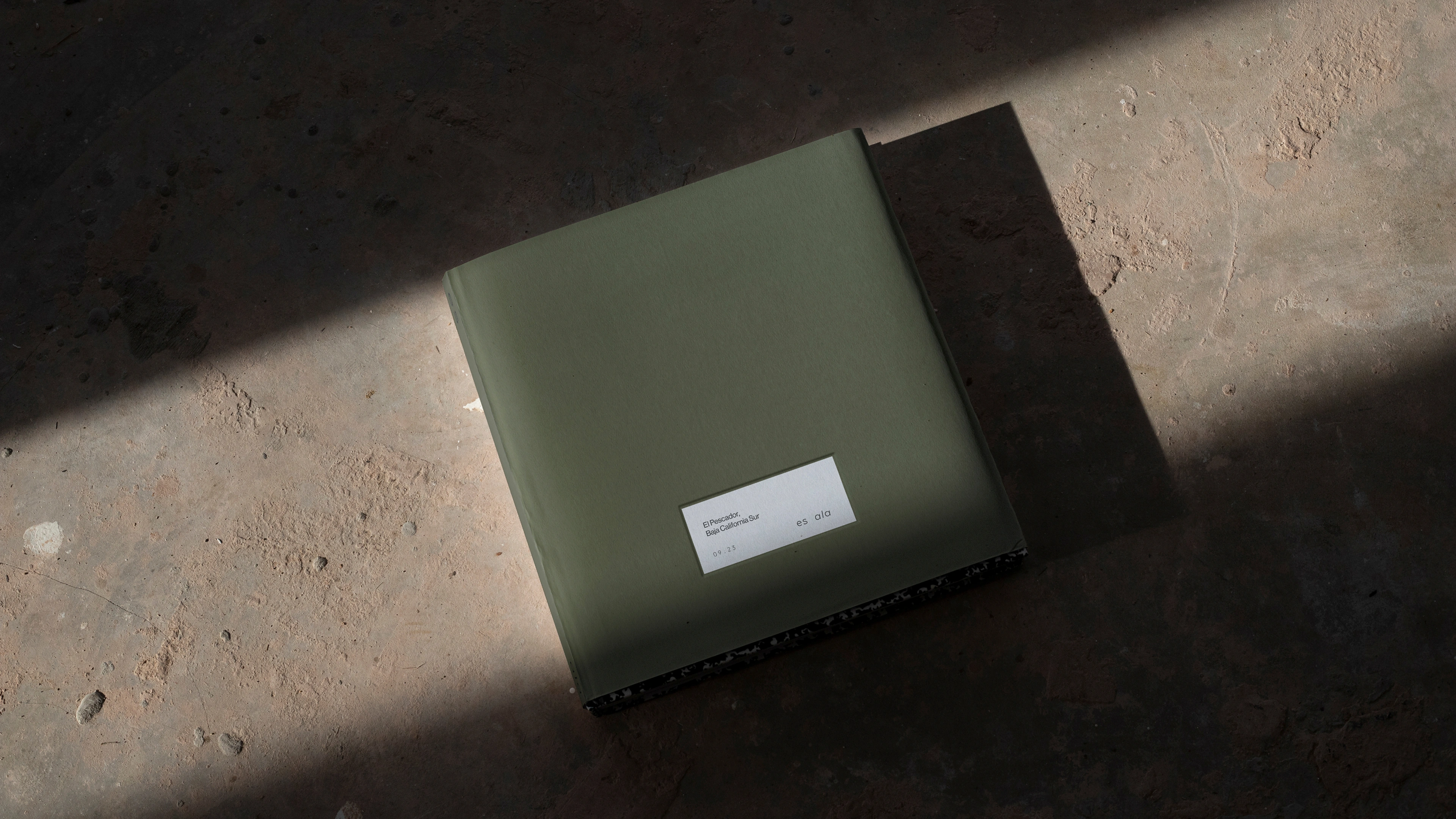
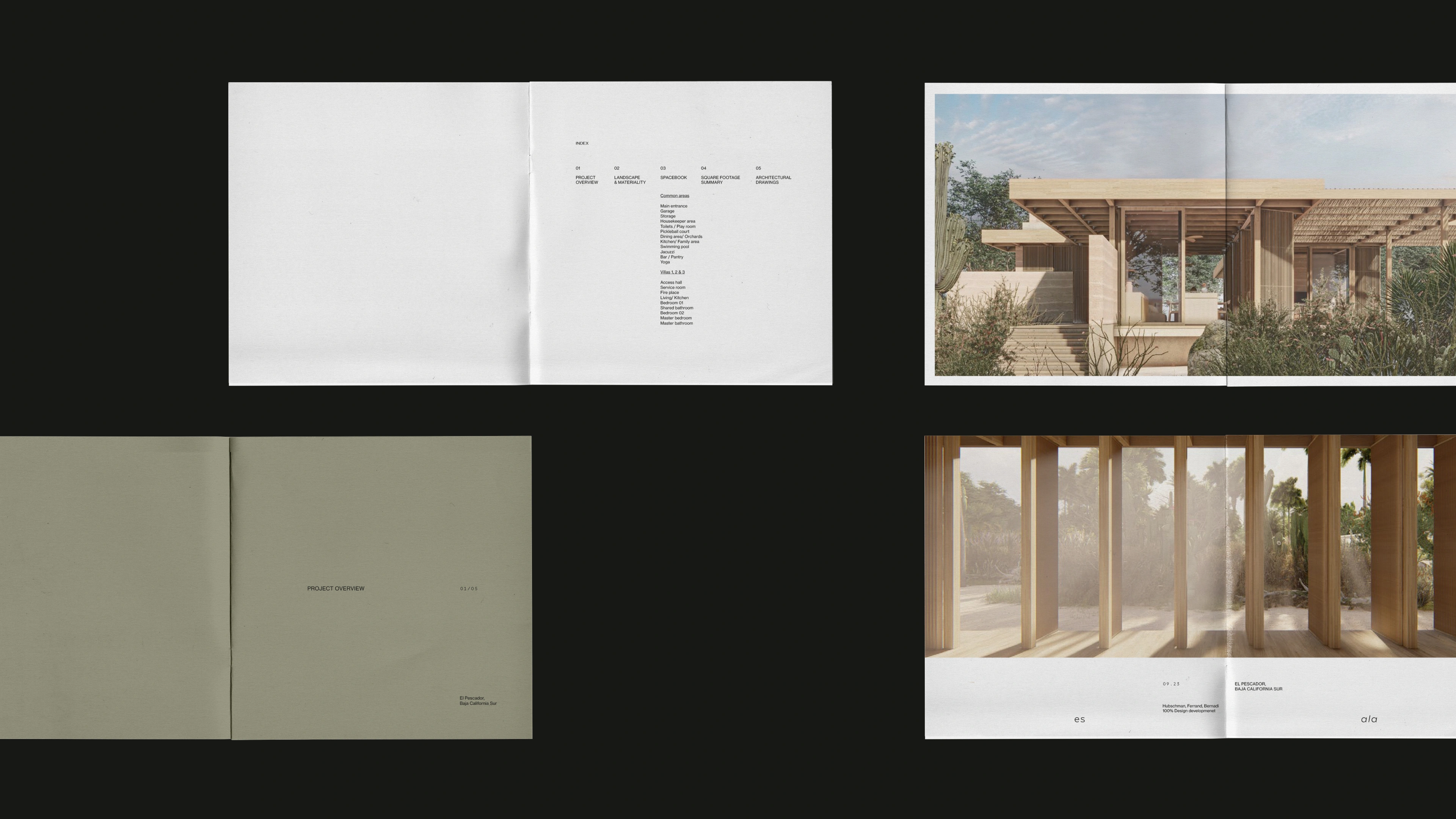
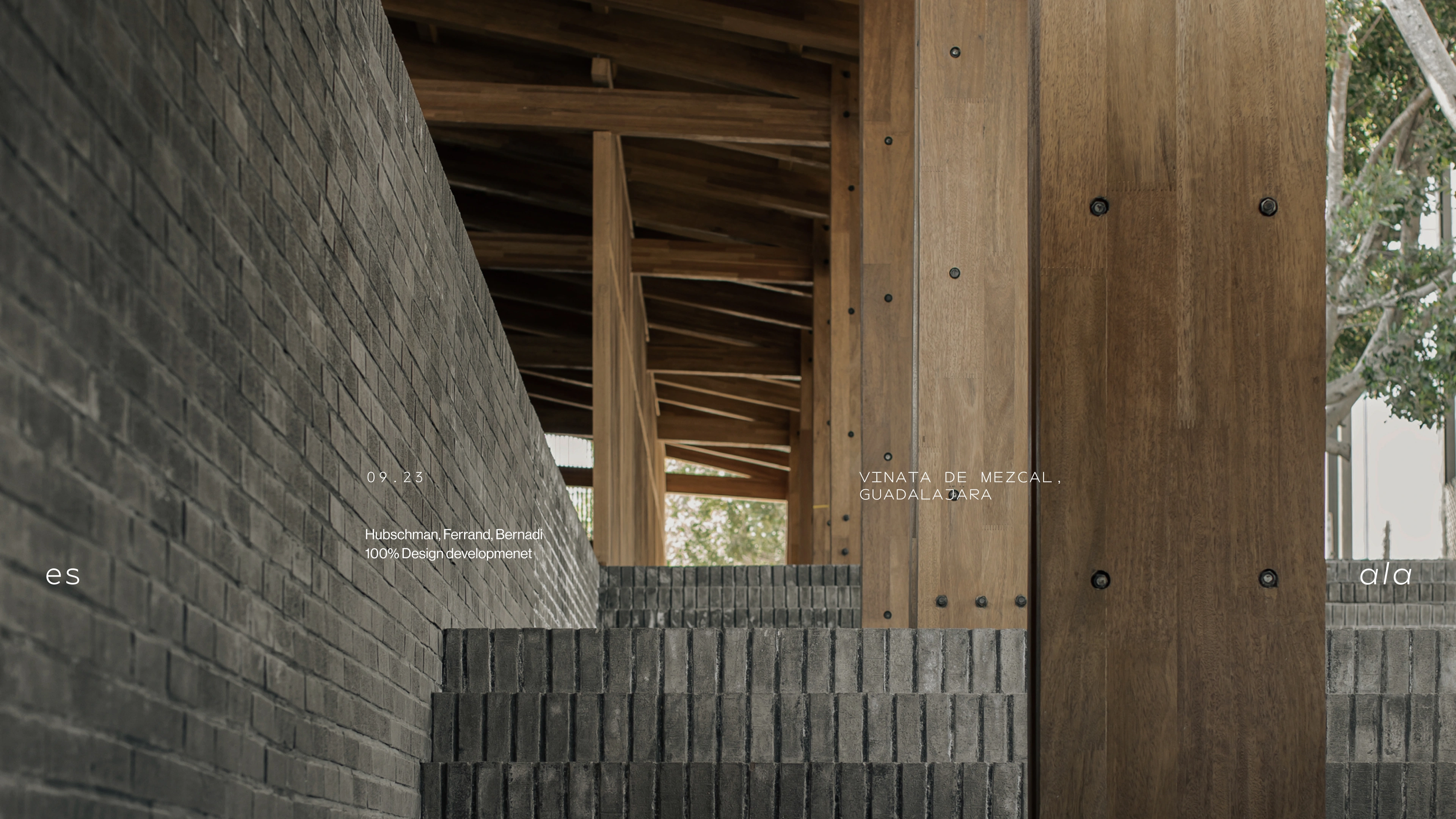
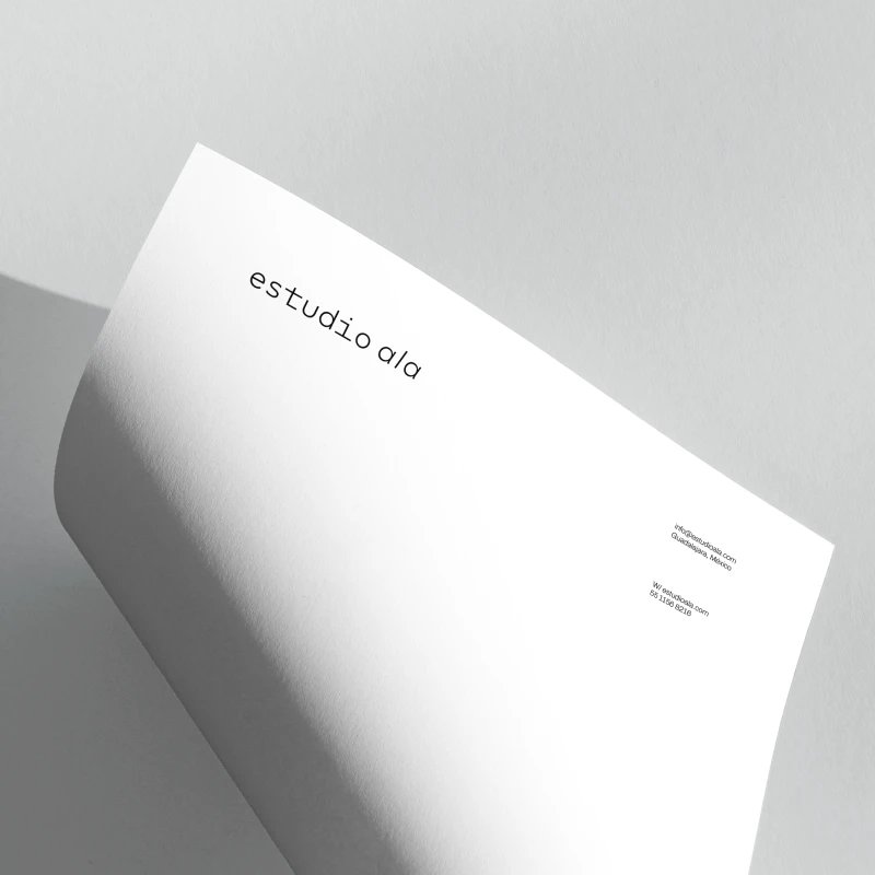
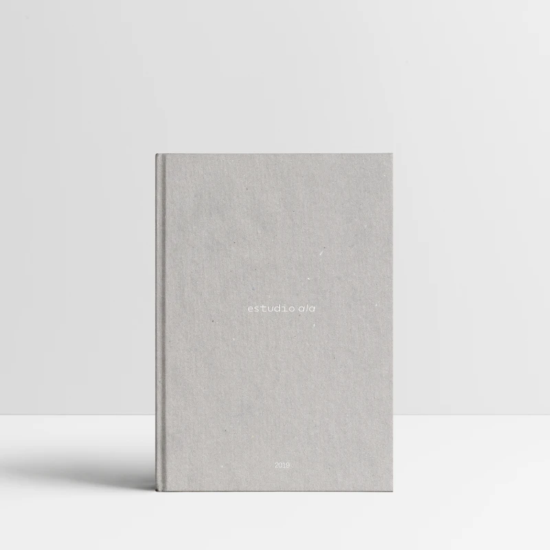
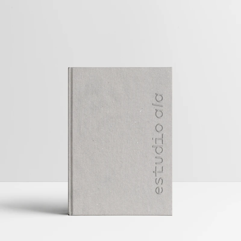
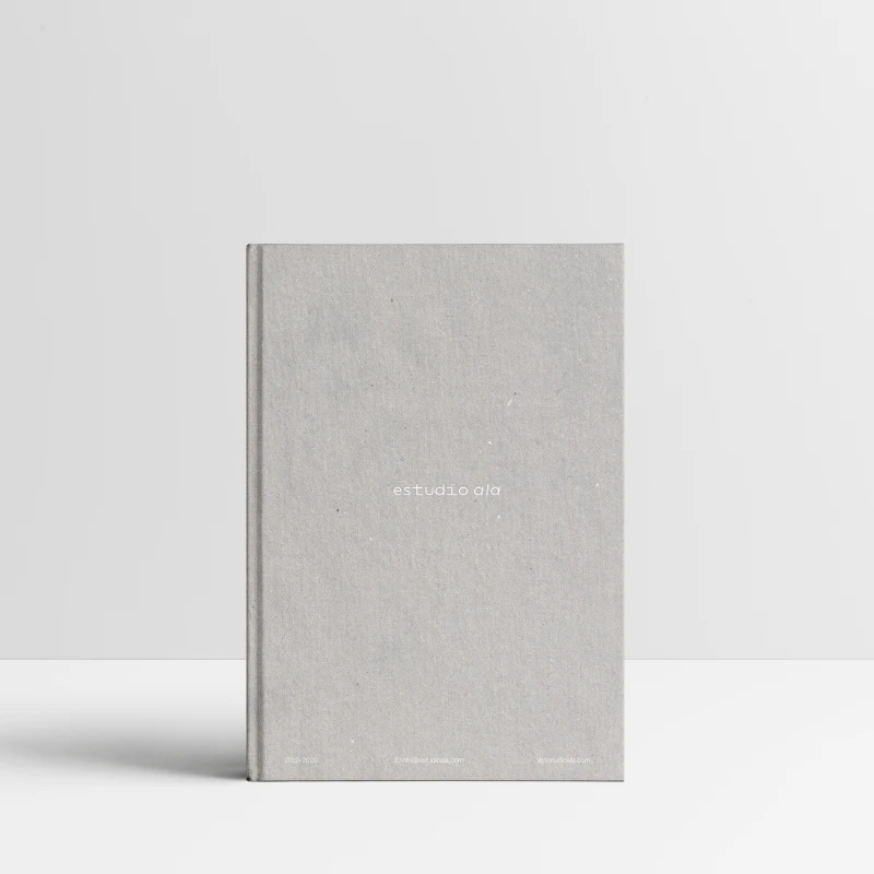
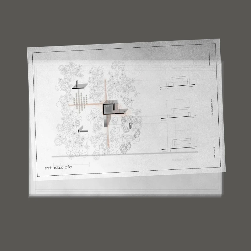
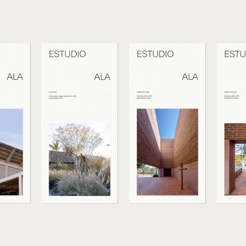
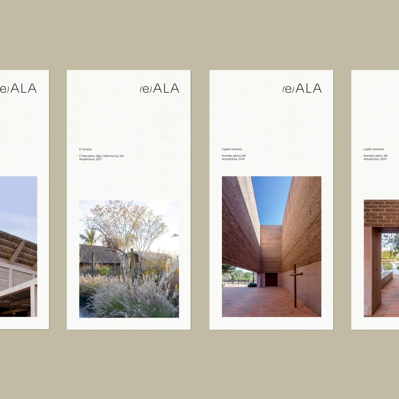
Driven by Es Ala’s perspective on architecture, we aim to build an image that reflects these attributes. We redesigned their logo to create an ethereal composition with bodies that have no positions or barriers. For editorial compositions, we used airy and flexible layouts, where the protagonist is represented by the use of blank spaces, which help to enrich and highlight the elements placed on them.
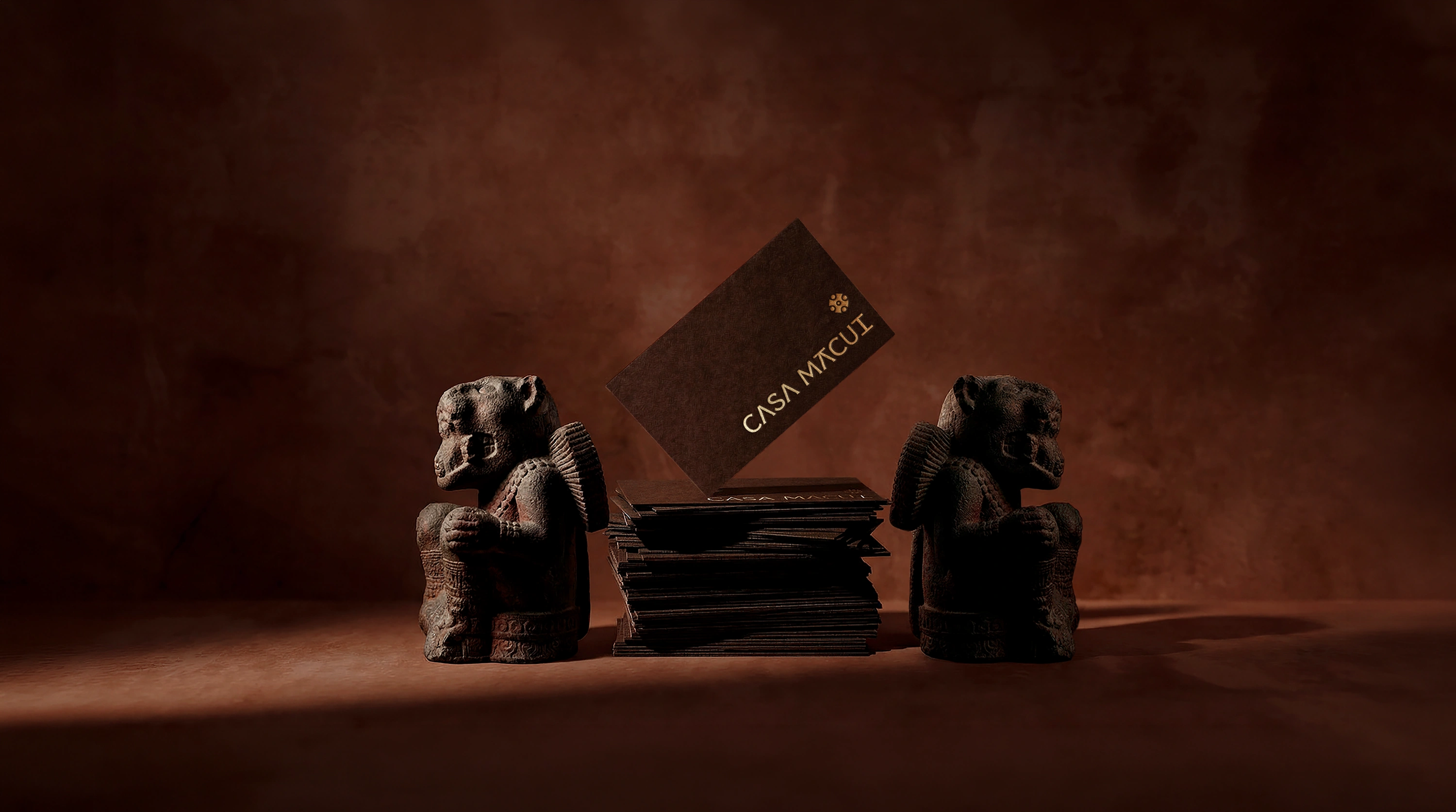
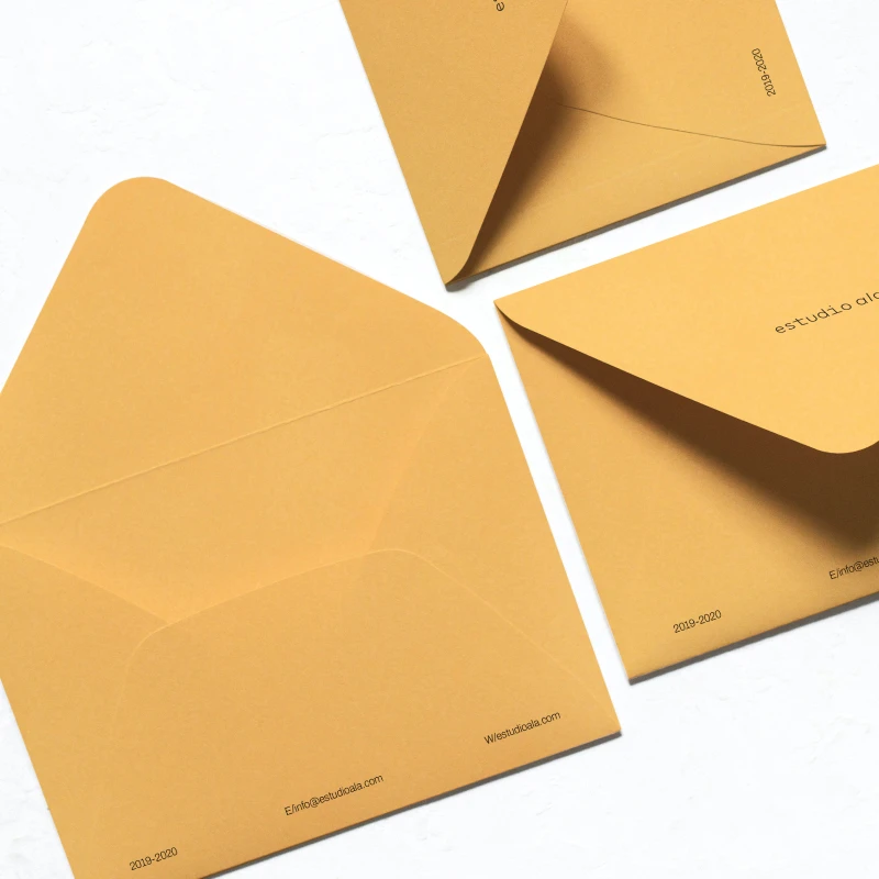
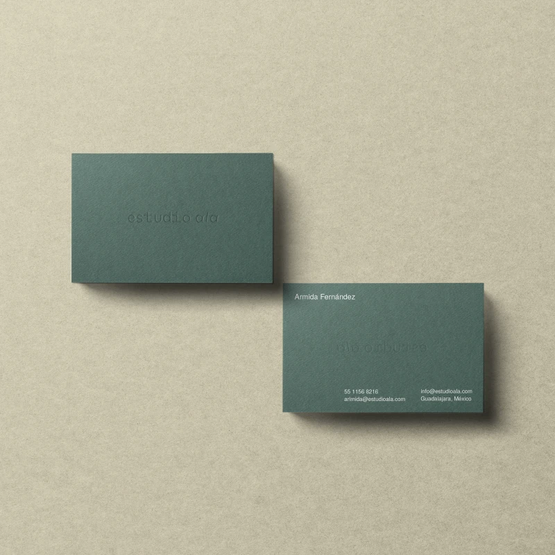
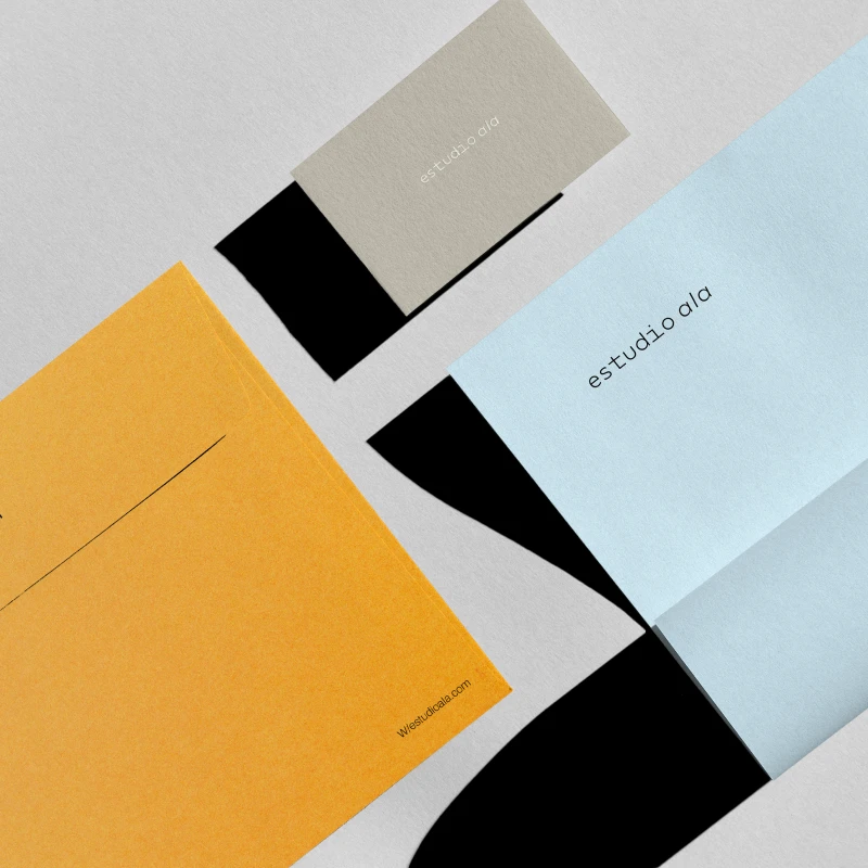
Es Ala's work stands out for its appreciation and valorization of regional materials and their use in new contexts. The color palette for Es Ala aims to represent this appreciation, using earthy colors that vanish with time.
Design Evolution & Strategy
Our process for es ala started by evolving the name to better reflect the brand’s heritage. From there, we focused on "lightening" the logo to ensure that it complements—rather than competes with—the studio’s portfolio. We explored diverse visual systems that utilized structured, minimalist compositions, intentionally designed to echo the precision and clarity of the studio’s architectural aesthetic.

No items found.