HIJ publication
Branding

Balanced branding reflecting artistic and logical architectural synergy for HIJ Taller

Overview

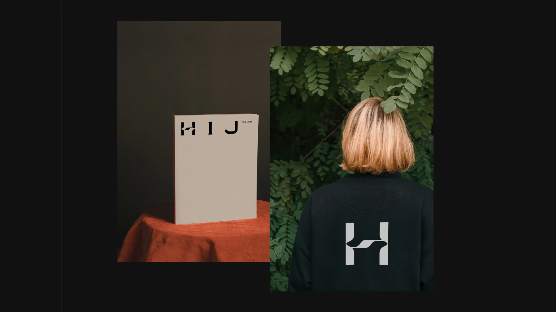
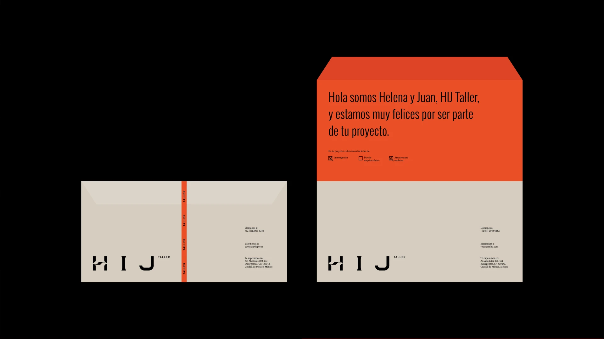
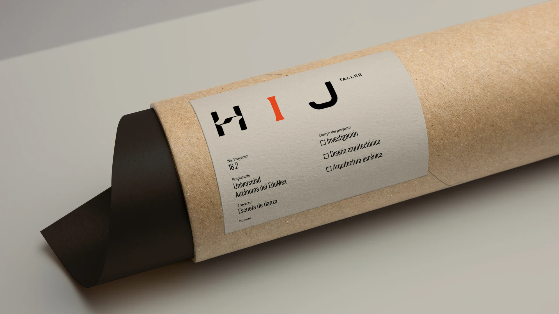
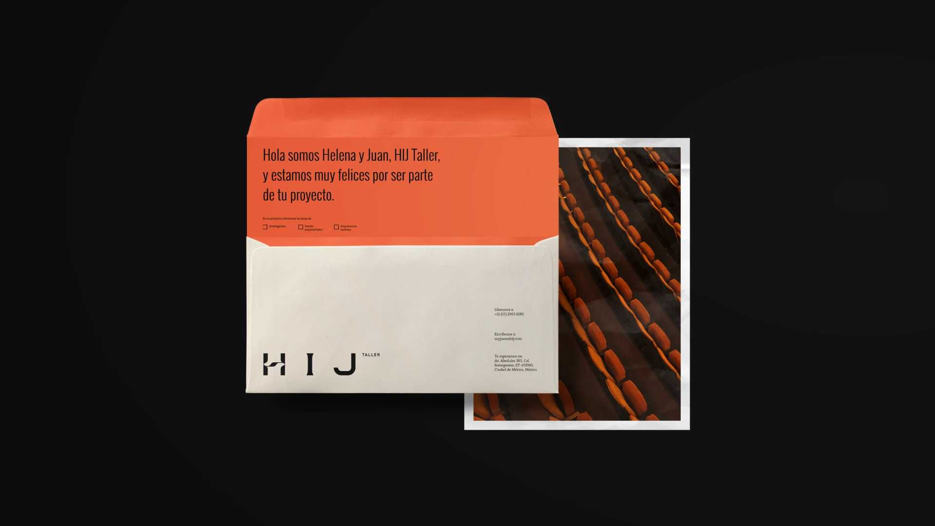
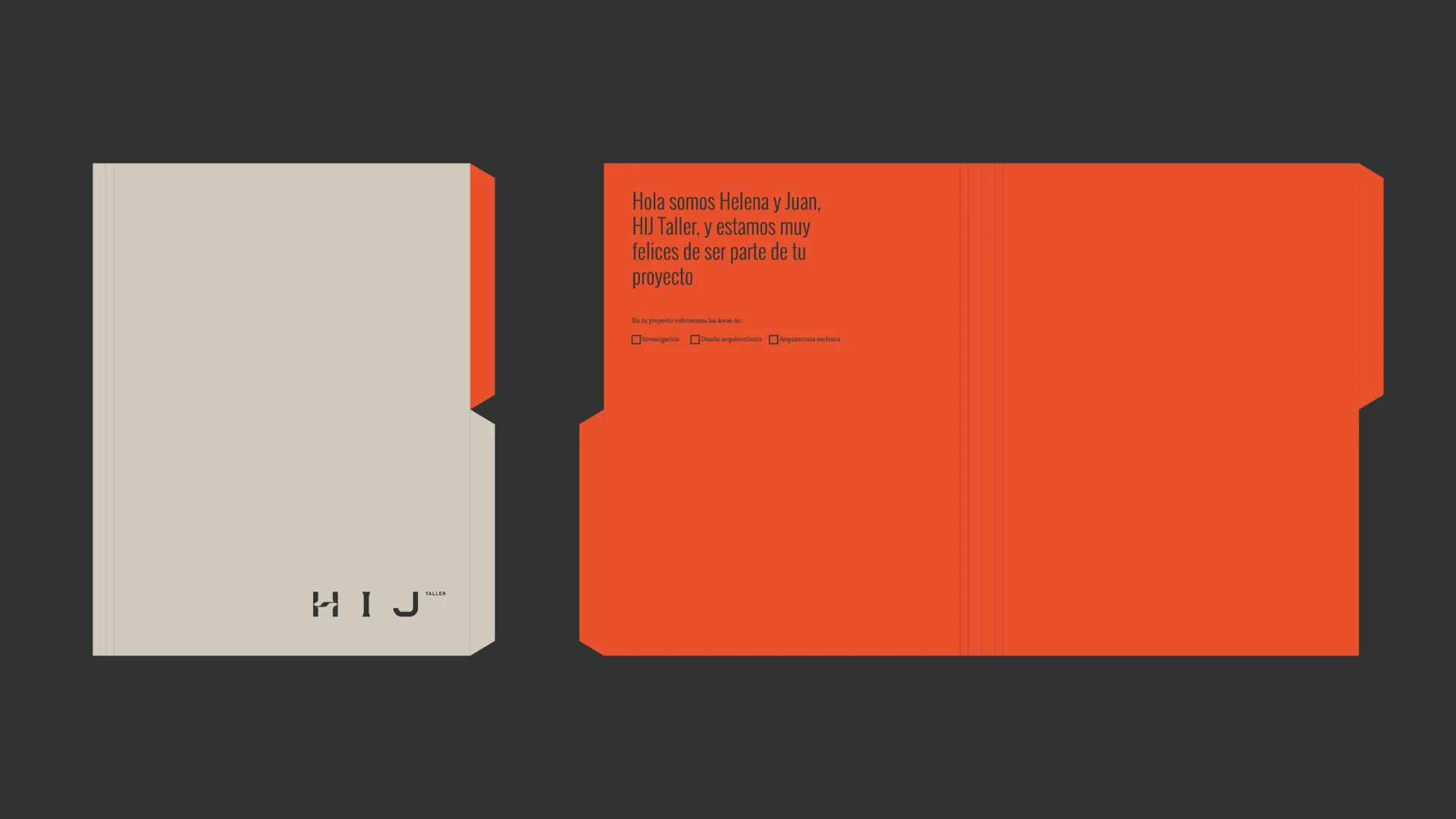
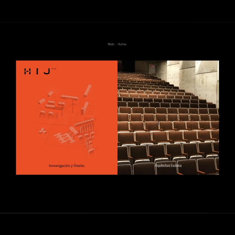
We created a brand identity for HIJ Taller that balances the founders' artistic and logical personalities. By blending these contrasting traits, we developed a harmonious visual system and a flexible language that reflects their specialized architectural expertise. The final design communicates their commitment to providing personalized, integral solutions for every client

Client
Taller HIJ
Category
Branding
Date
Aug 22, 2021
No items found.
About

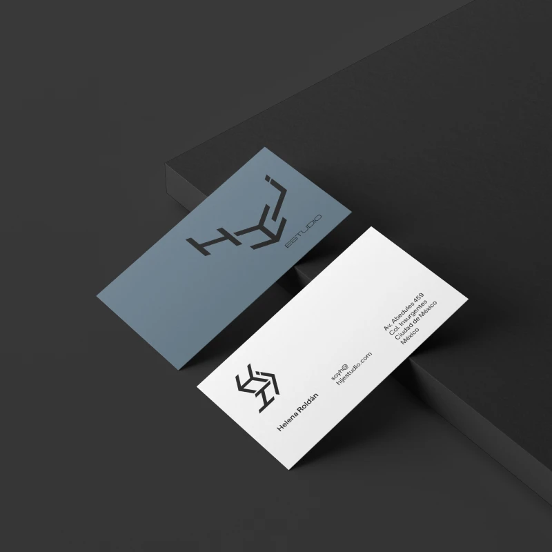
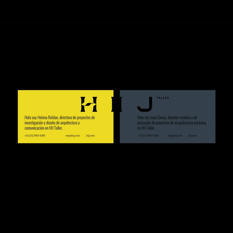
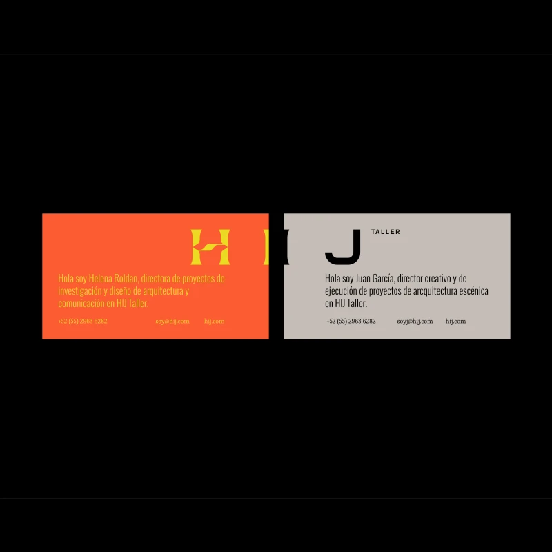
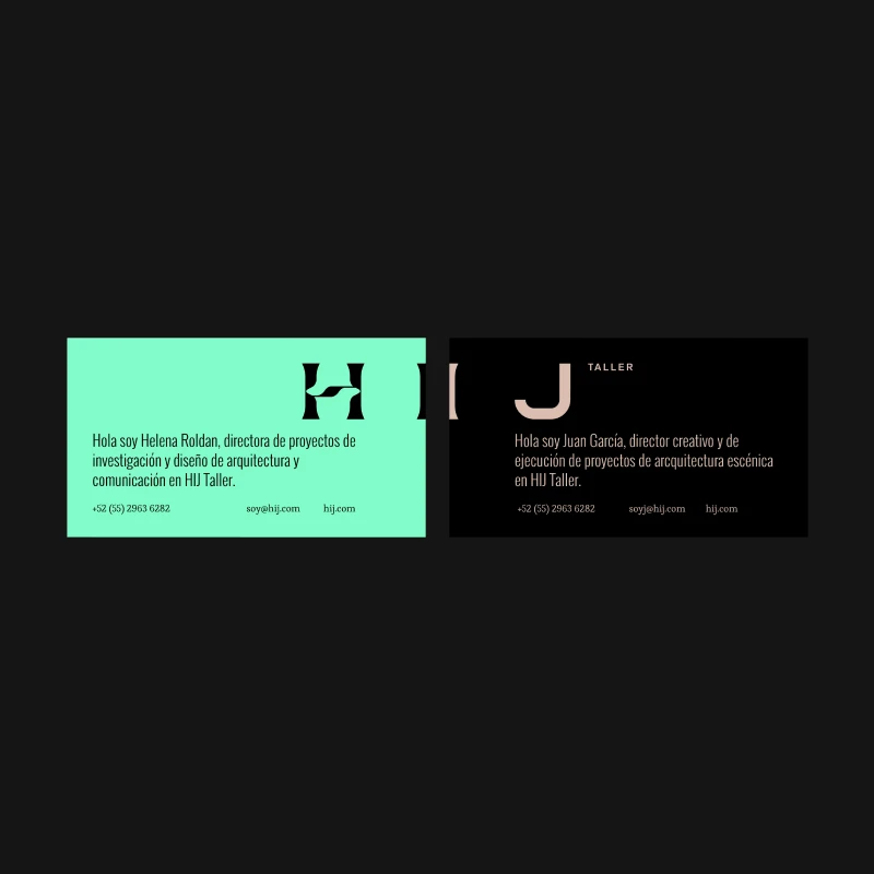
HIJ Taller was a specialized architecture and design studio based in Mexico City that focused on creating exceptional, comprehensive solutions in theater planning. Founded by Spanish architects Helena and Juan, the studio carved out a unique niche within the design community by blending architectural precision with the theatrical arts. The firm dedicated its practice to crafting immersive, highly functional spaces, providing deeply personalized treatment and integral designs for every client and cultural venue they engaged with.

Visual Narrative

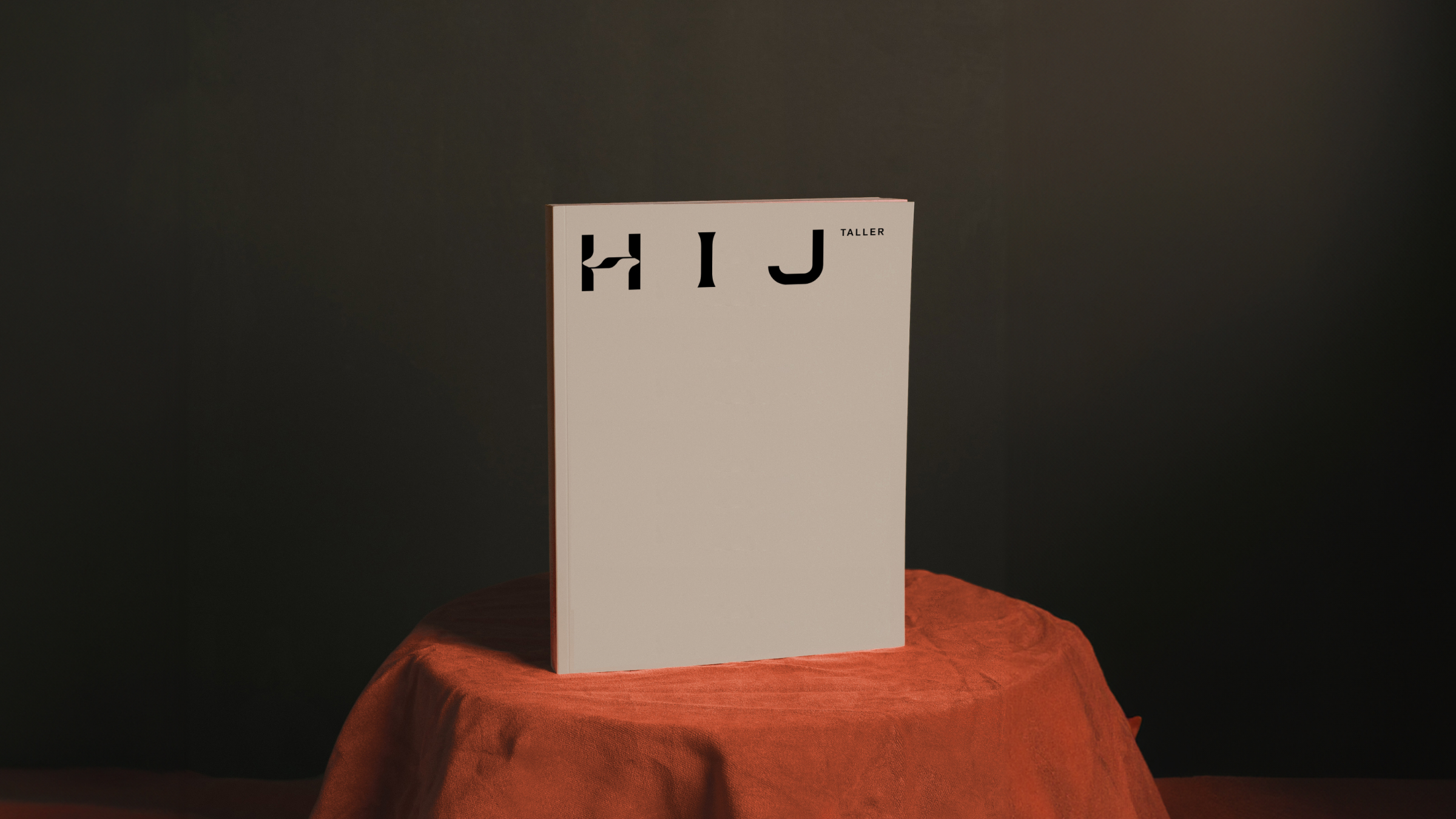
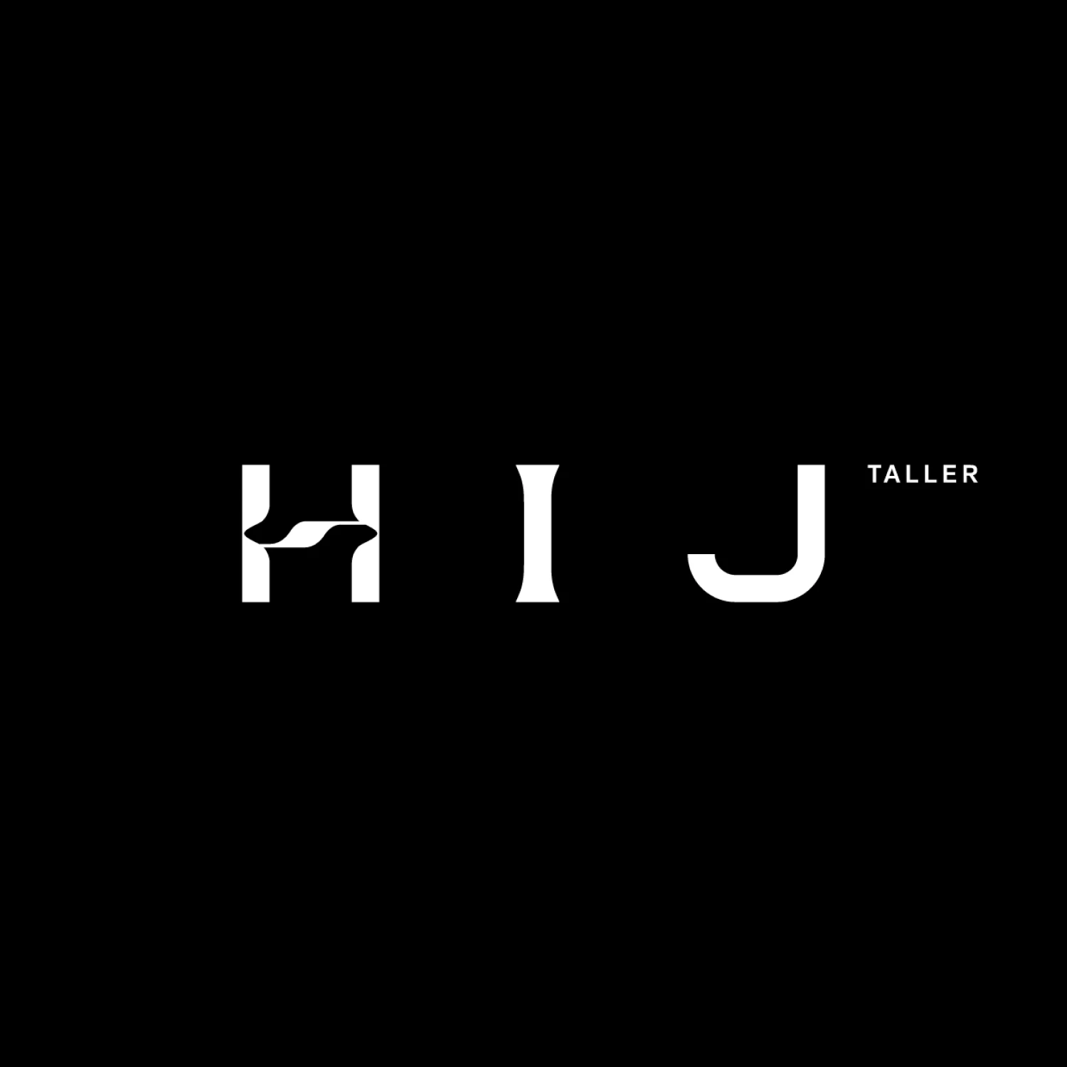
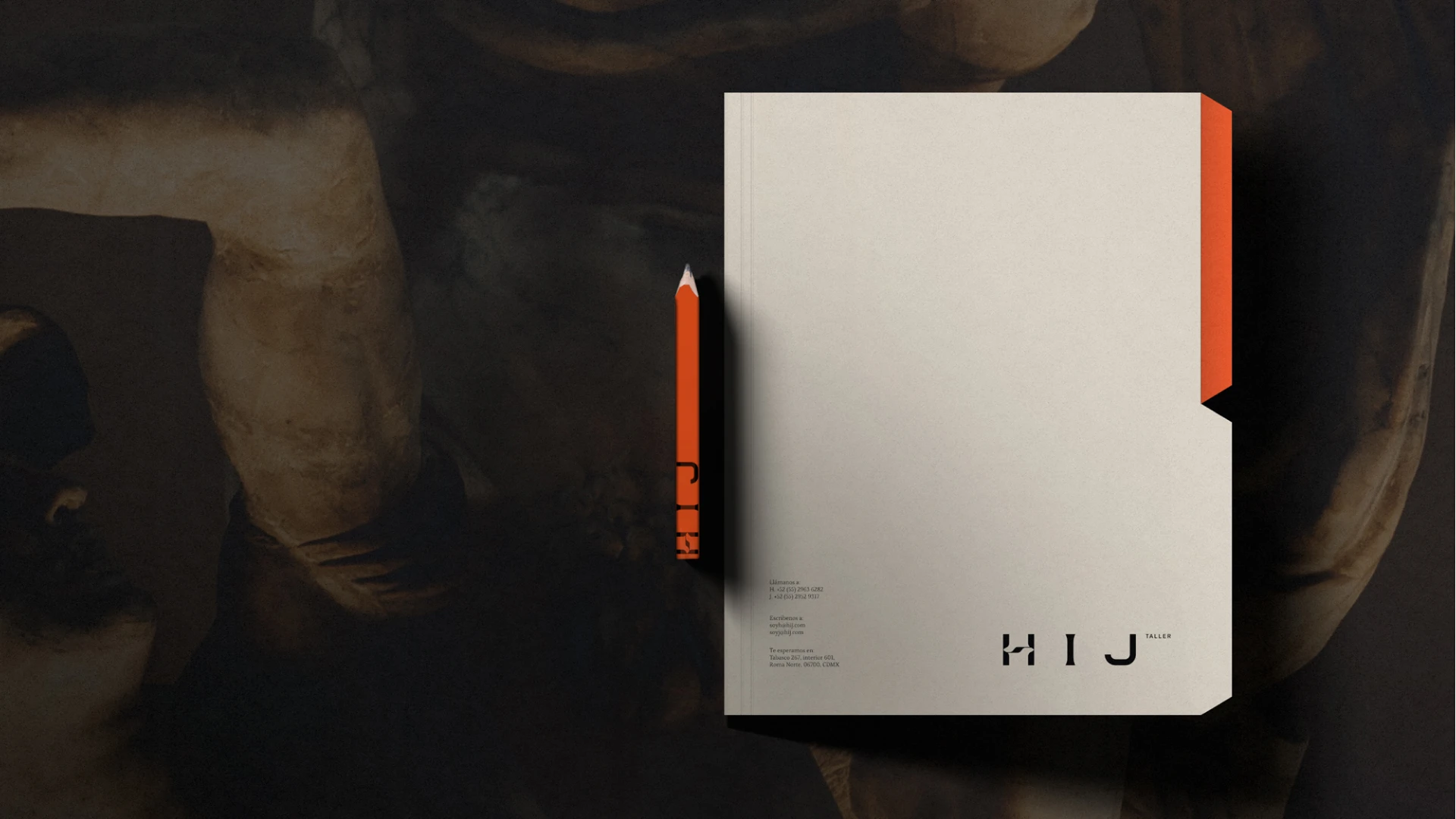
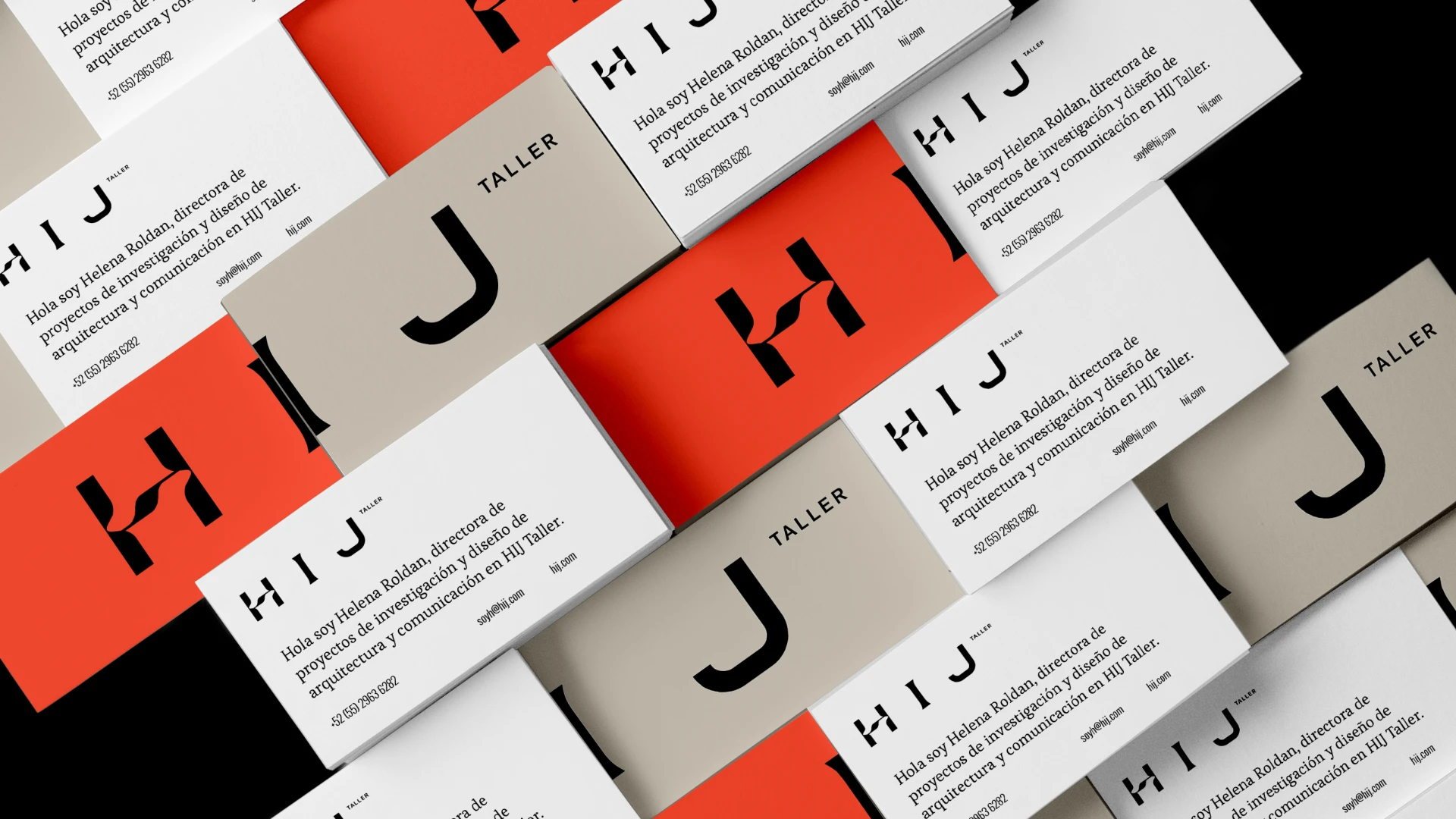
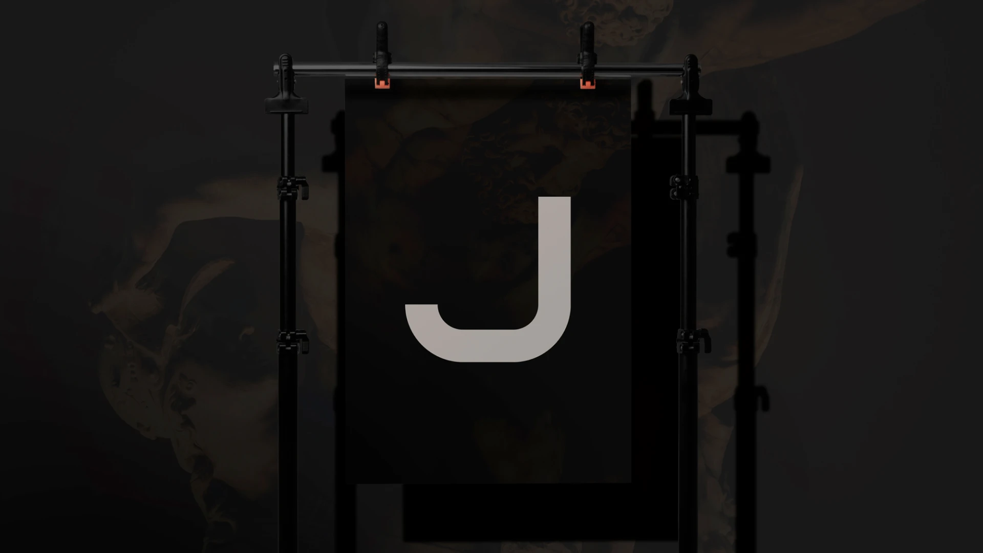
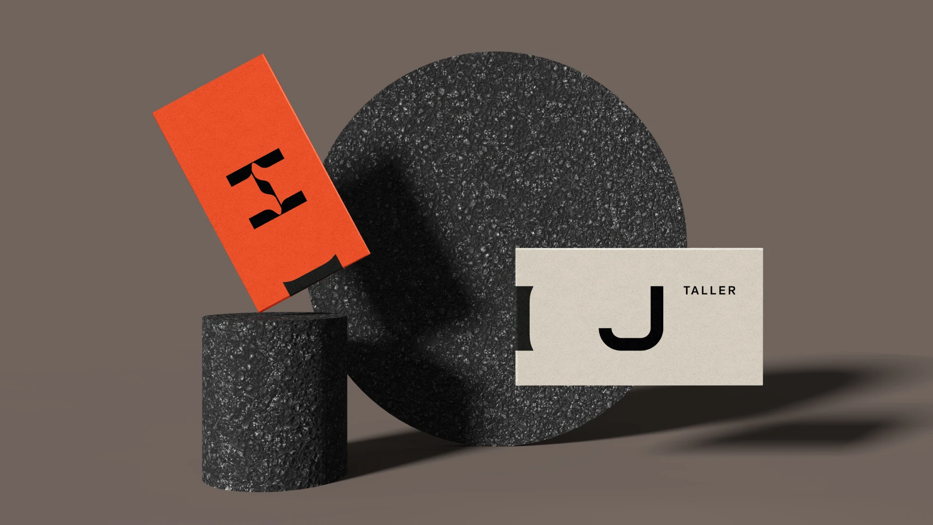
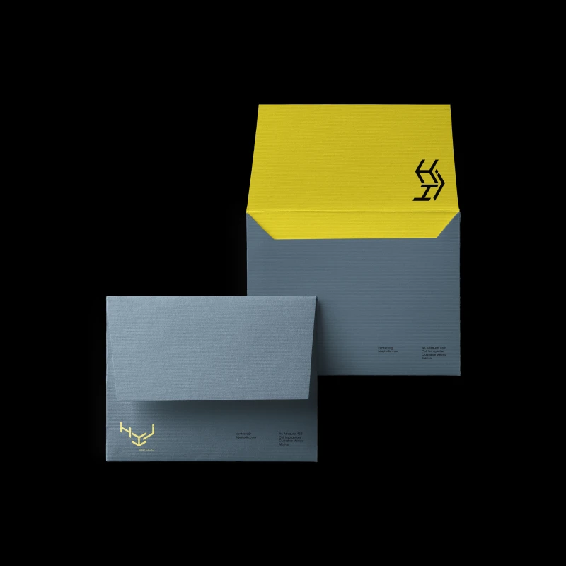
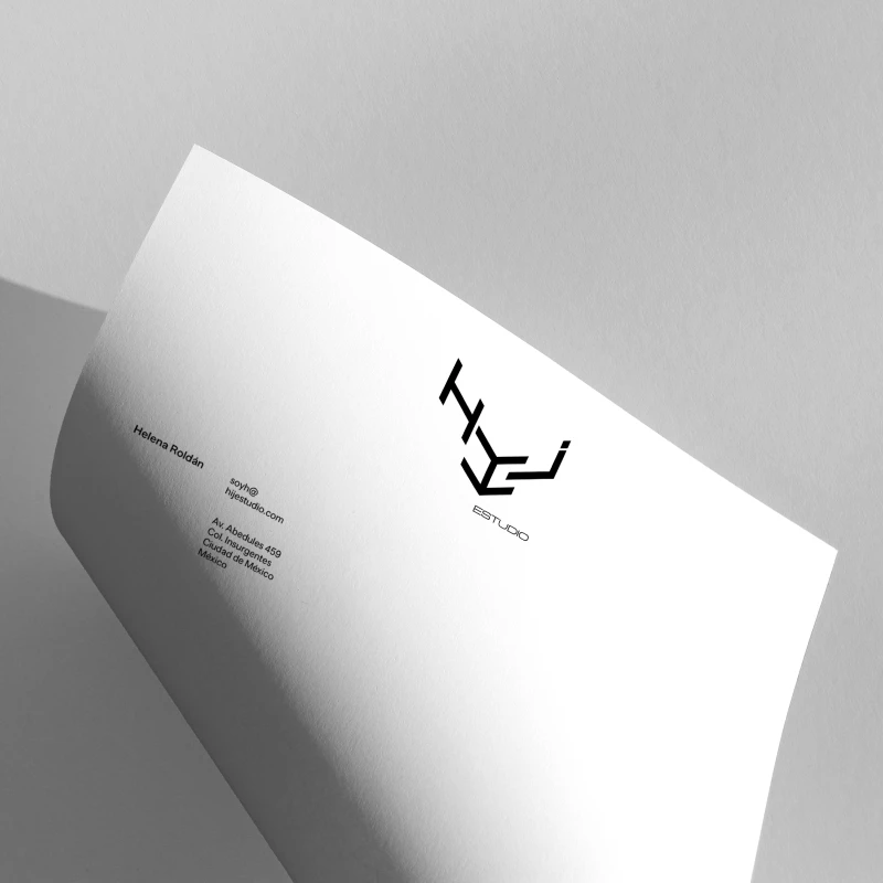
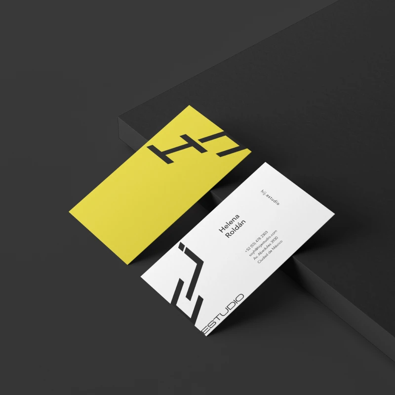
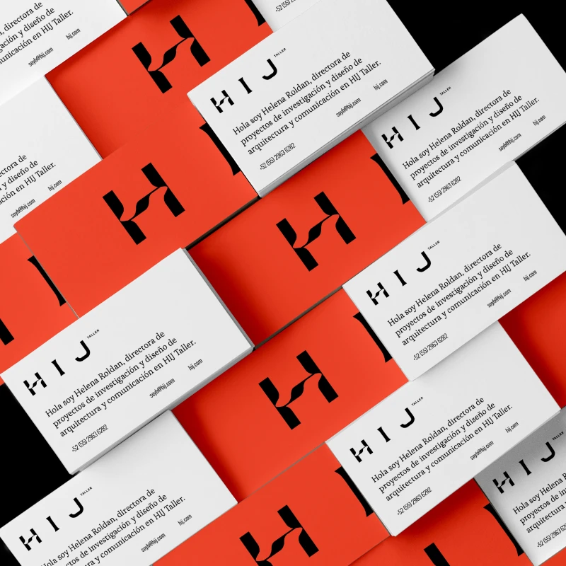
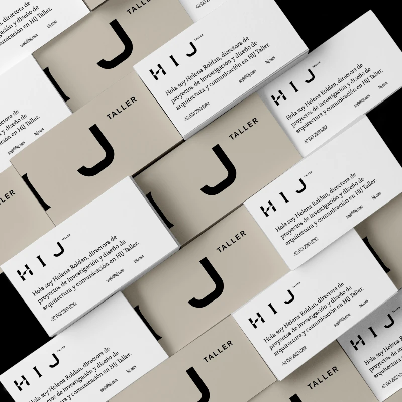
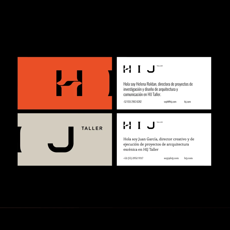
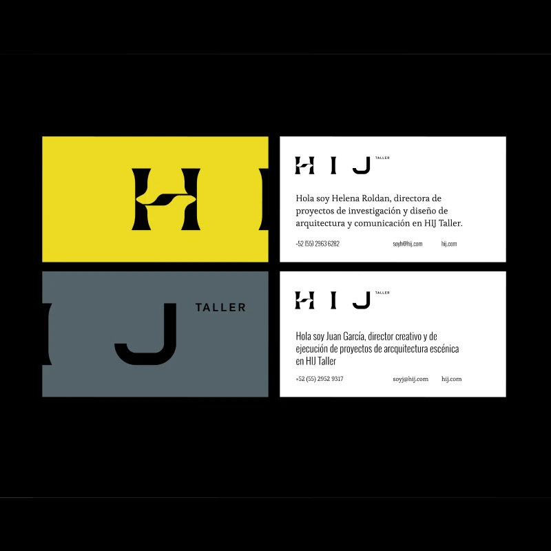
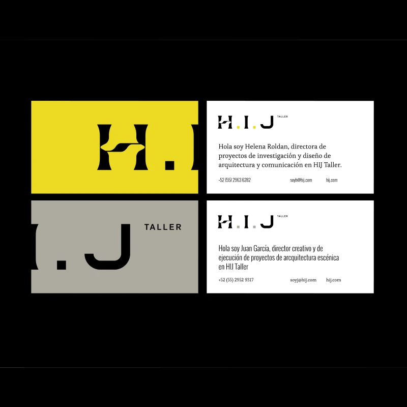
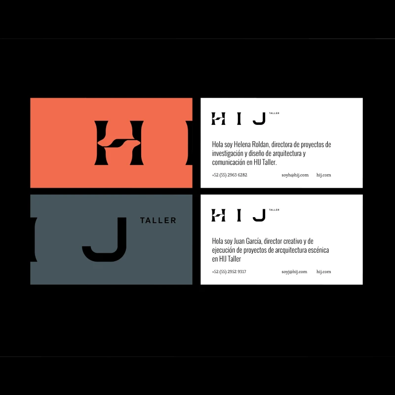
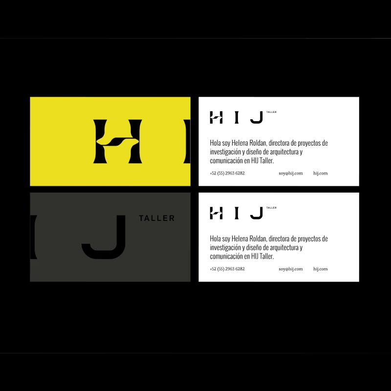
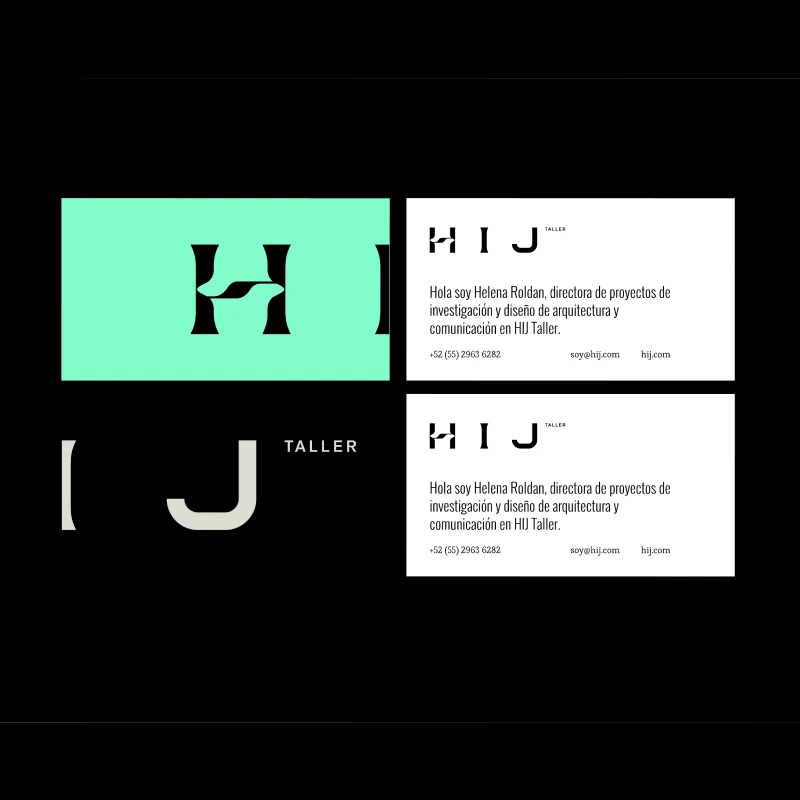
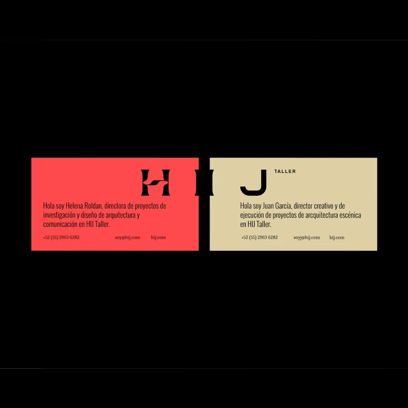
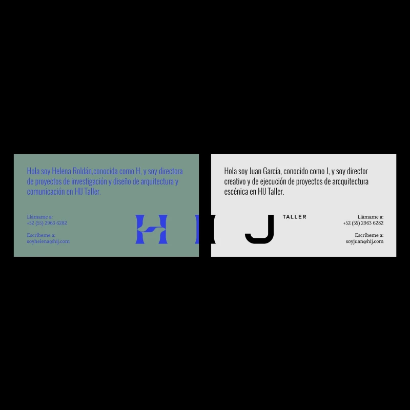
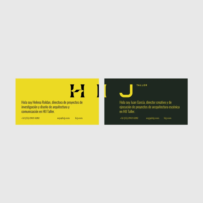
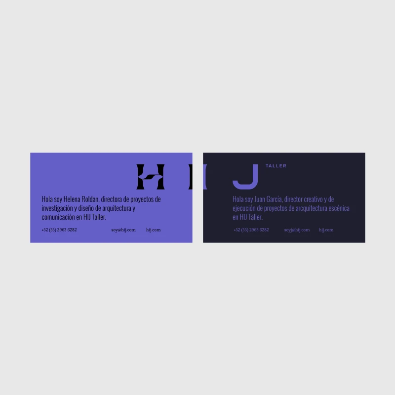
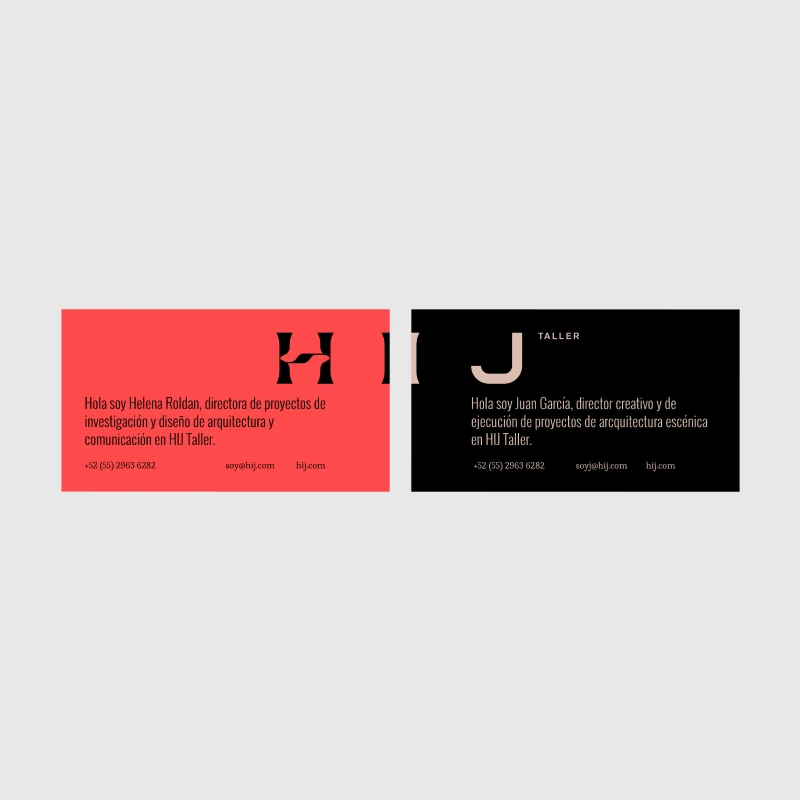
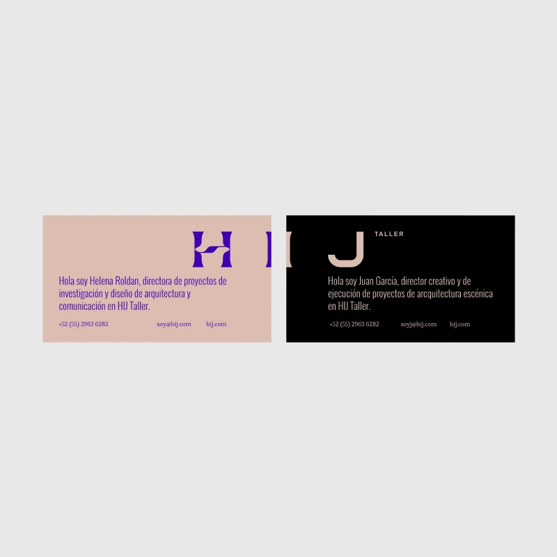
The visual narrative for HIJ Taller told the story of two distinct and complementary personalities working in perfect synchronization. It captured the vibrant contrast between Helena—artistic, energetic, and often represented as “H”—and Juan, the pragmatic, logical “J.” To mirror this unique partnership, the brand was built on the concept of independent components, each possessing its own particularities, typographic language, and character. When brought together, however, these contrasting elements seamlessly combined into a perfectly balanced, fluid, and harmonious visual composition.

Design Evolution & Strategy

The design process evolved by translating human duality and professional synergy into a structural brand system. Designers shifted away from monolithic, singular corporate identities toward a flexible, dual-element framework where rigid, logical grids met expressive, artistic details. By allowing individual graphic elements to thrive independently before locking them into a balanced composition, the final identity successfully mirrored the founders' working dynamic—proving that contrasting methodologies could unite to form a timeless, sophisticated architectural brand.

HIJ envelope exploration
HIJ letterhead and logo exploration
HIJ business cards and logo exploration
HIJ composition exploration
HIJ business cards exploration
HIJ business cards and color exploration
No items found.
Gradient background blending dark green and beige colors.
Let's get started

Run away with us

Escape from the superfluous to reach the most valuable.

Schedule a call
Gradient background blending dark green and beige colors.
Logos are dead web view
Spread of bananas with Foodback QR code stickers
Large-scale illuminated wall installation with the logo and the phrase inspire and connect
Probike logo on a drawstring pouch
Brócoli envelope
Avenir House logo in gold foil with flowers in a vase photo background
Scattered business cards for Green City showcasing the logo and diverse gradients.
A green plastic crate filled with long, textured green citrus fruits, likely finger limes, set against a minimalist beige background. The front center of the crate is labeled with the text "THE CURIOUS LIME" in a clean, white serif font.
Humani business card
HIJ publication
Empty stadium seats with the word Above spelled out in the seats
A minimalist olive-green A-frame sign stands on a sunlit gravel surface against a dark, slatted wooden wall, casting a sharp shadow to the left. The hanging white poster displays the brand name "FORT" in brown text—with a distinctive raised "O"—alongside "
Green envelope design for Becoming, an architecture studio in Dominican Republic
ROOM A-Frame Sidewalk Sign
Minimalist outdoor signage for Es Ala featuring white sans-serif typography on a dark cubic structure integrated into modern architecture.
box with cookies on top and Illustration of a chef and a cookie on a cookie bag packaging
Green baseball cap with 'PROSECCO & PIZZA CLUB' embroidered in white resting on two white T-shirts draped over a wooden chair.
Gemini said Three CUATRO CIELOS food pouches—blue (pancake flour), maroon (spiced cashews), and yellow (granola)—are displayed in a tiered arrangement against a neutral tan backdrop, featuring elegant typography and geometric patterns.
Magazine or catalog cover with Casa Salazar branding, featuring a yellow background and stylized black lettering, indicating edition no. 1