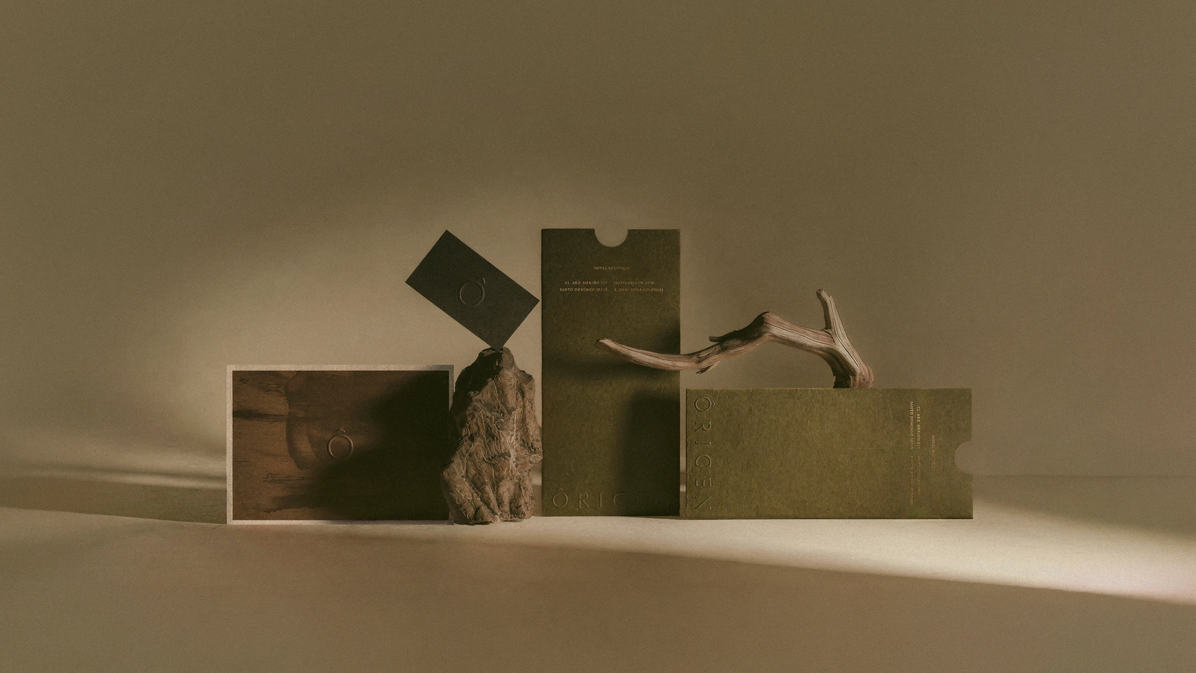
Branding

Rebirth of a 16th-century colonial icon building

Overview

We designed a comprehensive visual identity system and brand narrative for Hotel Origen, transforming the history of a 16th-century colonial mansion into a cohesive experience across print, digital, and spatial touchpoints.

Client
Origen
Category
Branding
Date
Jul 20, 2026
No items found.
About

A boutique hotel coming to life in the heart of Santo Domingo, Dominican Republic.

The project is set within a 16th-century colonial mansion that, after undergoing multiple transformations over time, was reclaimed for restoration to begin this new chapter as a hotel.
Visual Narrative

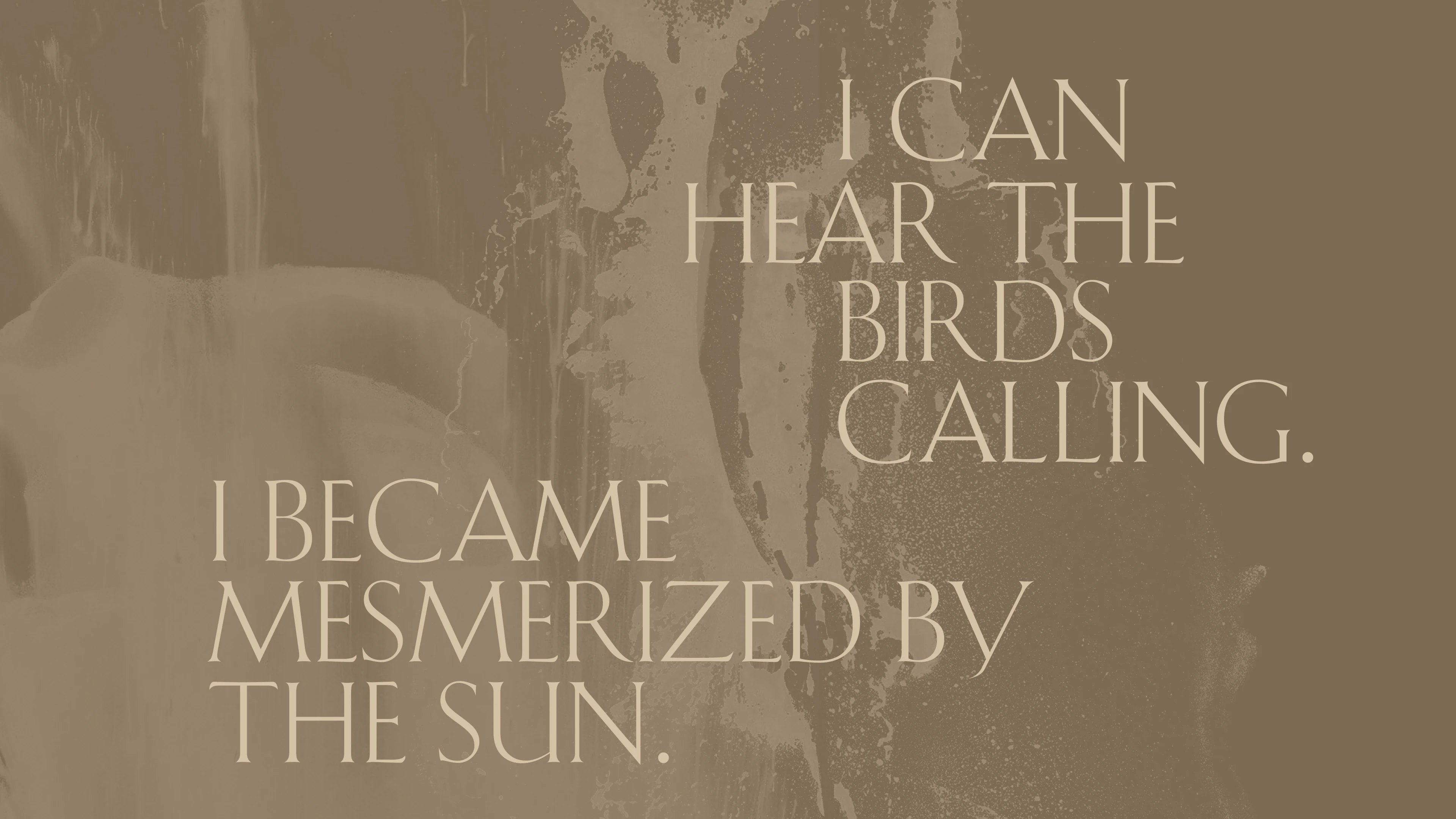
The brand came to us with an established logo but lacked a cohesive visual system and a solid voice.

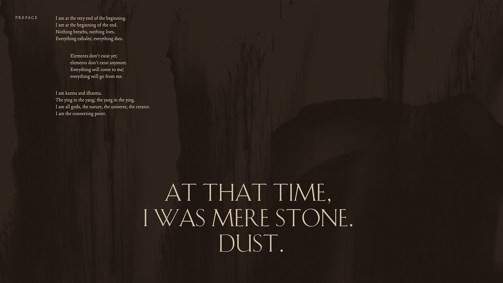
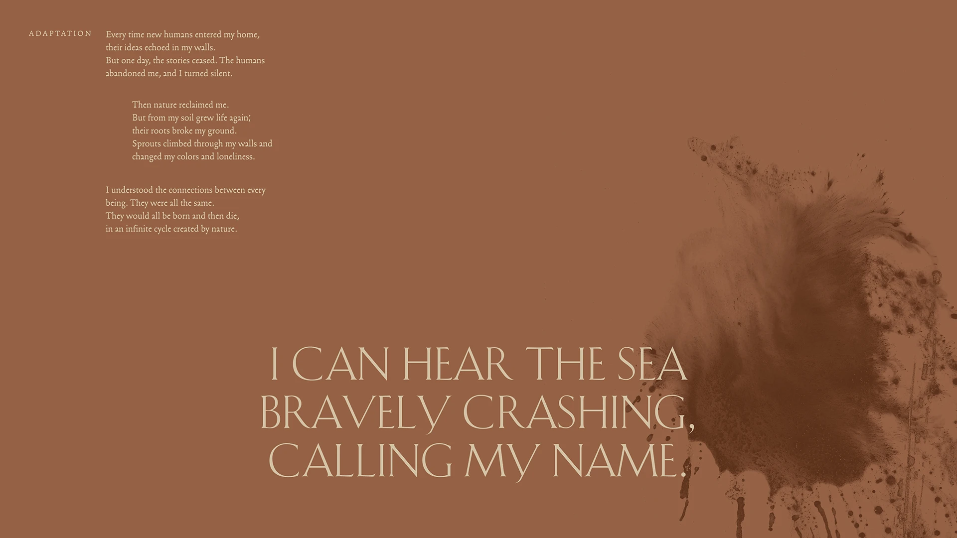
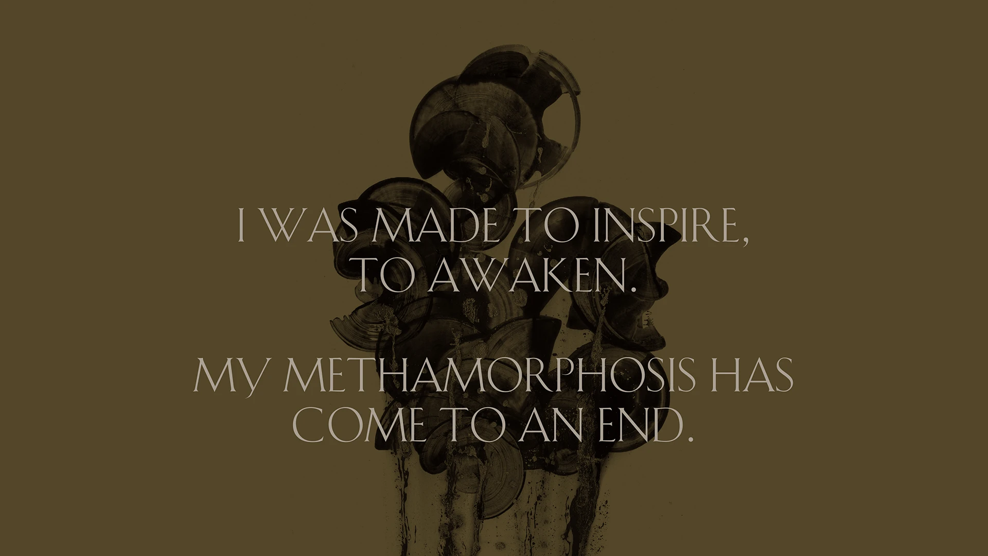
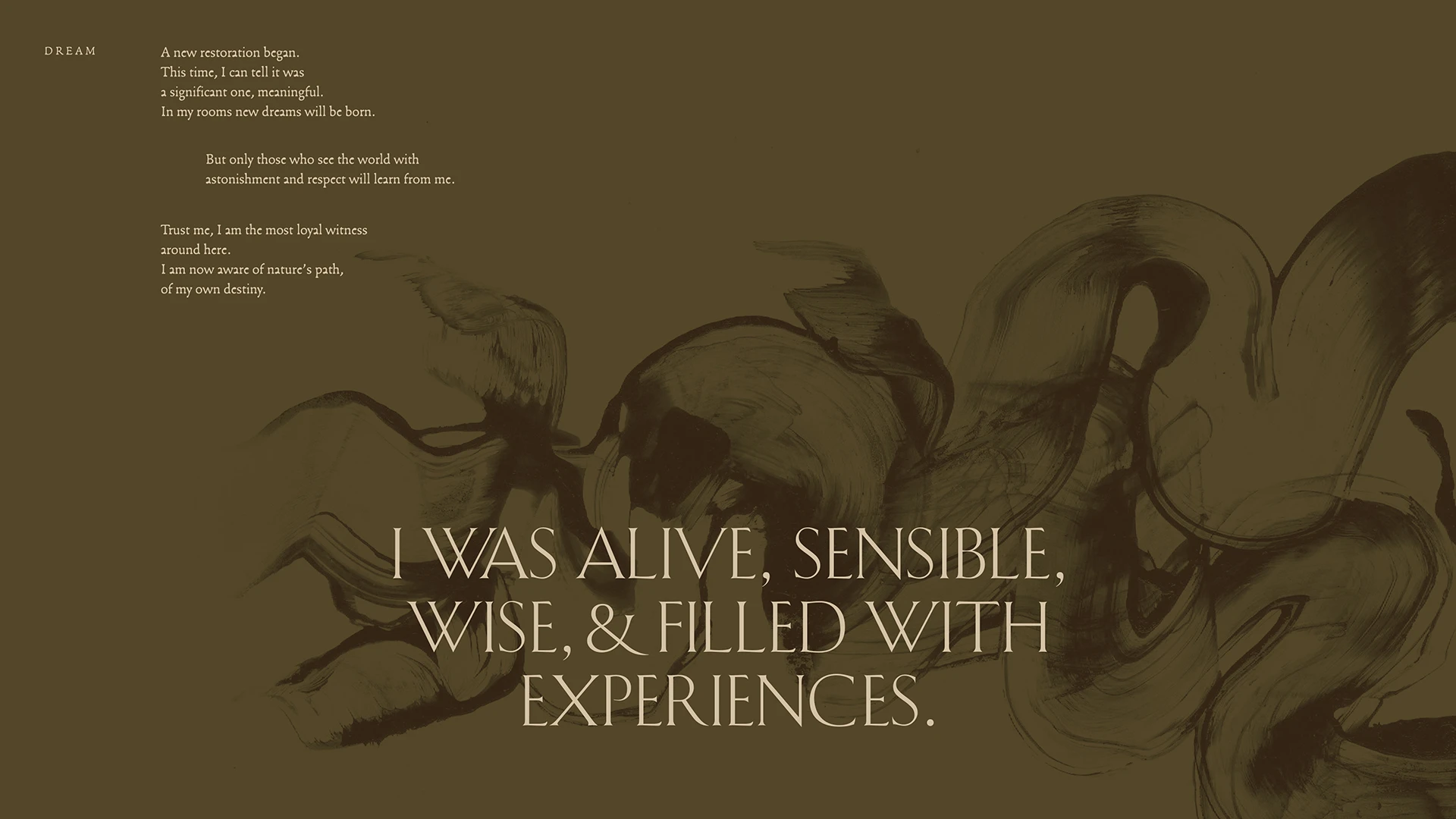
Inspired by the property's history, we developed a first-person narrative where the house itself recounts its past and its genesis. The journey begins at an earthly level—a pre-construction plane where only raw matter existed. It narrates how the colonial era transformed those materials into a firm, solid structure, and how, after centuries passed and the surrounding society evolved, abandonment set in. The house remained in silence for decades, until the restoration process awakened it to make way for a new Origen.

Design Evolution & Strategy

This narrative served as the foundation for the brand's graphic universe. We created textures that illustrate the transition from raw material to life and architecture. The color palette was drawn from earth tones and the surrounding tropical environment, as well as the hotel's interior design concept.

The typographic system comprises three font families that structure the identity. Francesco (by Franck Jalleau), a typeface with irregular forms that references raw matter and the beauty of imperfection. For accents of refinement and sophistication, we used Schneidler Initials, characterized by light, sharp strokes. Finally, we implemented Metric for editorial copy and general reading layouts.

For Hotel Origen, we built the entire visual experience and every touchpoint where the brand expresses itself graphically: from printed collateral and signage iconography to uniforms, social media direction, and the website.

Hotel Origen graphic exploration
Hotel Origen typographic exploration
Hotel Origen graphic exploration
Hotel Origen typographic exploration
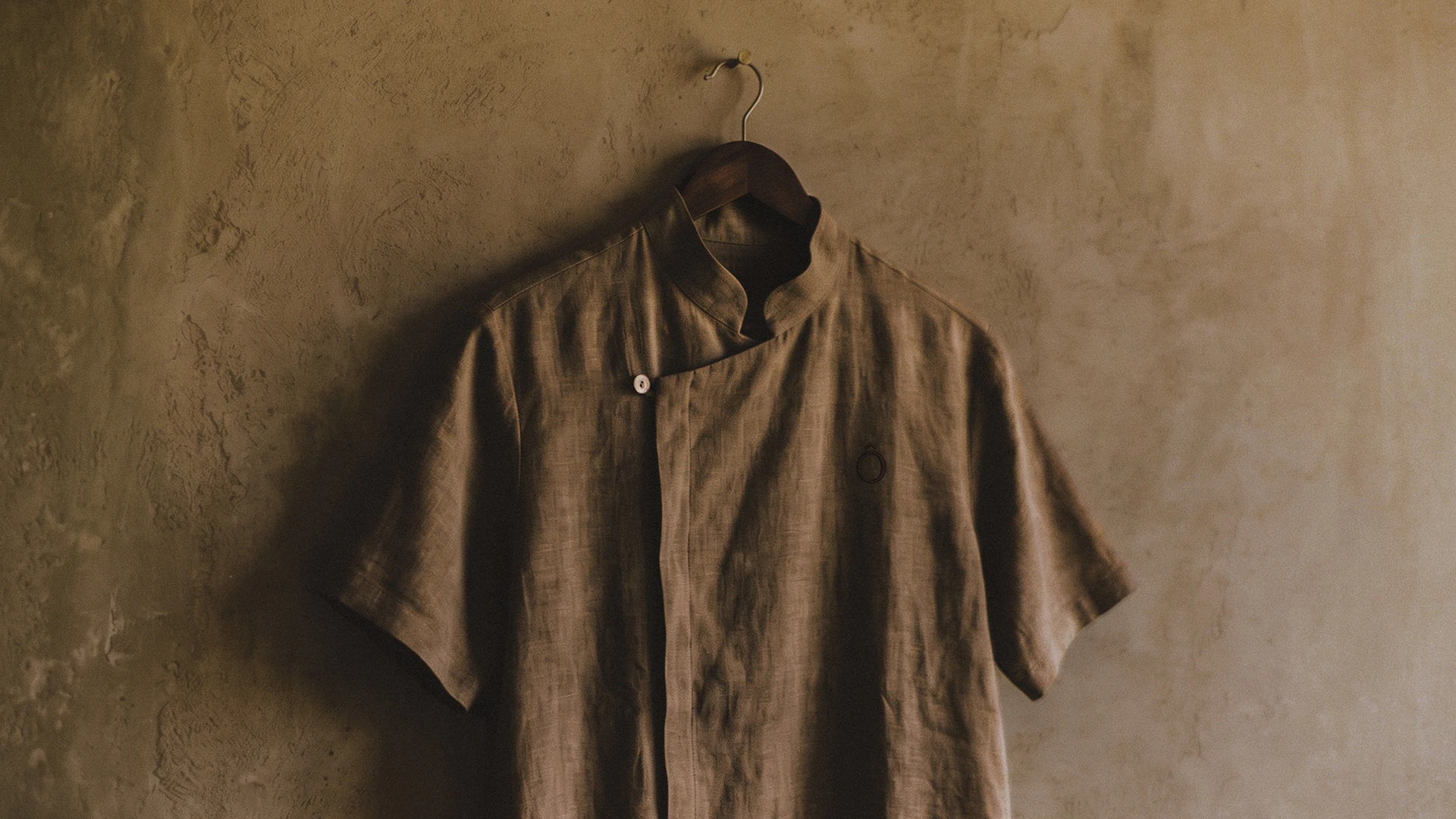
Hotel Origen shirt exploration
Hotel Origen texture
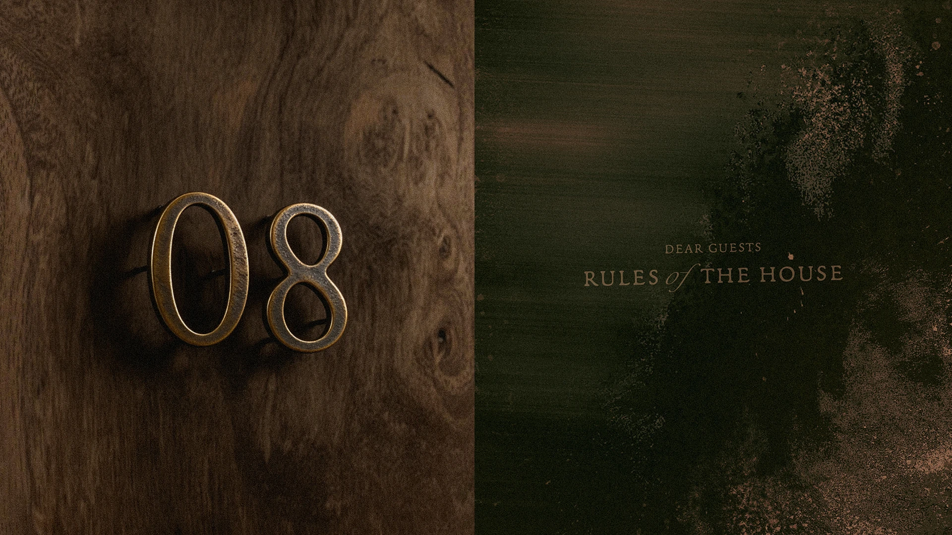
Hotel Origen rule book
Hotel Origen welcome book
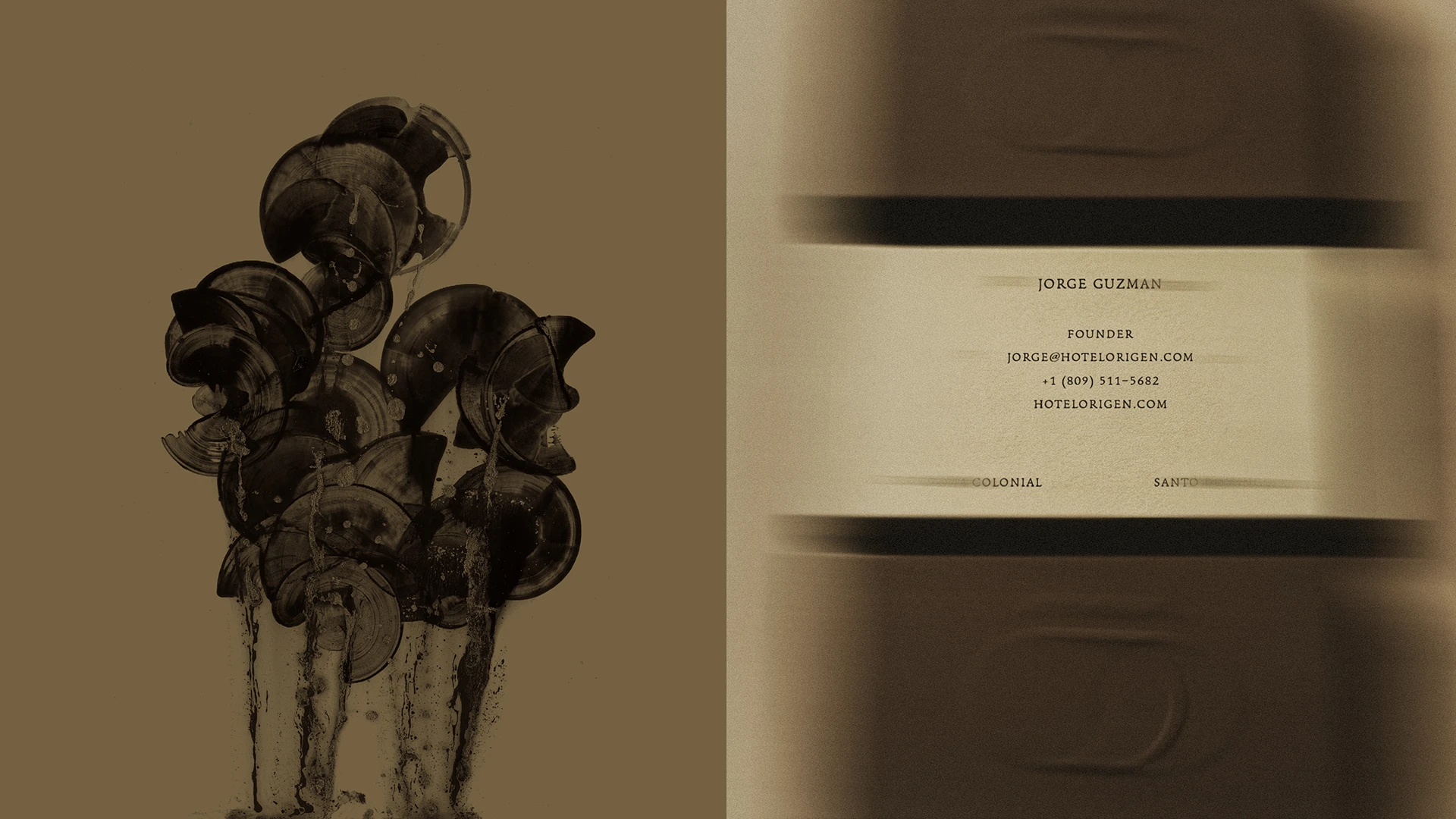
Hotel Origen business cards
Hotel Origen envelope explorations
Hotel Origen coasters explorations
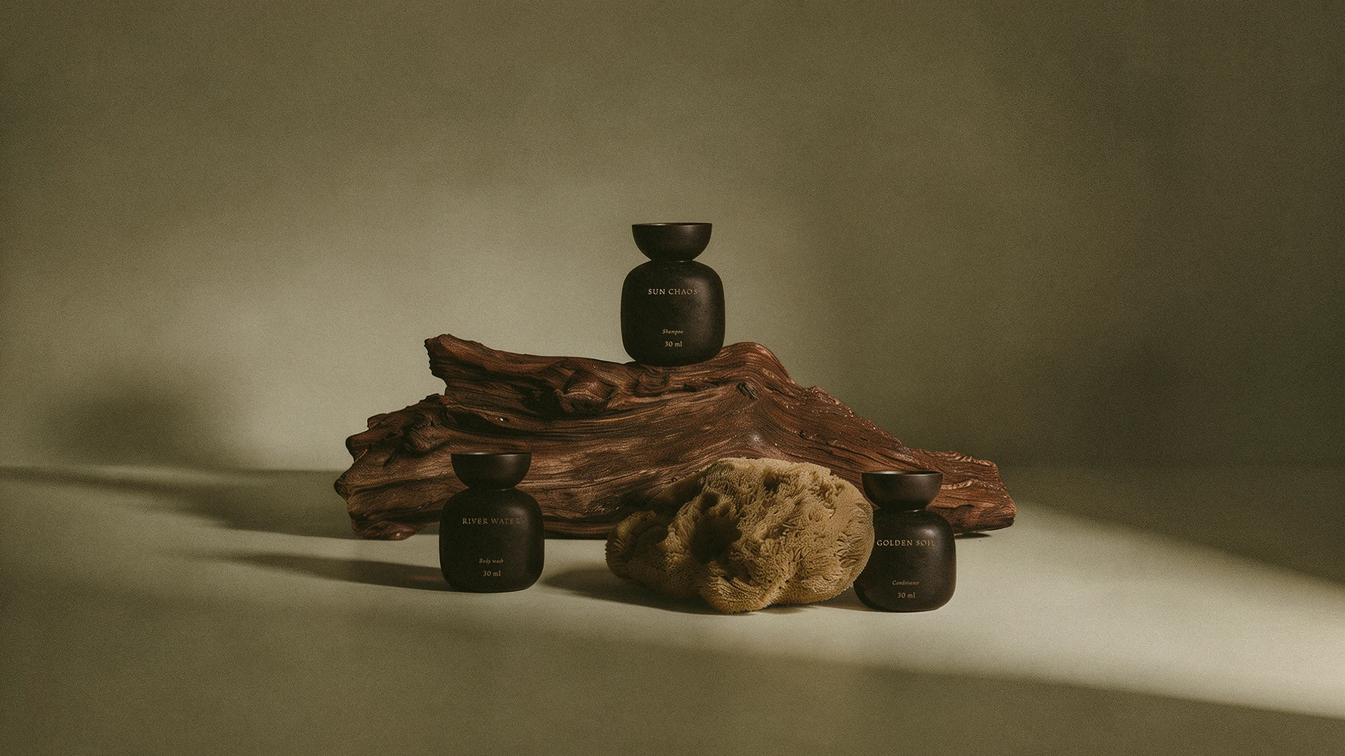
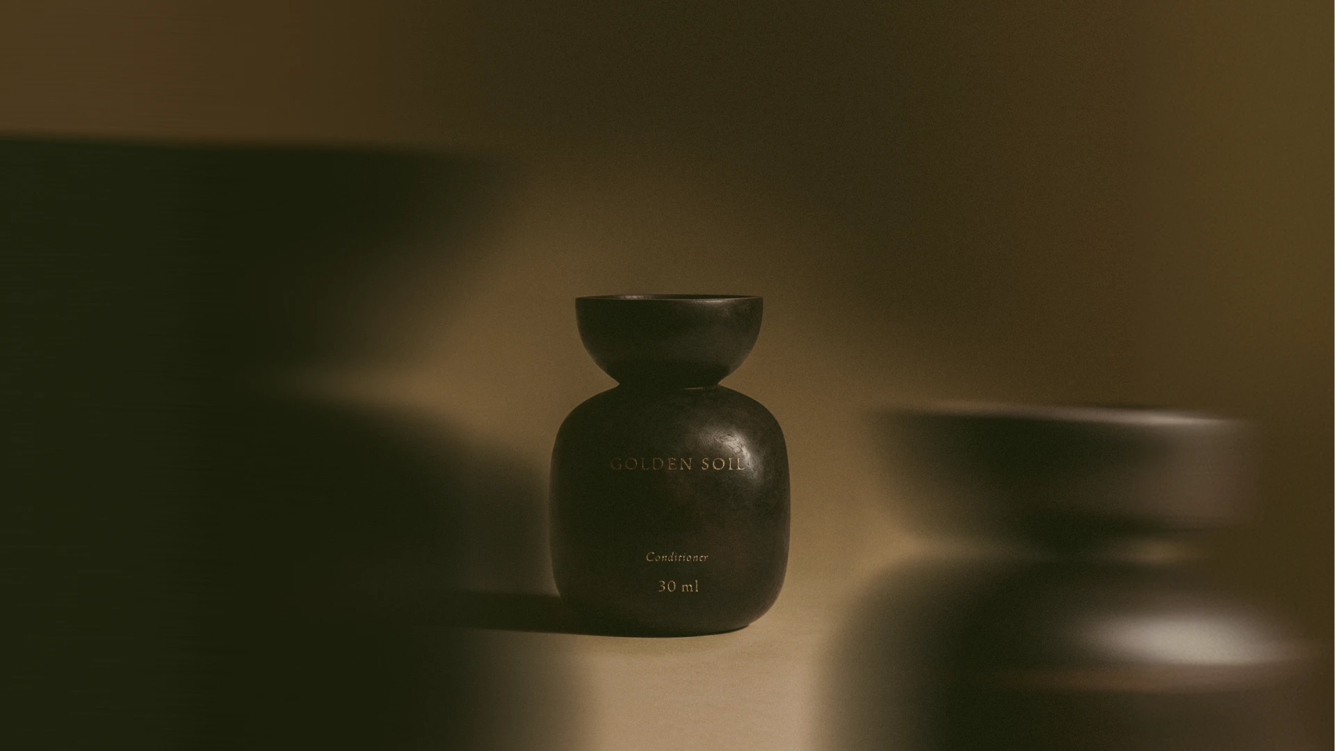
Hotel Origen complimentary products
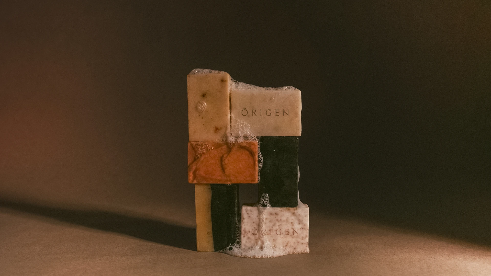
Hotel Origen soap bars
Hotel Origen paper shopping bag
Hotel Origen door hanger
Hotel Origen front sign
Hotel Origen room  signage
No items found.
Gradient background blending dark green and beige colors.
Let's get started

Run away with us

Escape from the superfluous to reach the most valuable.

Schedule a call
Gradient background blending dark green and beige colors.
Mindset + logo
Kite Compliance logo
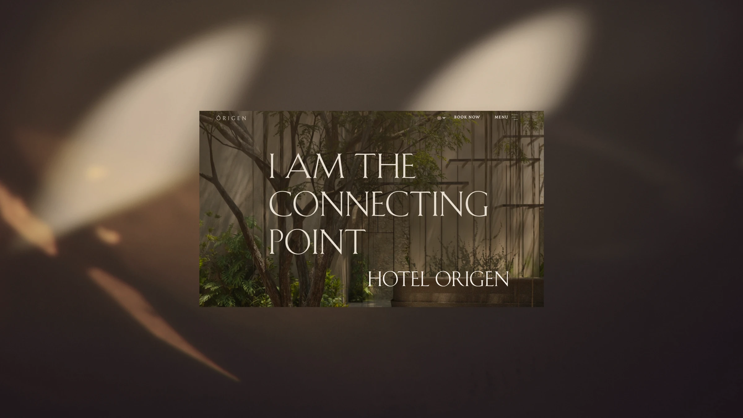
Origen web hero
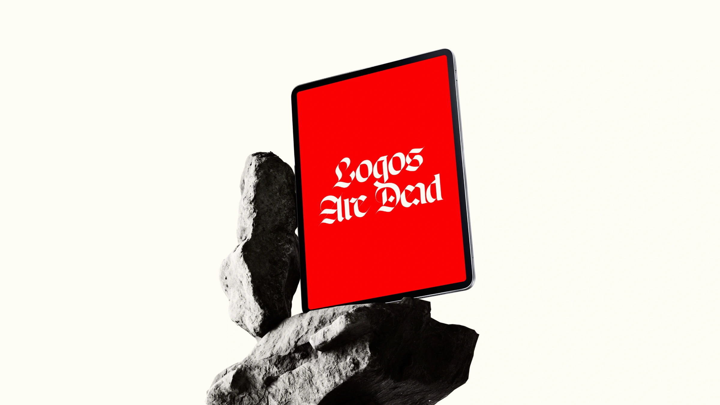
Logos are dead web view
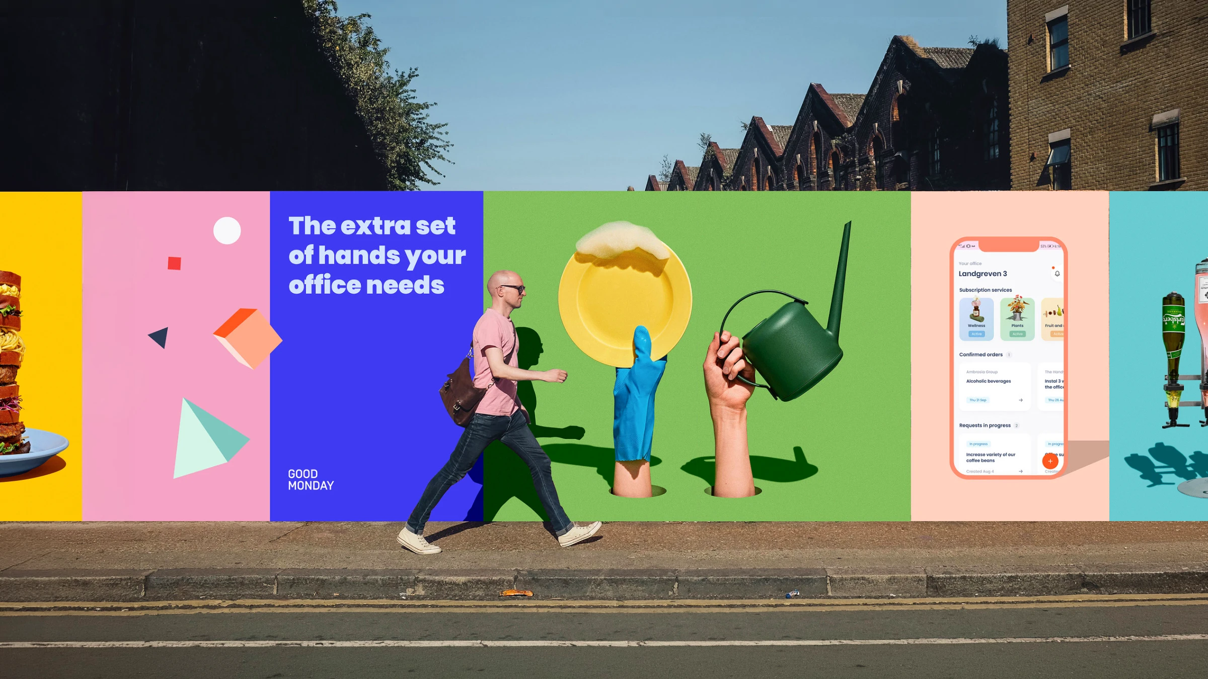
Spread of bananas with Foodback QR code stickers
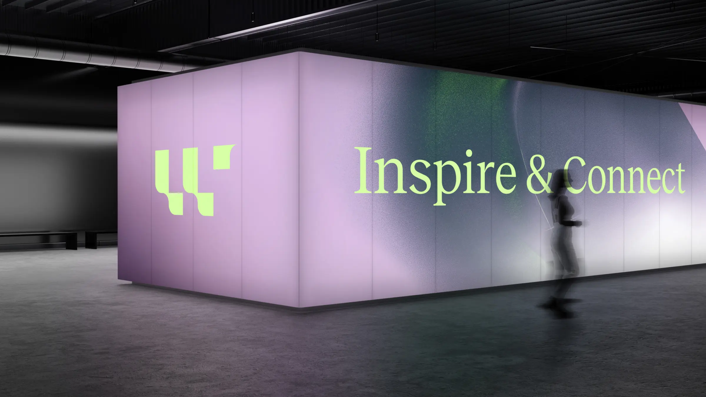
Large-scale illuminated wall installation with the logo and the phrase inspire and connect
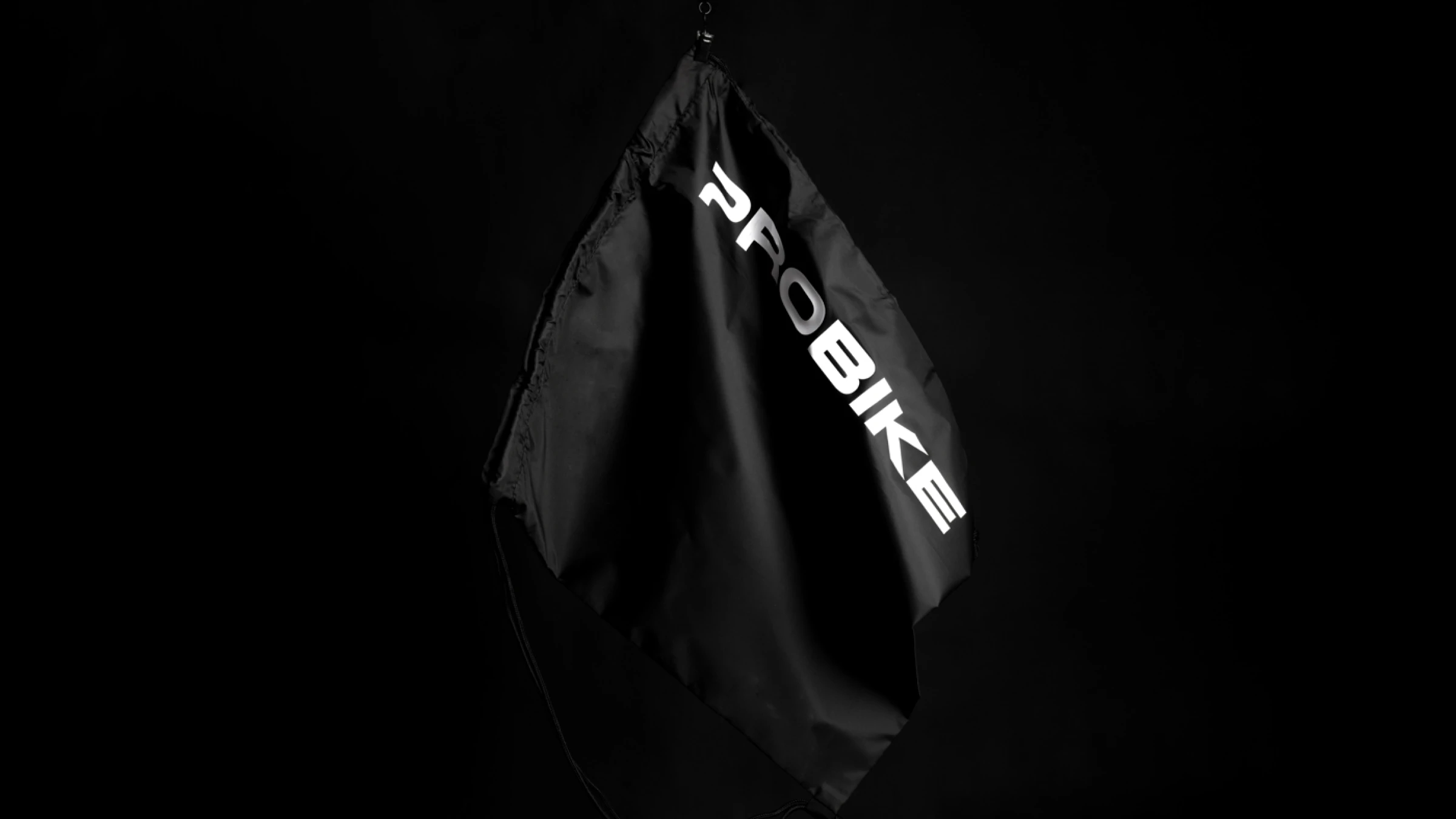
Probike logo on a drawstring pouch
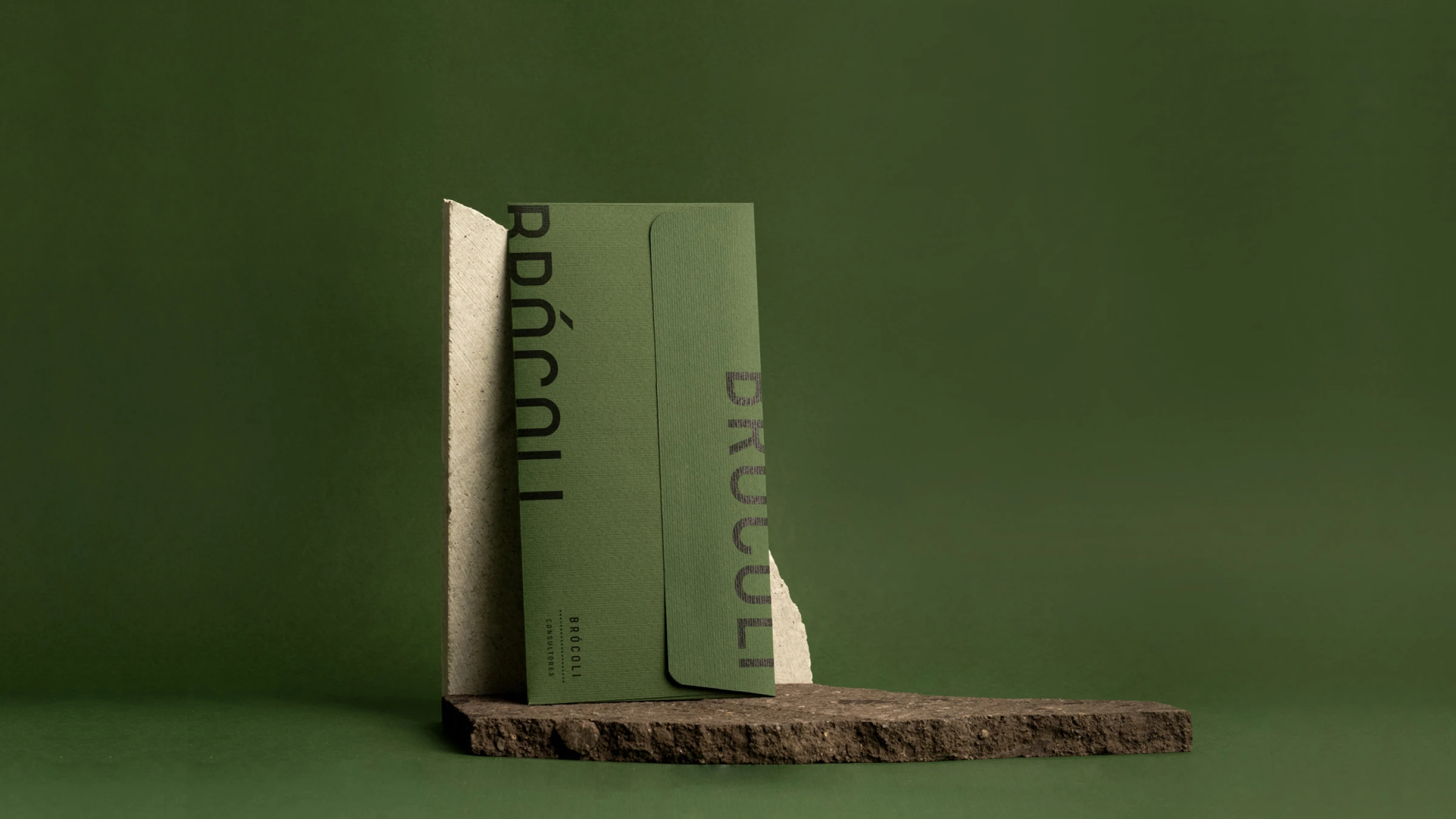
Brócoli envelope
Avenir House logo in gold foil with flowers in a vase photo background
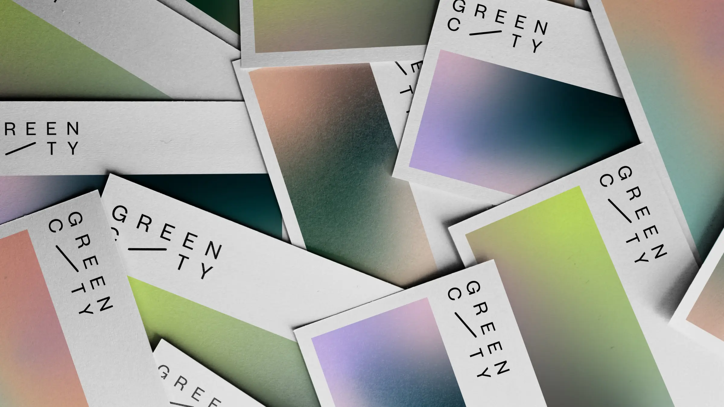
Scattered business cards for Green City showcasing the logo and diverse gradients.
Humani business card
HIJ publication
Empty stadium seats with the word Above spelled out in the seats
A minimalist olive-green A-frame sign stands on a sunlit gravel surface against a dark, slatted wooden wall, casting a sharp shadow to the left. The hanging white poster displays the brand name "FORT" in brown text—with a distinctive raised "O"—alongside "
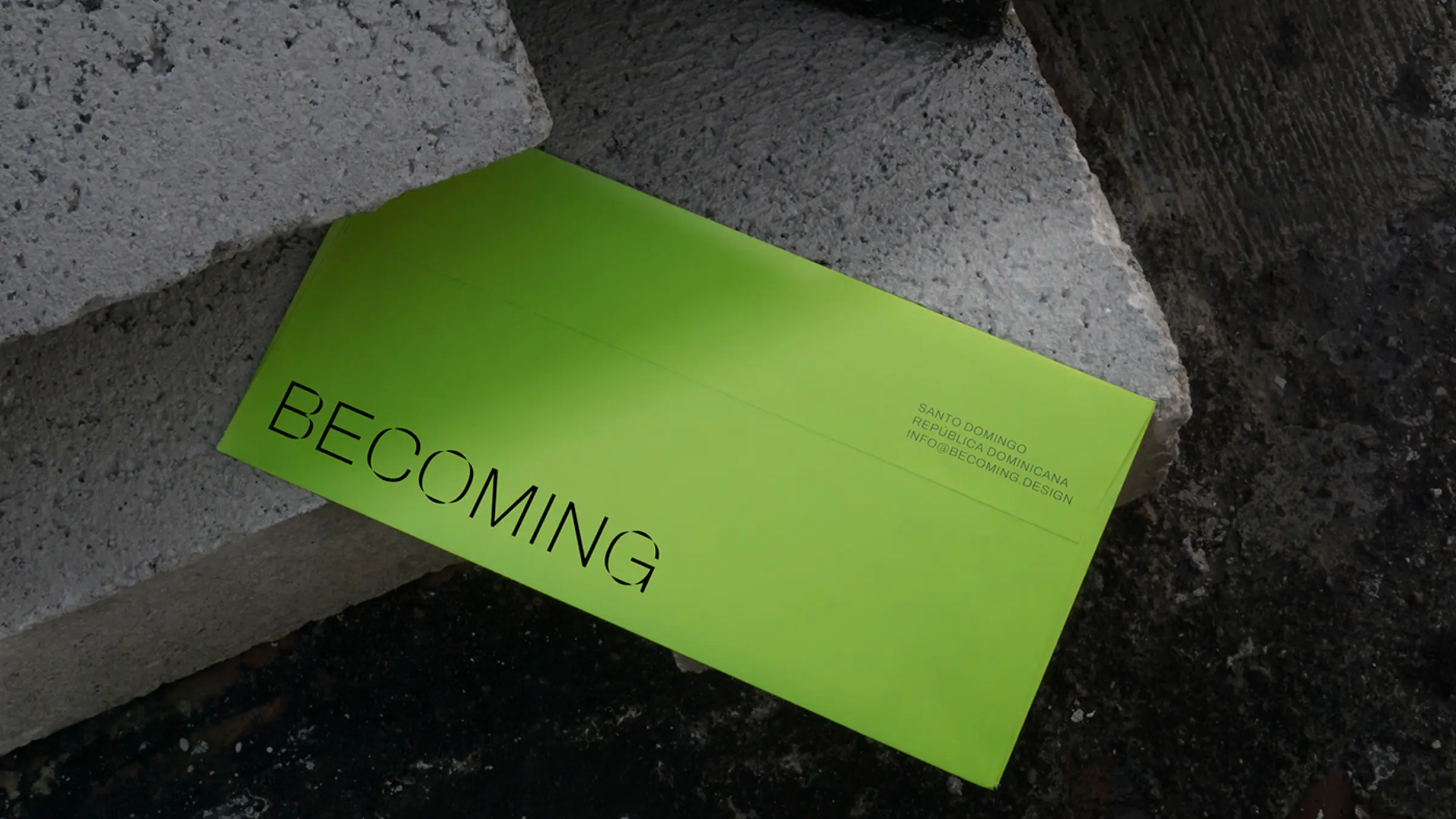
Green envelope design for Becoming, an architecture studio in Dominican Republic
ROOM A-Frame Sidewalk Sign
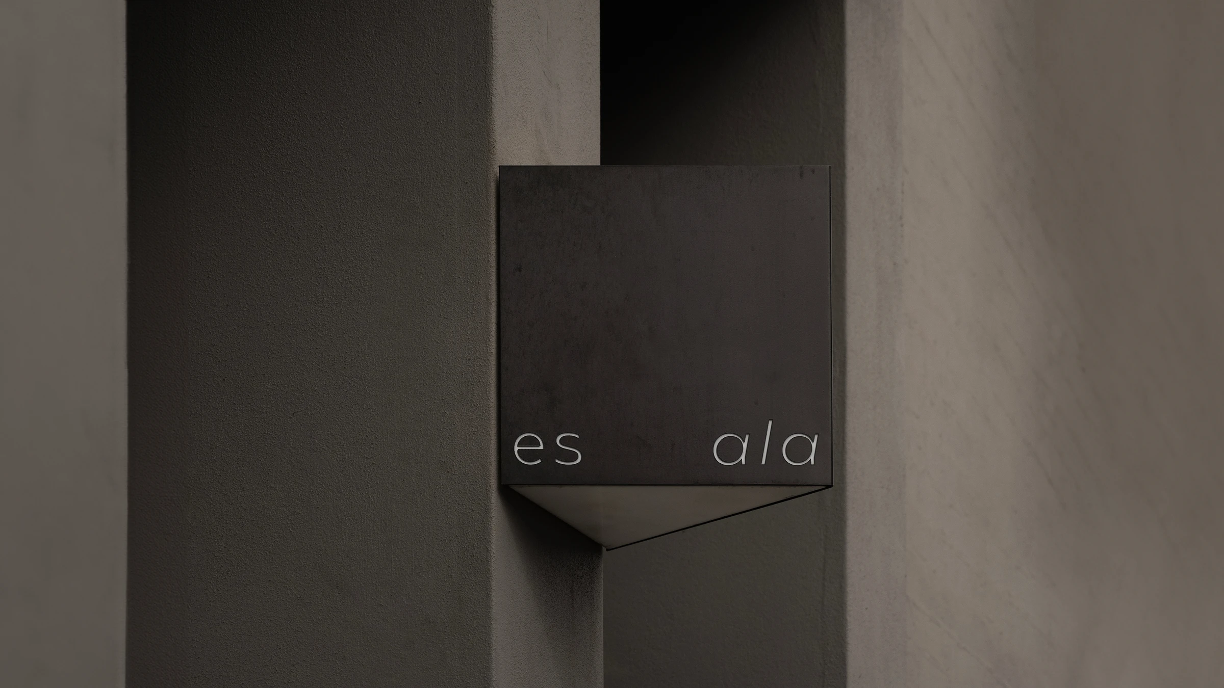
Minimalist outdoor signage for Es Ala featuring white sans-serif typography on a dark cubic structure integrated into modern architecture.
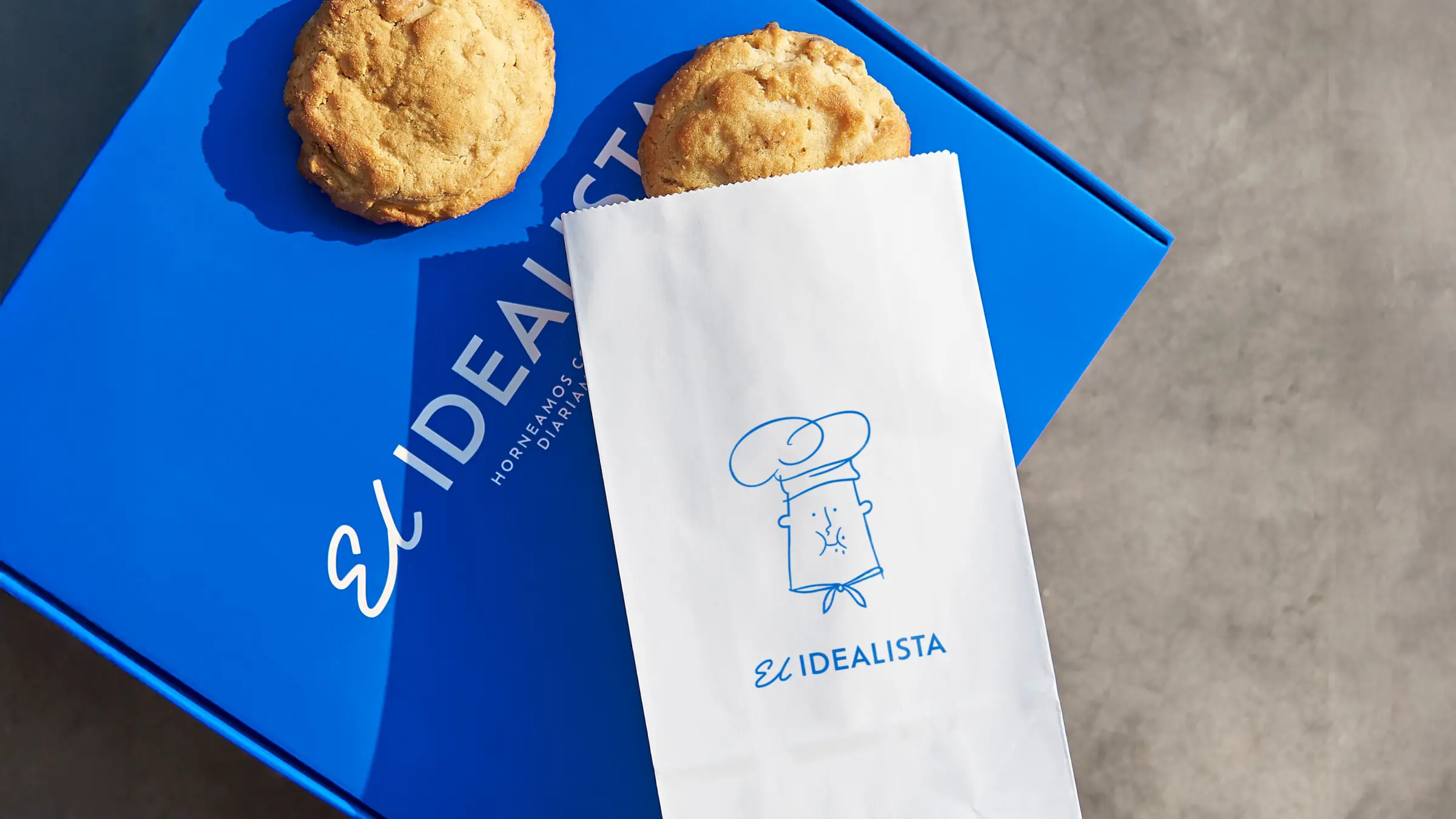
box with cookies on top and Illustration of a chef and a cookie on a cookie bag packaging
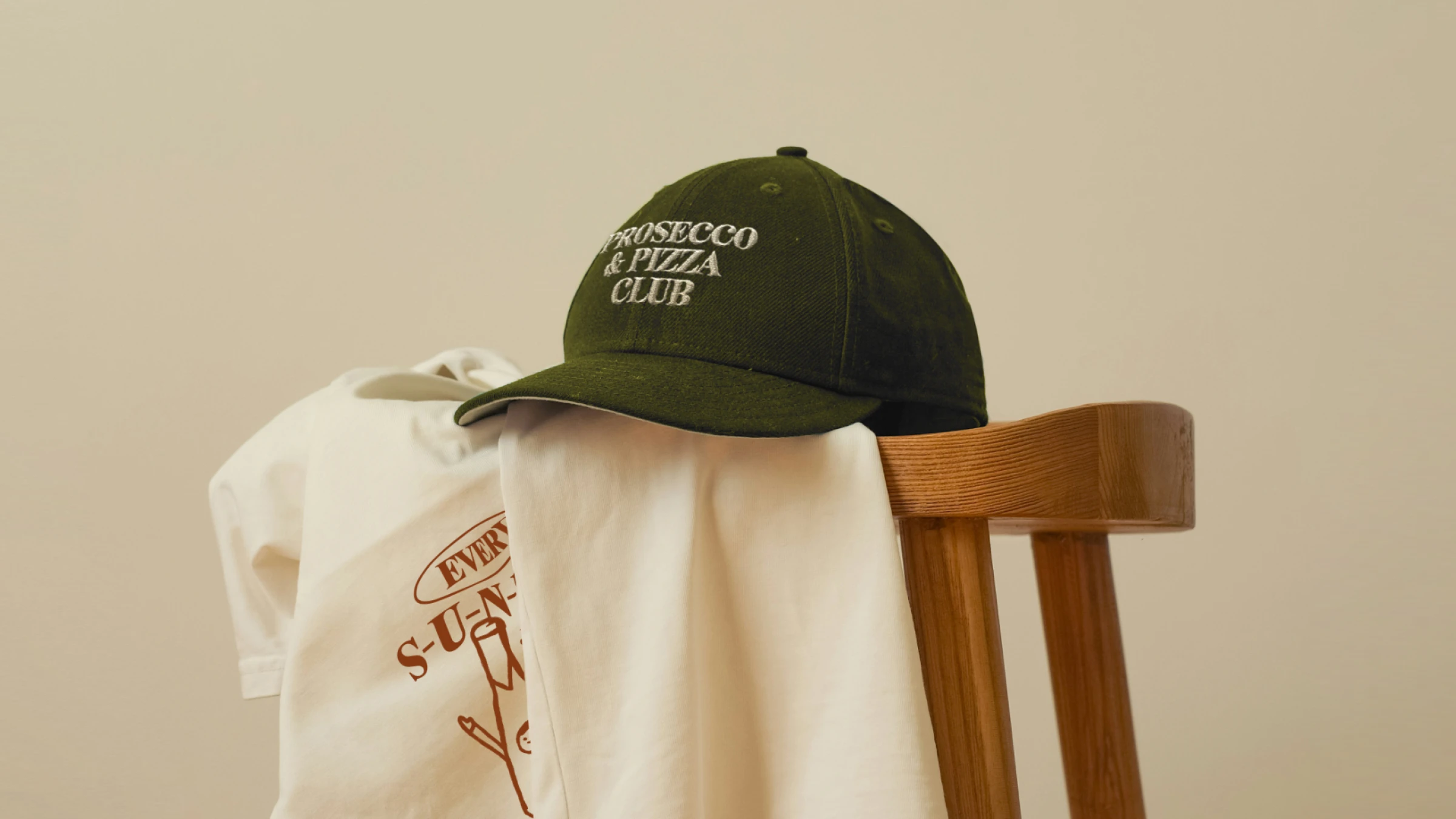
Green baseball cap with 'PROSECCO & PIZZA CLUB' embroidered in white resting on two white T-shirts draped over a wooden chair.
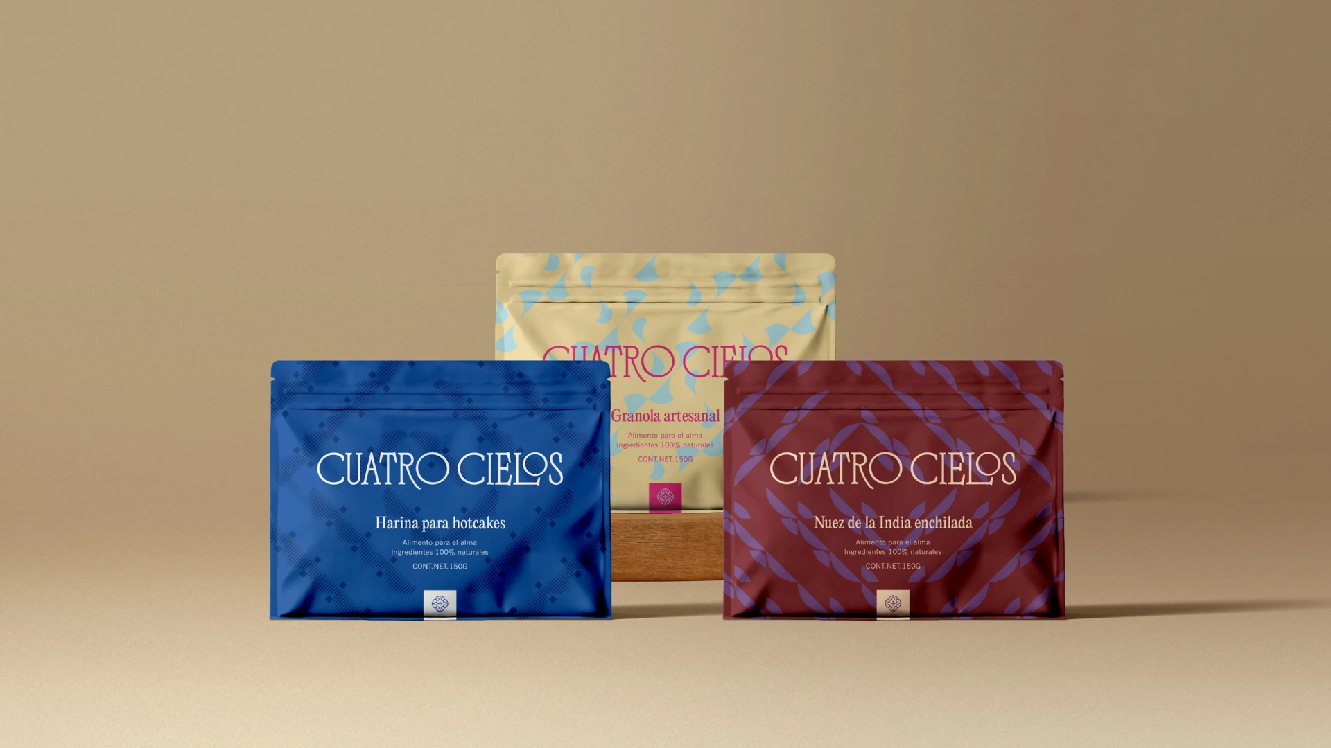
Gemini said Three CUATRO CIELOS food pouches—blue (pancake flour), maroon (spiced cashews), and yellow (granola)—are displayed in a tiered arrangement against a neutral tan backdrop, featuring elegant typography and geometric patterns.
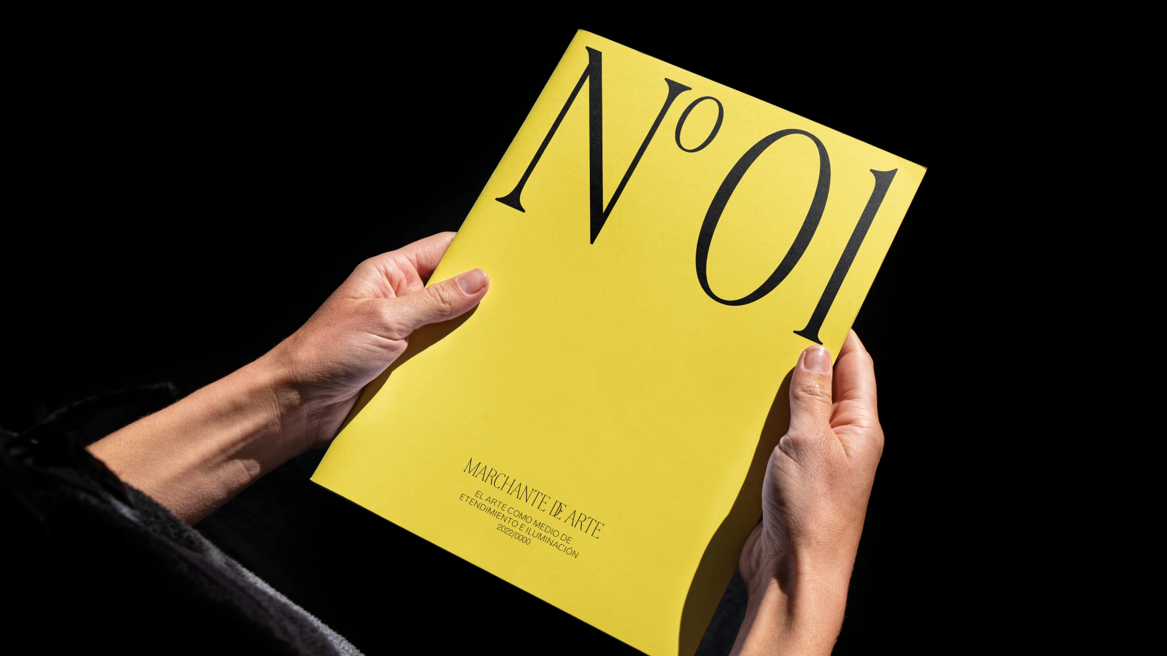
Magazine or catalog cover with Casa Salazar branding, featuring a yellow background and stylized black lettering, indicating edition no. 1