
Redefining the Modern Workplace: From Corporate Minimalism to Human-Centric Design
An 8-year partnership guiding ROOM’s evolution from a sleek tech-era start-up into a warm, tactile, and editorial brand system for the modern workspace.
The challenge
When ROOM launched, the tech industry was experiencing an unprecedented boom. To stand out, the brand established itself with an ultra-clean, flexible aesthetic guided by a "less is more" ethos. Built on a crisp black-and-white base with desaturated accents, generous negative space, geometric typography, and soft studio photography, the original identity communicated sophistication, transparency, and modern efficiency.
However, as the workplace landscape evolved and the pandemic redefined office dynamics, open-plan workspaces faced a fundamental paradigm shift. Offices were no longer just places to hold equipment; they needed to foster connection. ROOM required a brand evolution that kept pace with a changing world—moving away from cold, traditional corporate minimalism toward an experience that felt distinctly human.
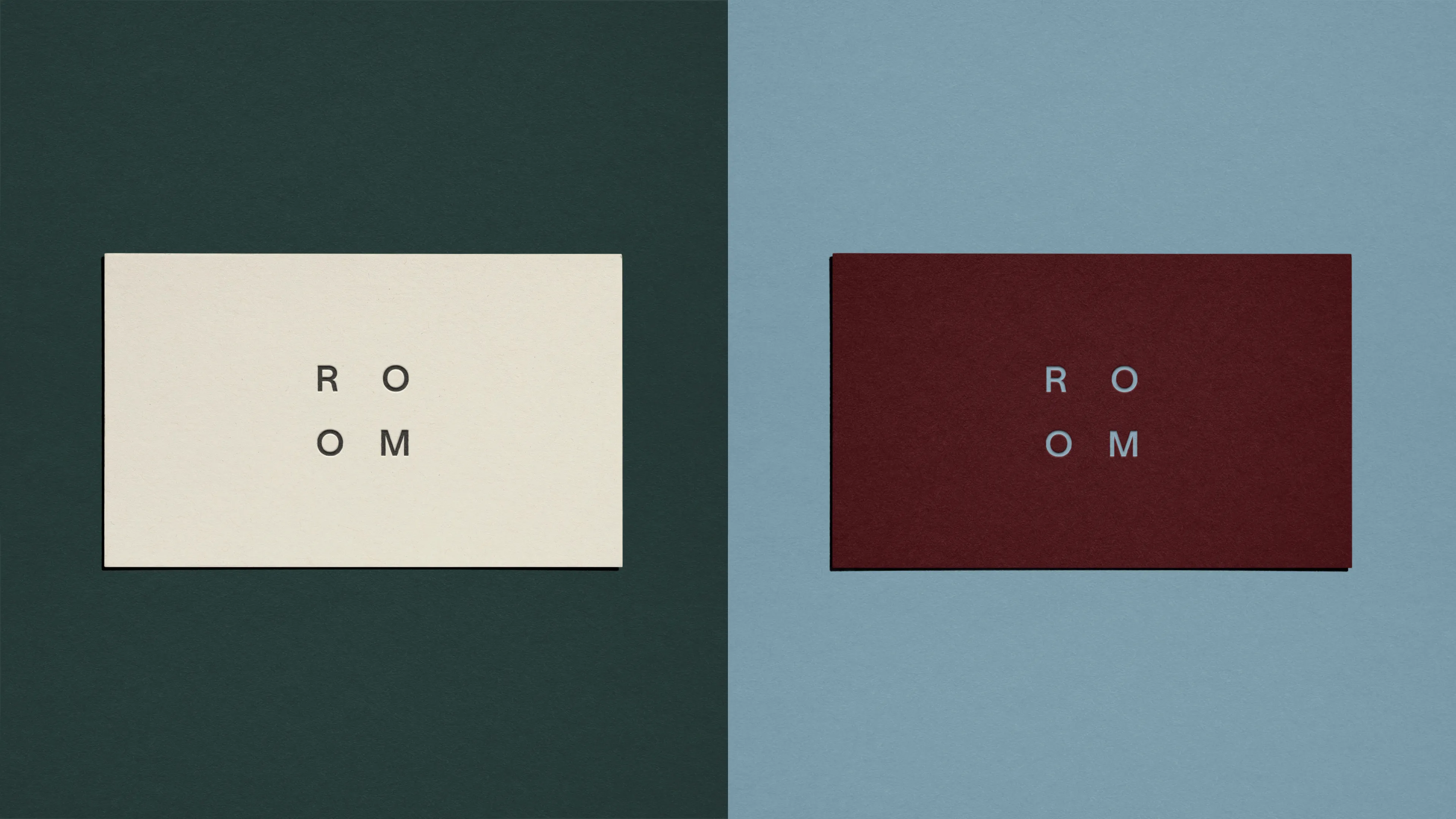
Workplaces are filled with products, but the most valuable asset inside any office is its people.
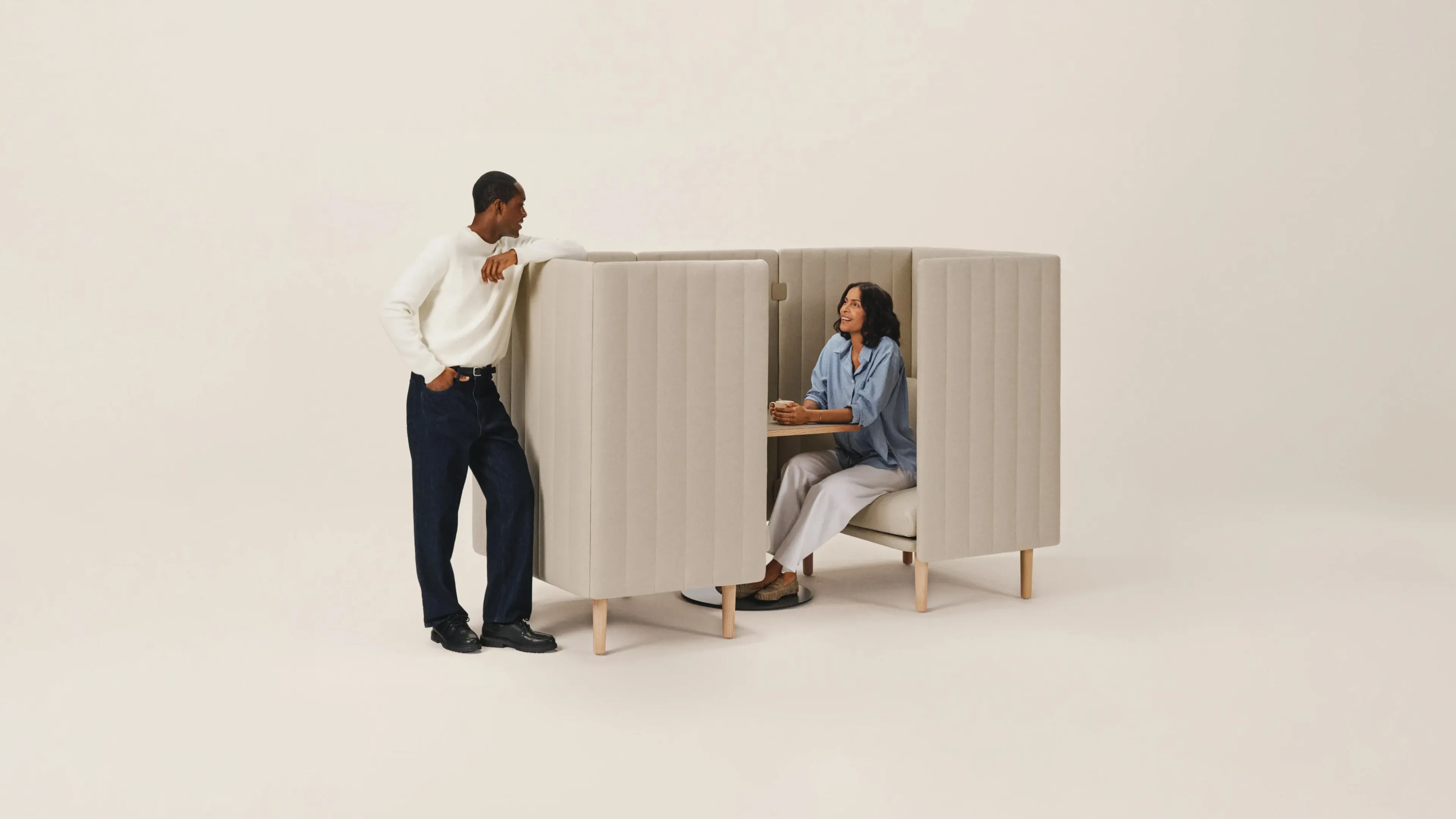
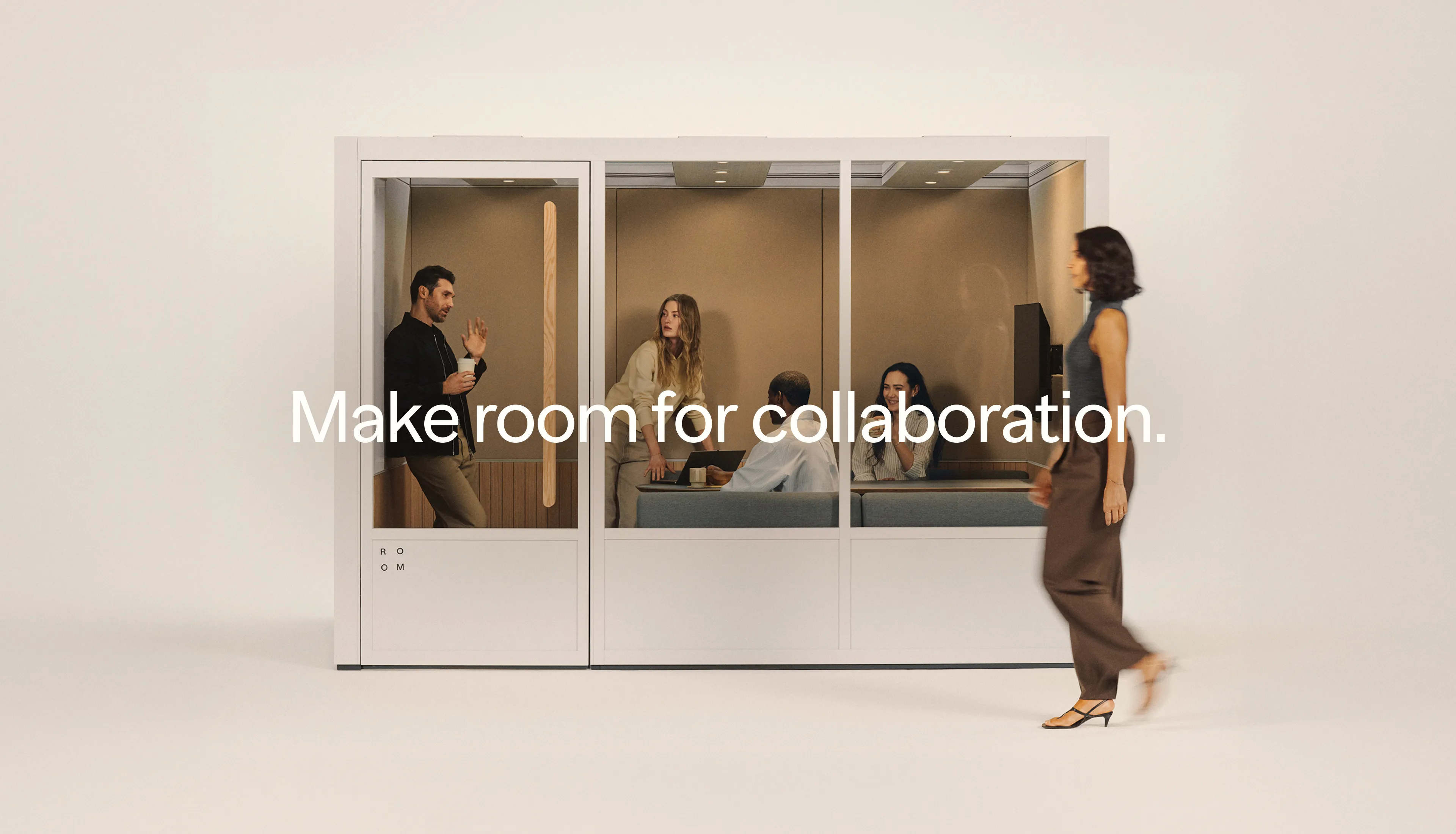
ROOM shifted its strategic focus from the physical pods themselves to what happens around them: the spontaneous conversations, quiet moments of focus, and daily human interactions that define a workday.
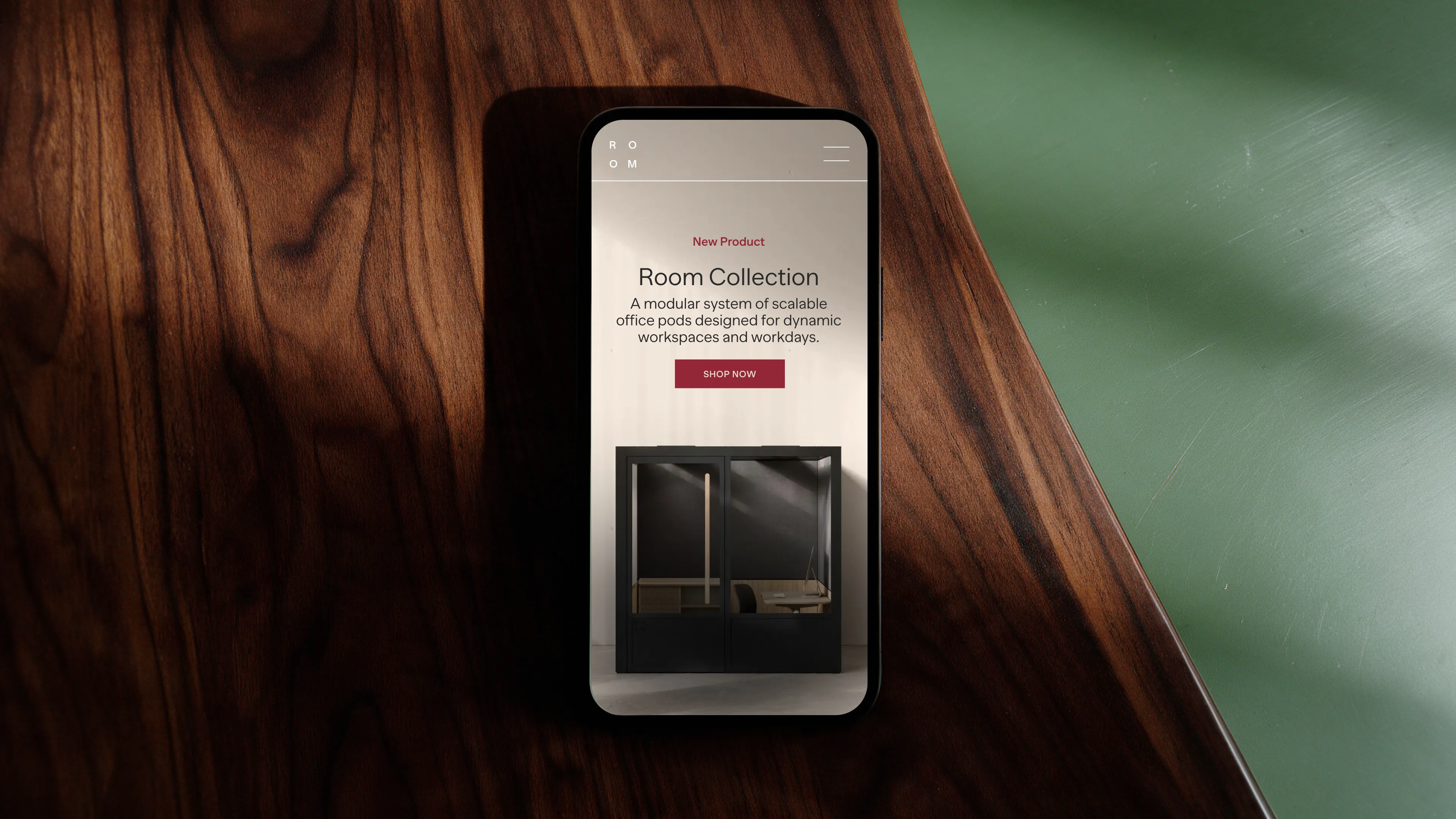
Rather than discarding ROOM’s signature modularity, we evolved its brand identity to focus on workplace culture, transforming a tech-driven visual identity into an editorial, tactile, and empathetic system that puts human well-being at the core of the brand.
Strategy & Insight
"Fugitiva has been instrumental in shaping ROOM’s brand from Day One. They didn’t just design for us—they immersed themselves in our ethos, translating our values and vision into a distinctive creative language across web, brand, social, and beyond."
The Solution & Visual Narrative
Tactile Materiality & Warm Art Direction
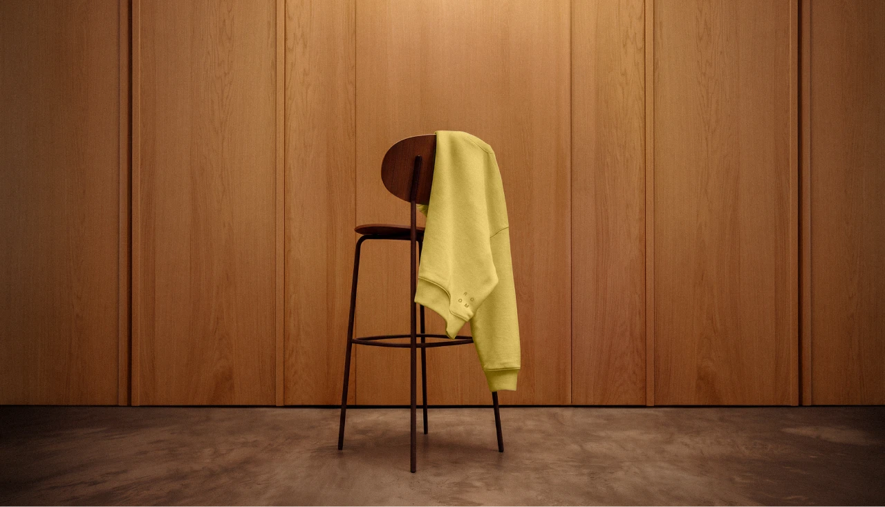
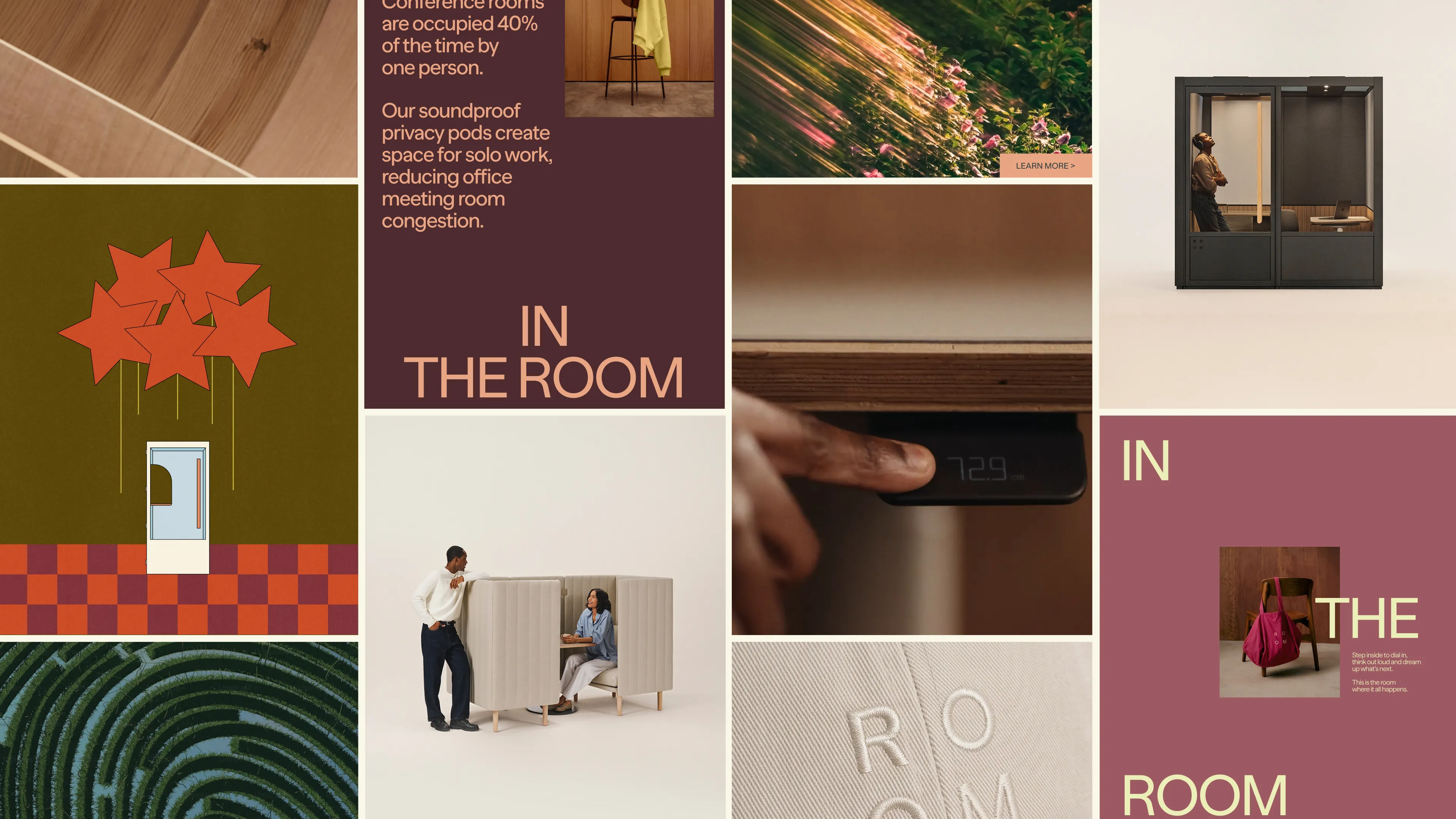
To align with post-pandemic workplace trends, the new visual direction prioritizes authentic physical materials. Photography and cinematography—crafted by Blonde Inc. and Neighbors Brooklyn—highlights real textures—warm woods, acoustic felt, natural fibers, and woven fabrics. Coupled with warm, high-contrast lighting and deep shadows, the imagery brings tactile volume and architectural depth to both spaces and products.
A Rich, Nature-Inspired Palette
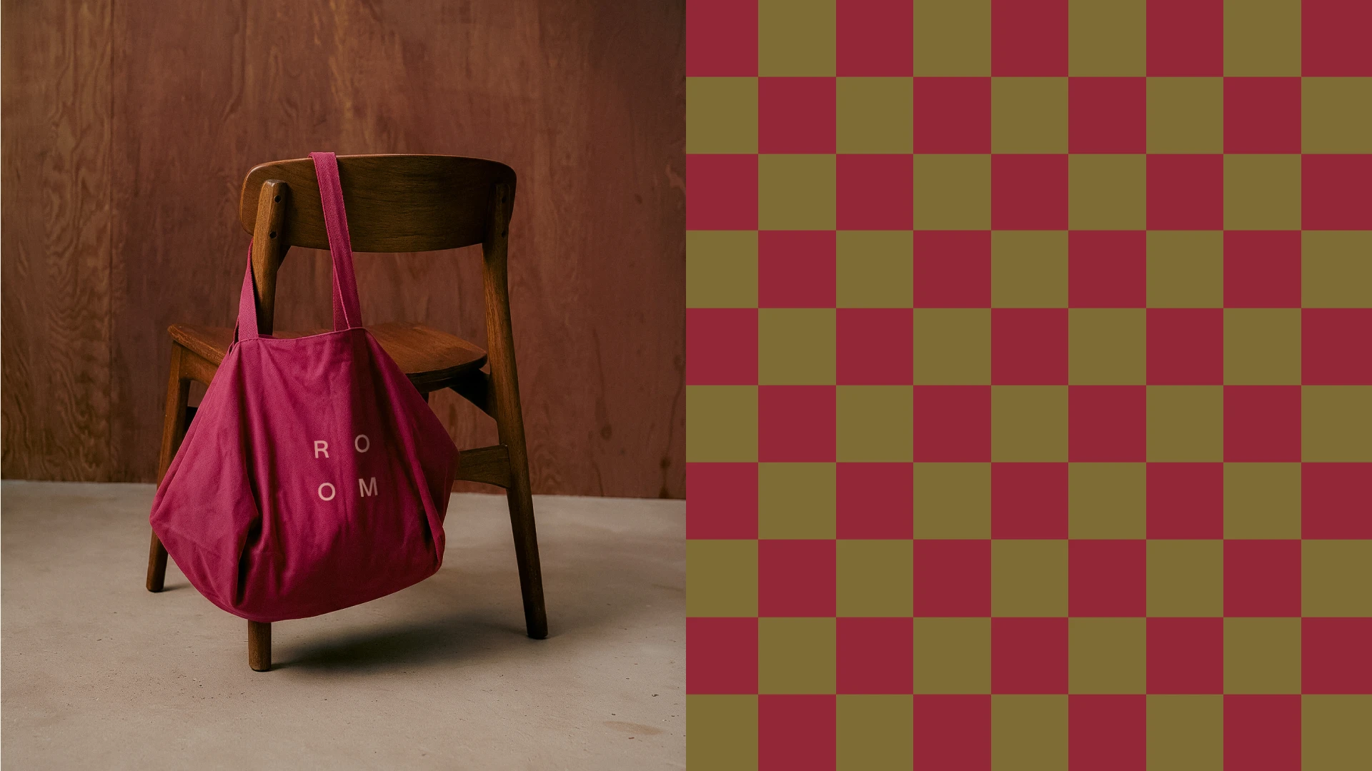
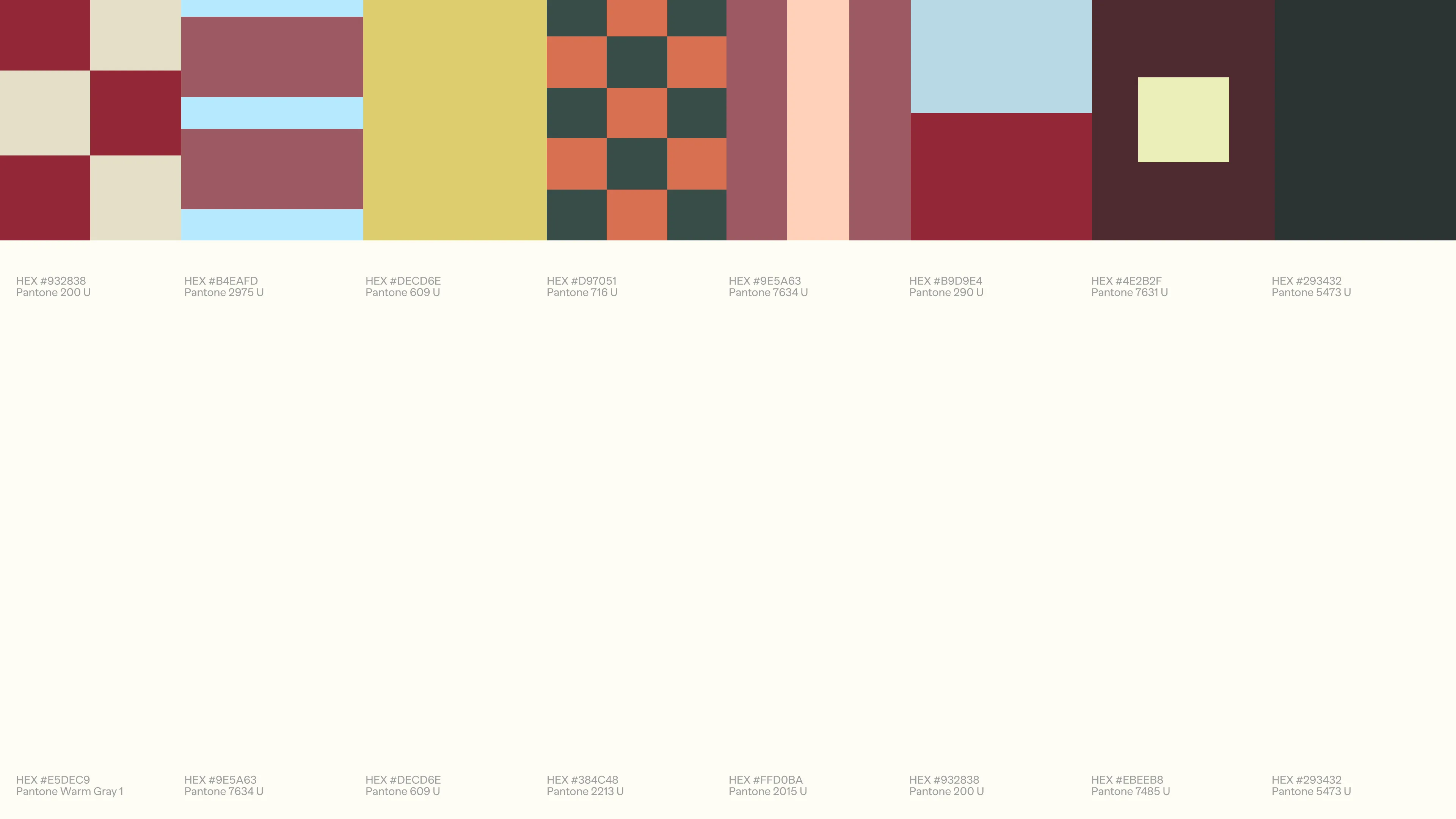
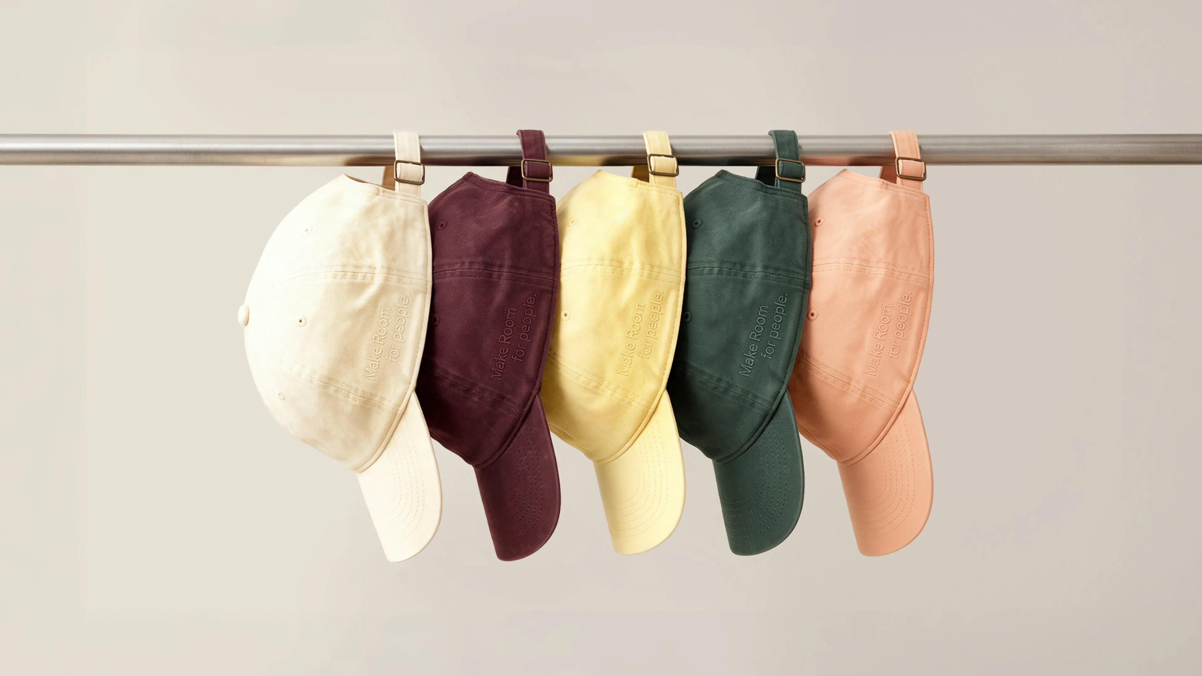
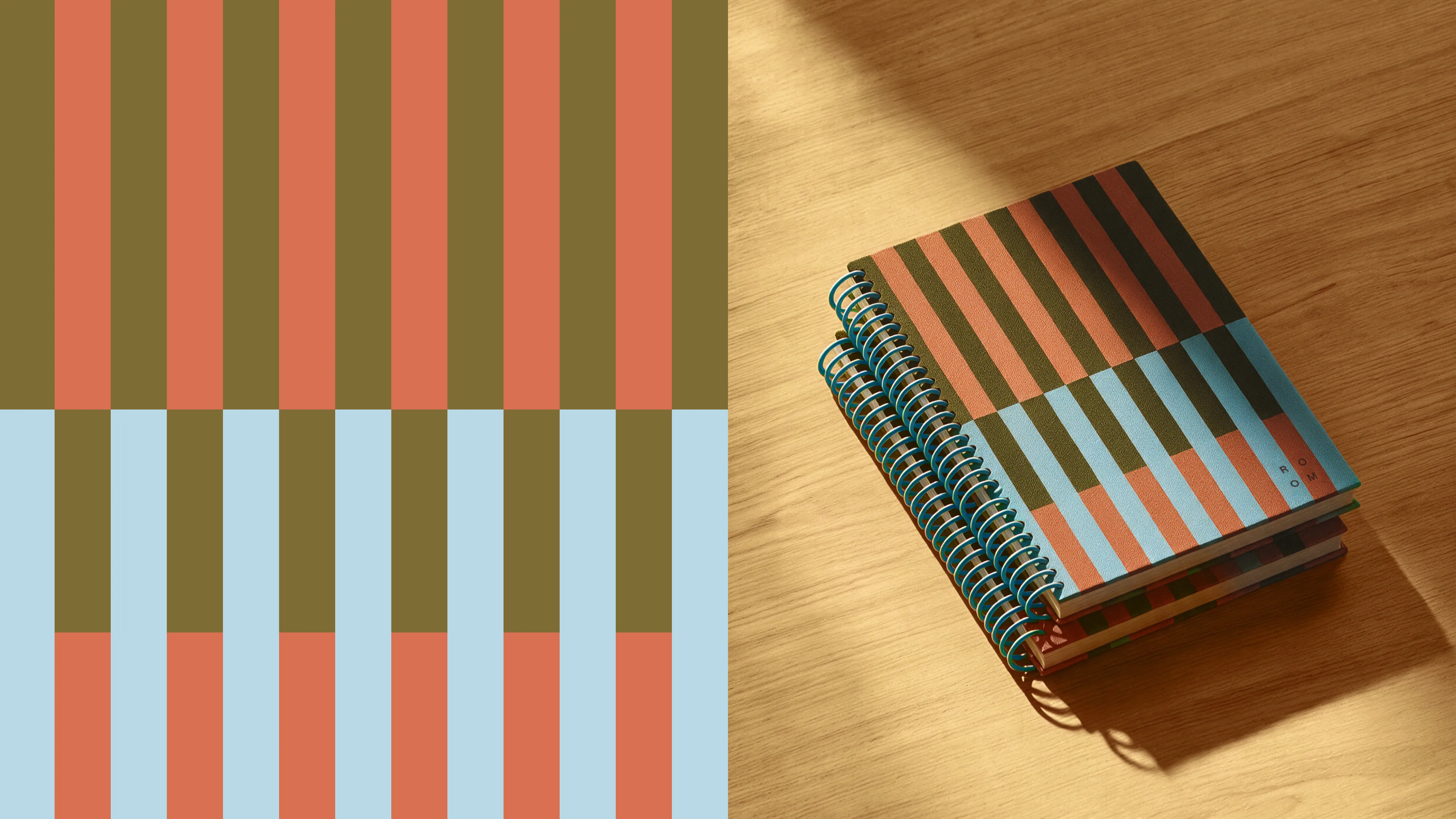
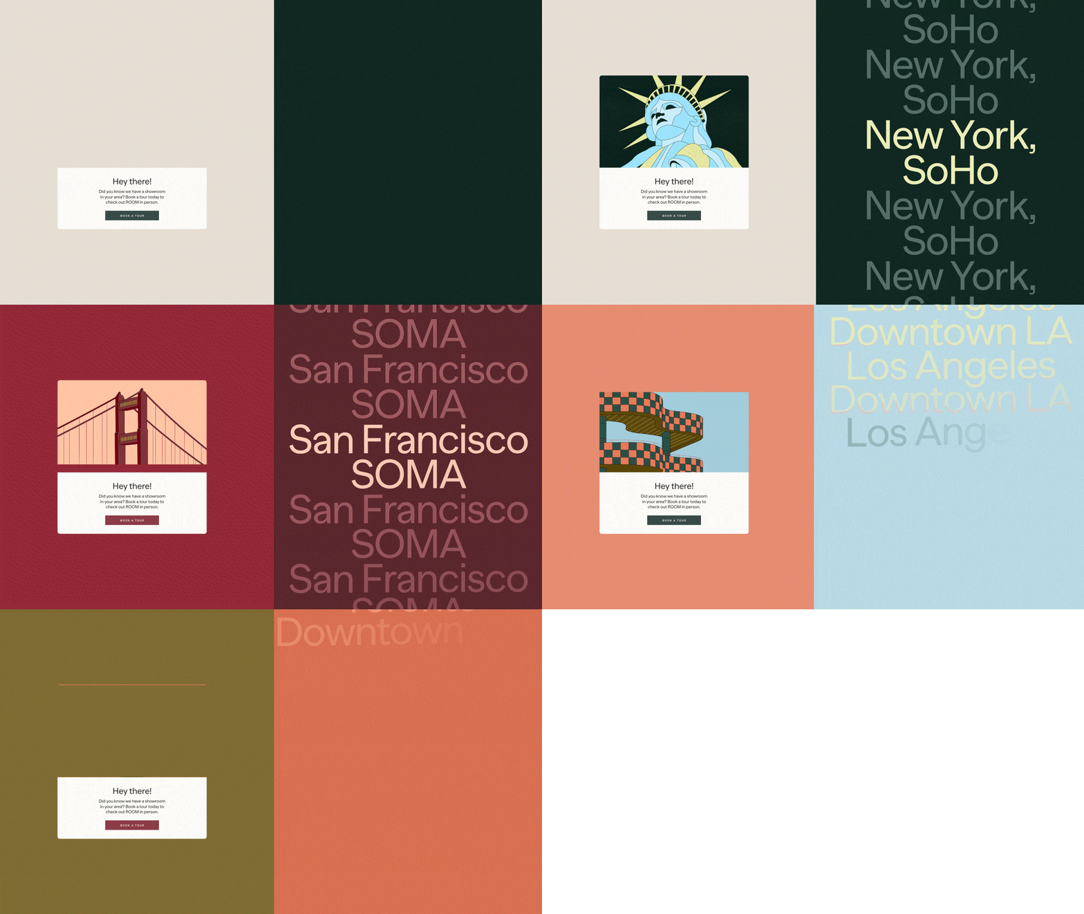
We expanded the color system beyond clinical neutrals. The evolved identity introduces a vibrant, earth-inspired palette featuring deep burgundy, forest green, terracotta, warm mustard, steel blue, and cream beige. These rich tones infuse digital and physical touchpoints with warmth, energy, and organic feel.
Narrative Illustration & Digital Rhythm
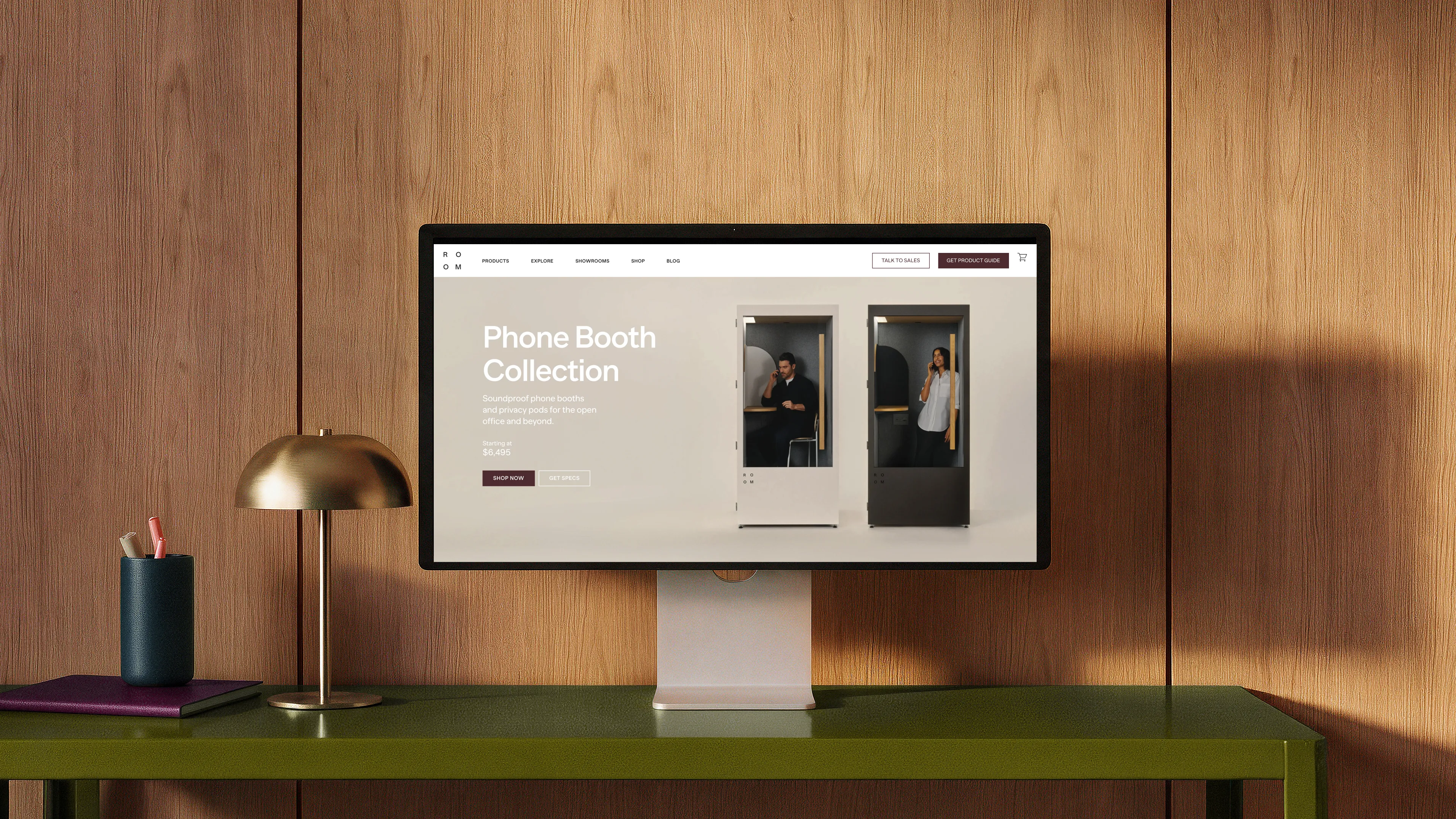
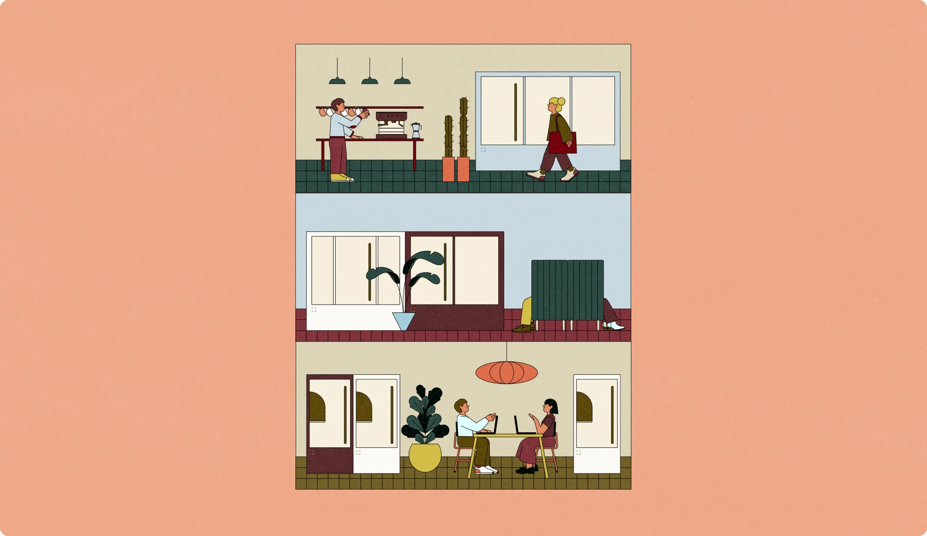
To bridge physical products with digital experiences, we integrated subtle textures that create a tangible rhythm on screen. Generic iconography was replaced with custom, outlined geometric illustrations. By embracing the brand's new earth tones, these graphic elements turn functional diagrams and assembly guides into engaging tools of narrative, empathy, and visual authority.

Impact & Partnership
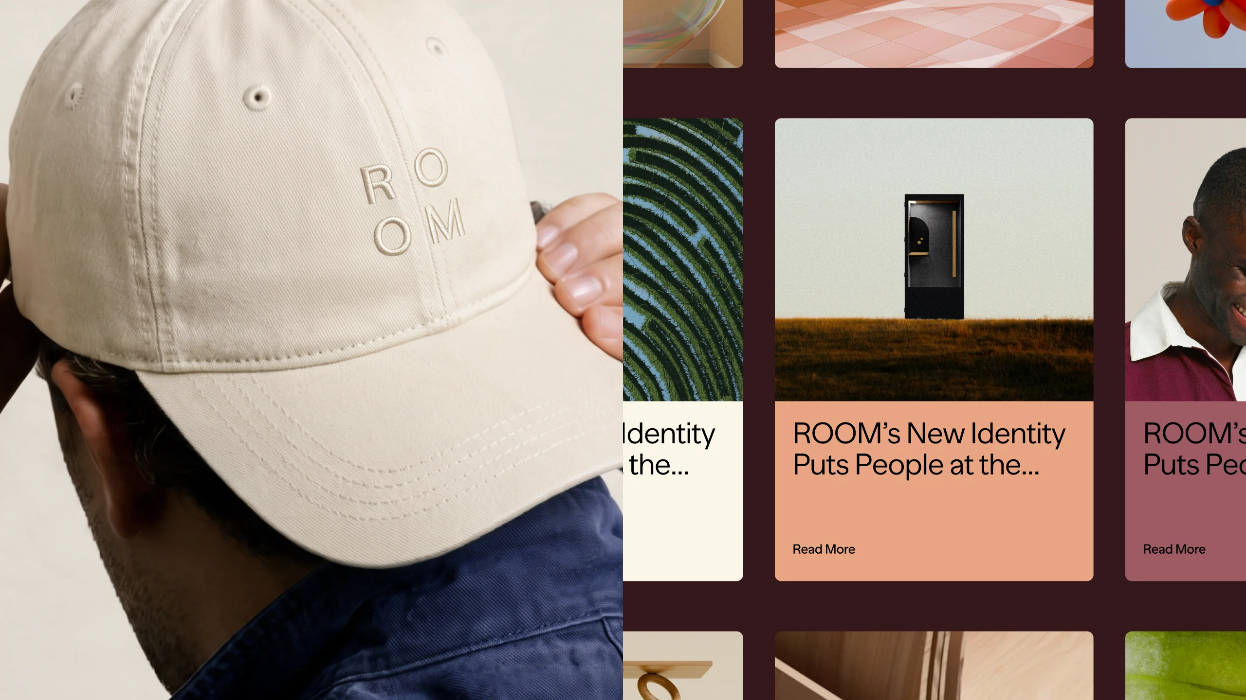
Through an enduring 8-year collaboration, ROOM transformed from a trending tech-pod start-up into an industry-defining leader in workplace infrastructure. By anticipating the shift toward human-first design, ROOM established a new visual standard for office design—proving that functional, modular solutions can feel deeply warm, personal, and sophisticated.




Escape from the superfluous and reach the valuable.

