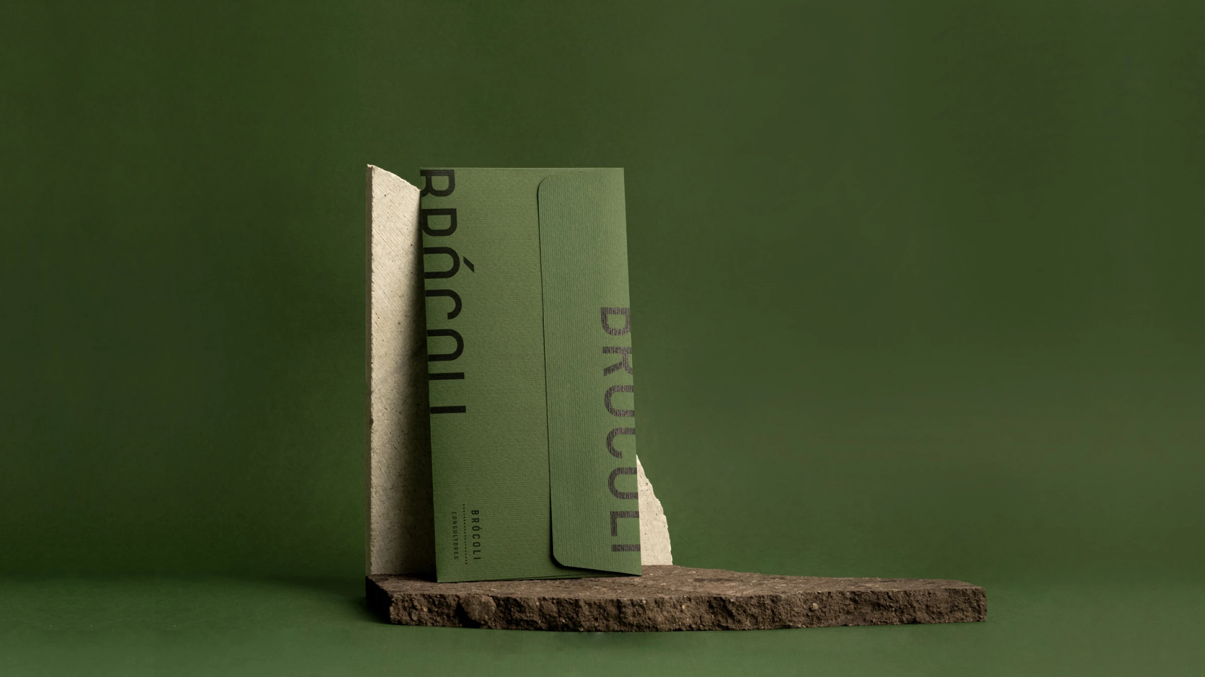
A minimalist olive-green A-frame sign stands on a sunlit gravel surface against a dark, slatted wooden wall, casting a sharp shadow to the left. The hanging white poster displays the brand name "FORT" in brown text—with a distinctive raised "O"—alongside "
Branding

Designing the art of the sunrise

Overview

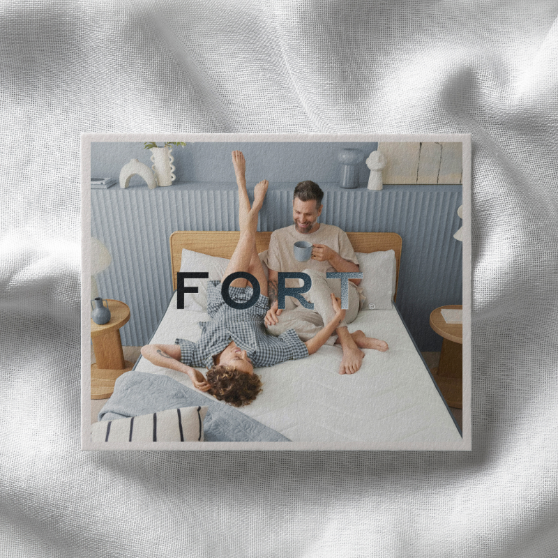
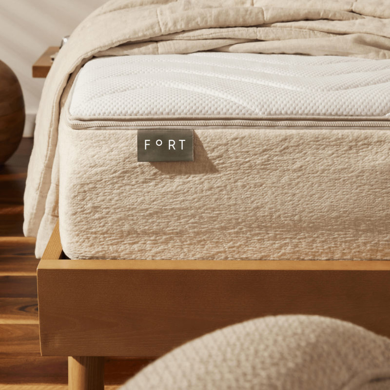
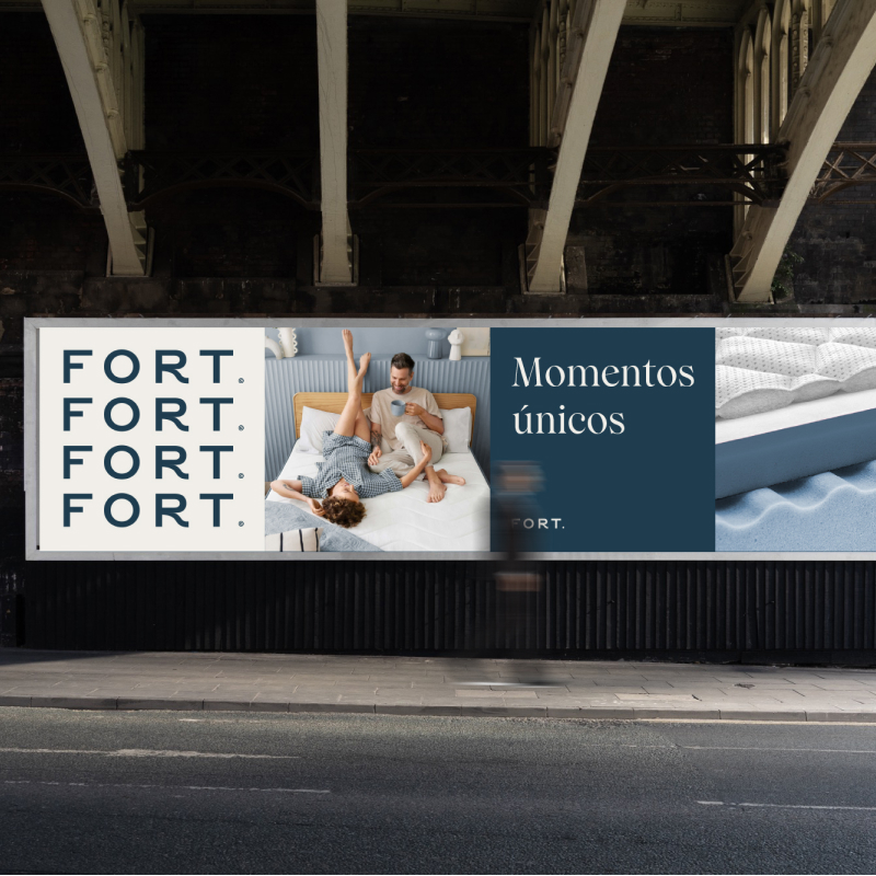
We developed a brand identity that positions the mattress as the stage for life’s most meaningful family moments. Inspired by the natural cycles of light, the visual narrative evokes the warmth of a sunrise and the serenity of dusk.

Client
Fort
Category
Branding
Date
Jul 29, 2025
No items found.
About

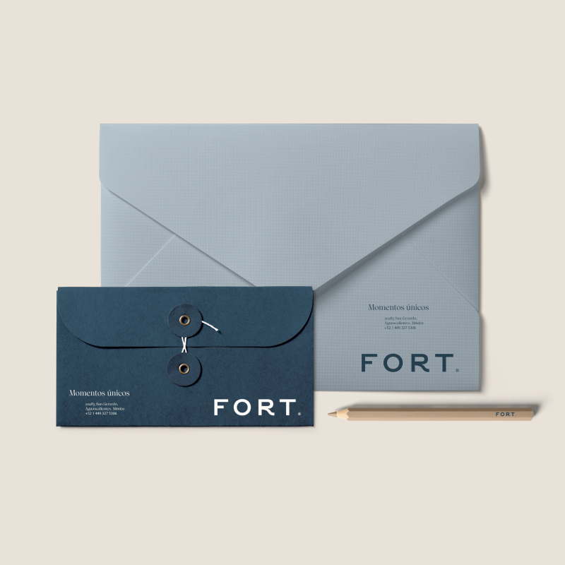
Fort is a family-born mattress brand from Aguascalientes, Mexico, built on the belief that family is both the driving force and the ultimate purpose of every endeavor. The company’s core mission is to elevate the quality of life for its entire ecosystem—from collaborators and suppliers to the families who welcome Fort into their homes.

We believe that a mattress is more than just furniture; it is the stage where life’s most cherished moments unfold. With this philosophy, we pour dedication and passion into every product, ensuring that every family receives the comfort and uncompromising quality they deserve.

Visual Narrative

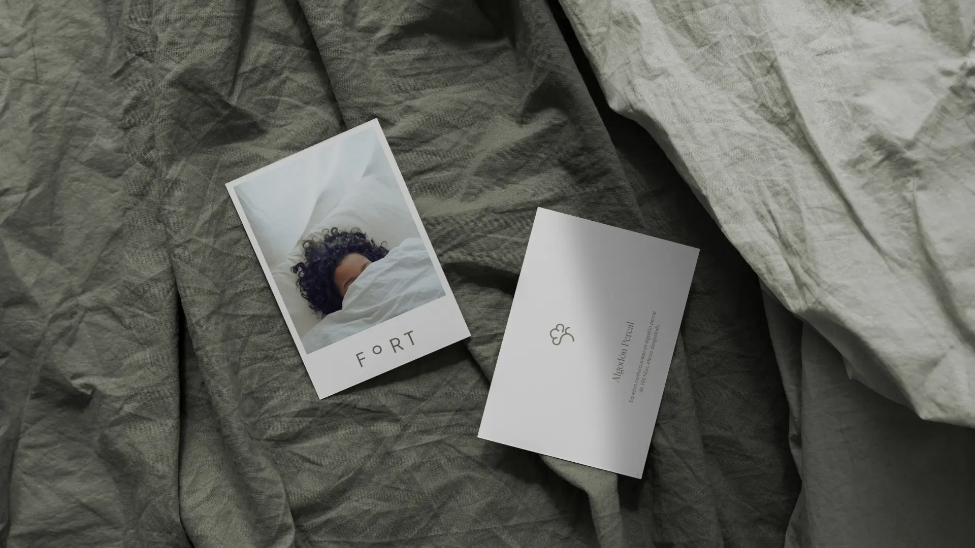
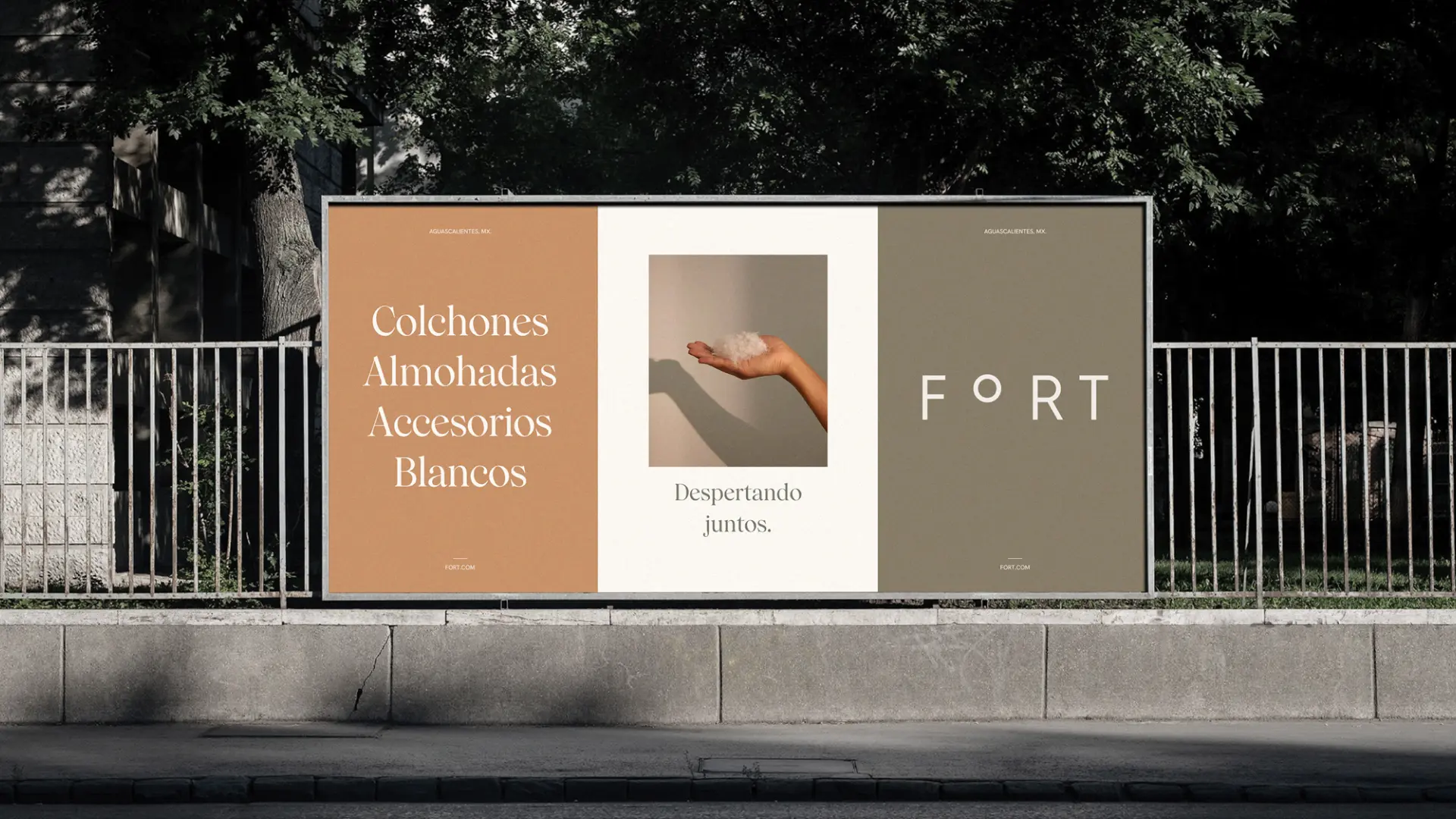
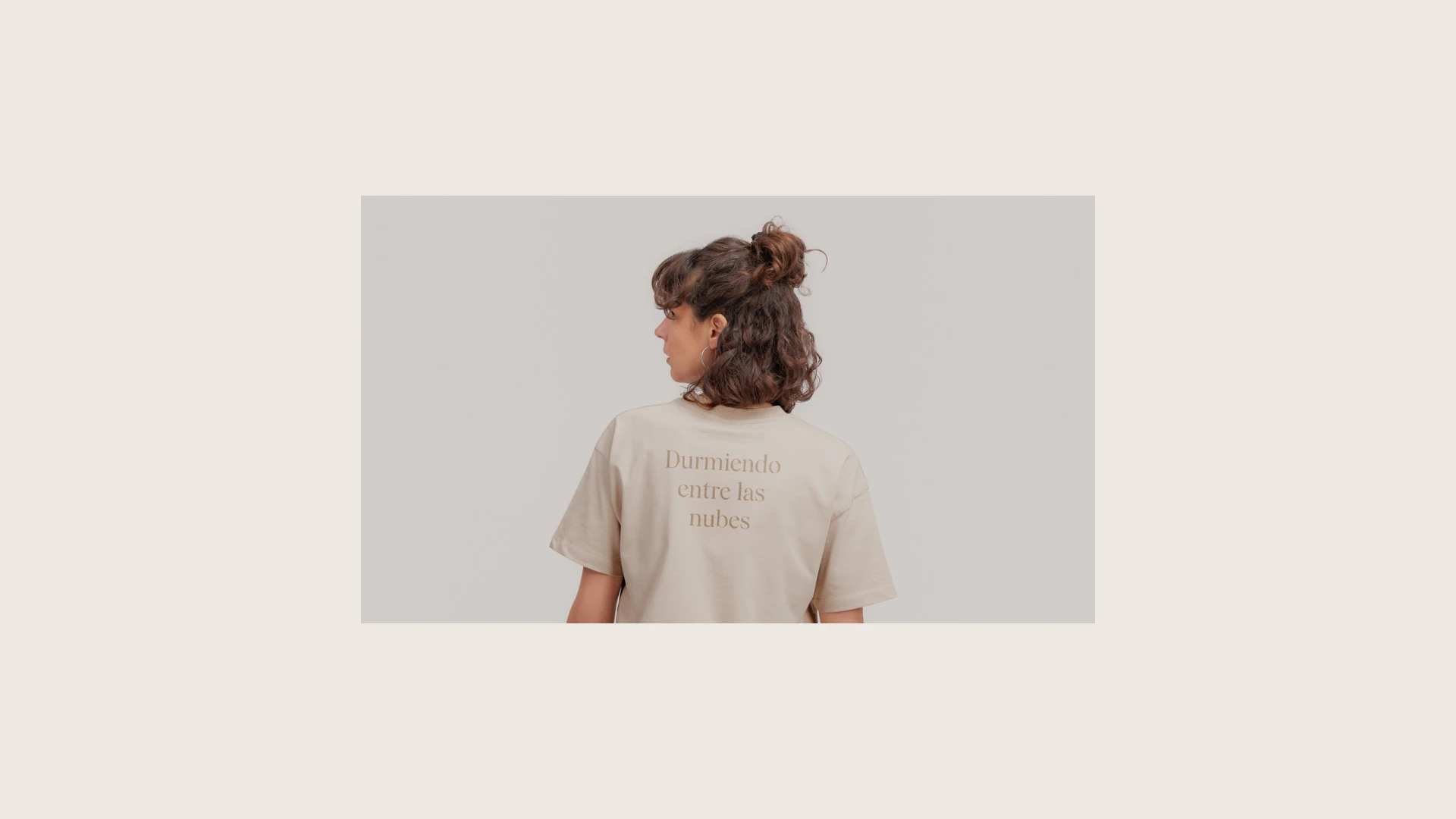
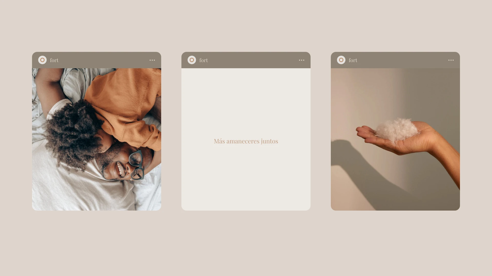
The brand identity is deeply rooted in the natural cycles of light, capturing the warmth of the day’s most intimate moments—like waking up next to a loved one. The visual aesthetic reflects the transition of time, emphasizing the vital role sleep plays in the human experience.

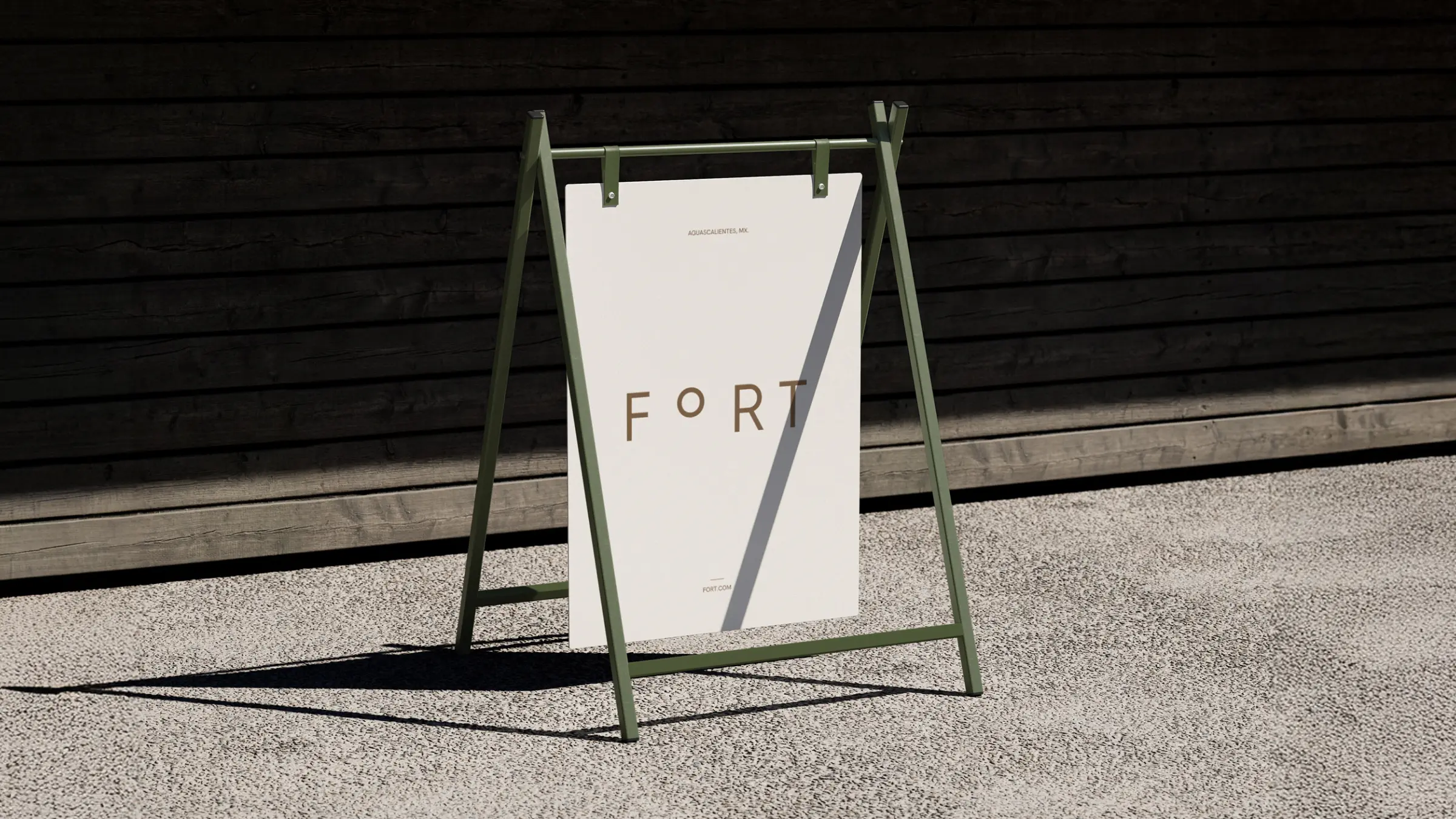
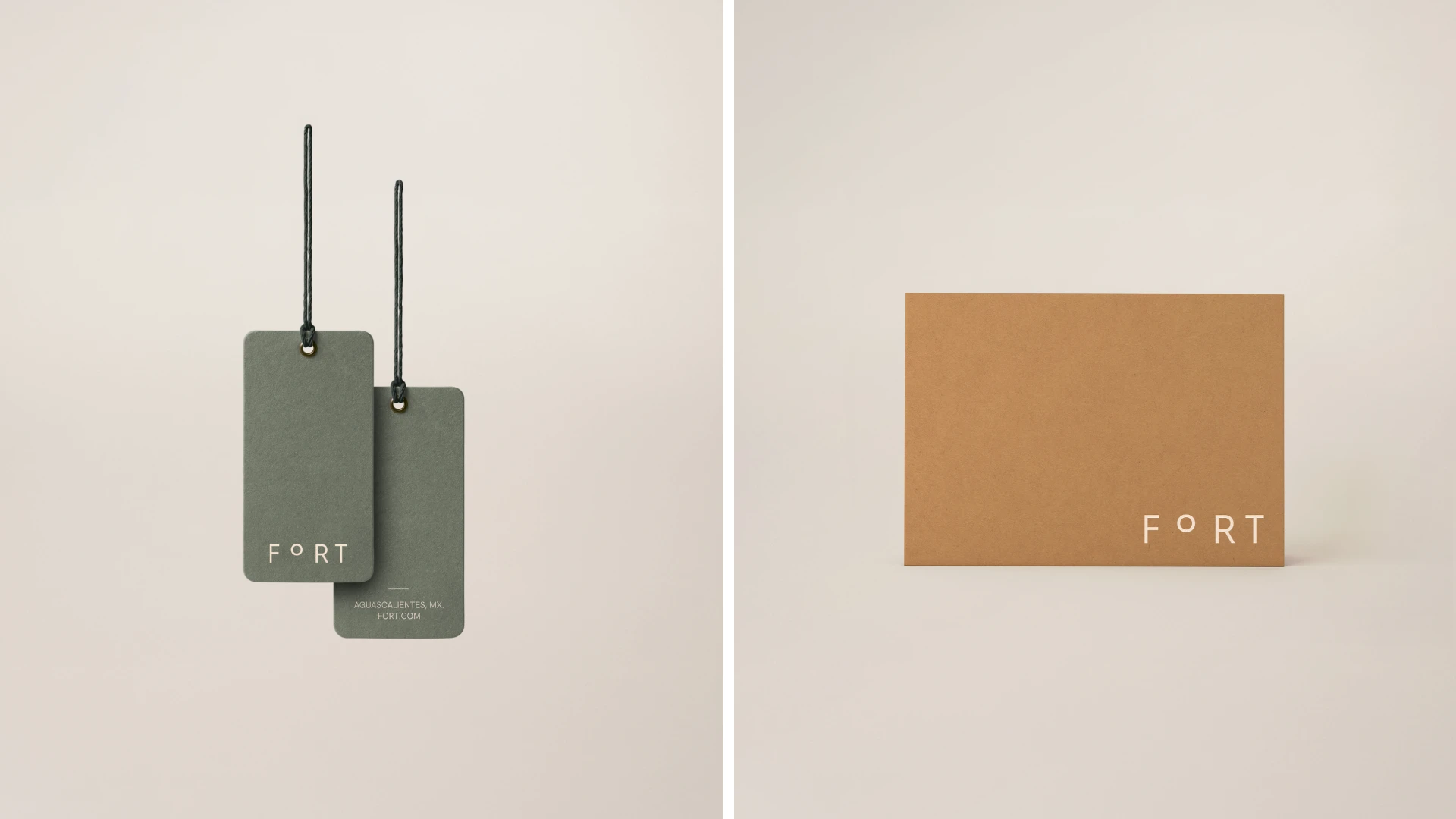
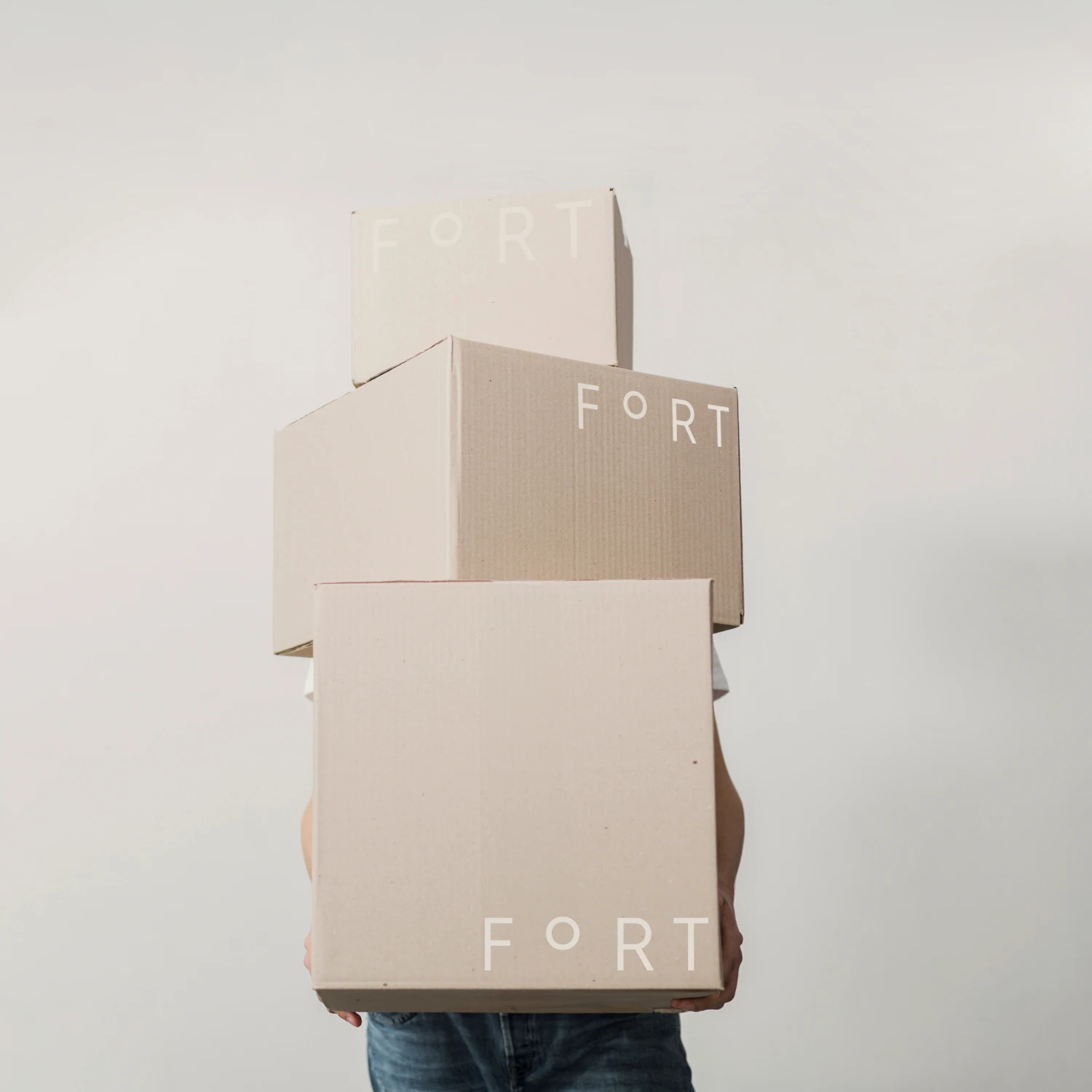
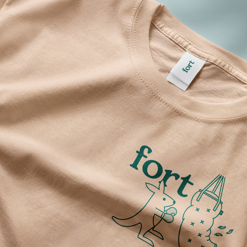
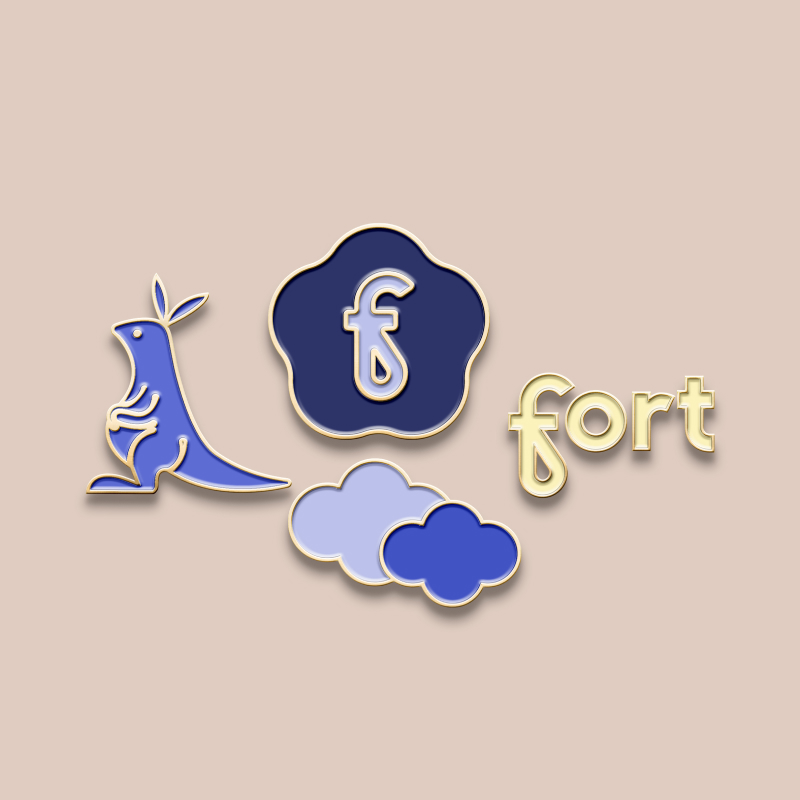
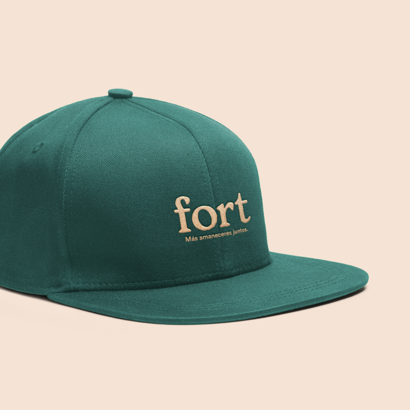
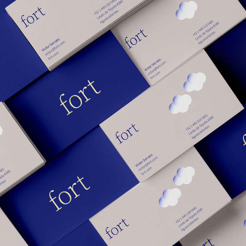
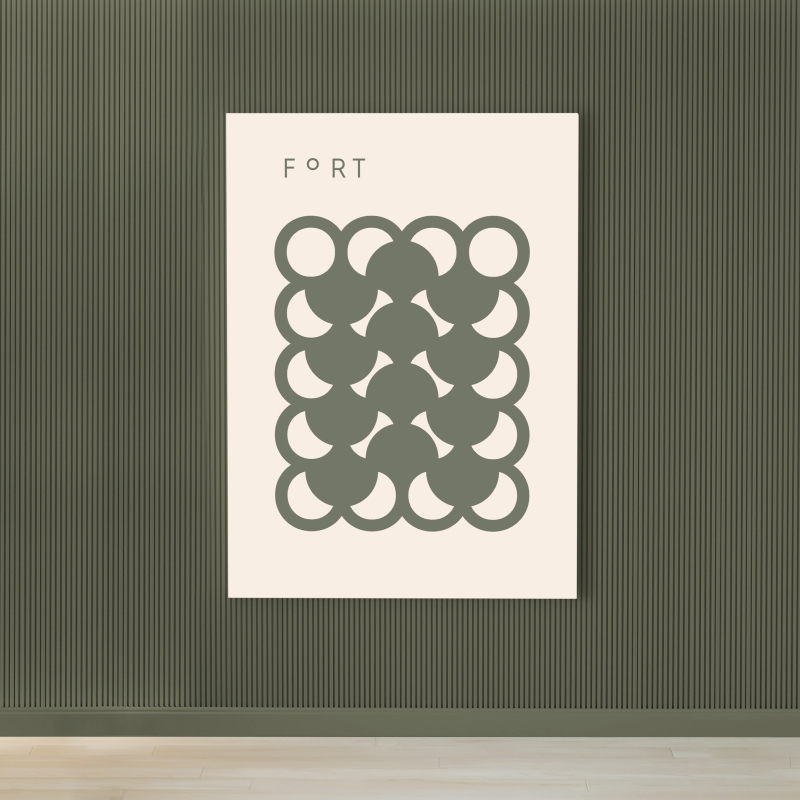
The Fort logo features stylized, light typography with neutral, balanced shapes. The centerpiece is the letter "o," which transforms into a dynamic symbol of the sun and the moon. This represents the duality of dawn and dusk, mirroring the beginning and end of our daily lives. Complemented by a warm color palette, the brand conveys that a Fort mattress is a sanctuary for connection and wonderful human experiences.

Design Evolution & Strategy

The creative journey began with the development of three distinct strategic directions, each crafted to embody a warm, human-centered identity. We explored concepts ranging from a friendly brand character designed to guide consumers through their experience to a minimalist, clean aesthetic featuring the classic blue tones traditionally associated with the mattress industry.

Ultimately, the "Waking Up Together" concept was selected, perfectly aligning with Fort’s vision of emotional intimacy. By emphasizing the shared human experience, the final design ensures the brand feels inviting and rejuvenating, much like the first light of morning.

Fort mattress texture
Fort merch exploration
Fort cup exploration
Fort illustration exploration
Fort merch exploration
Fort badges exploration
Fort envelope exploration
Fort letterhead exploration
Fort merch exploration
Fort tags exploration
Fort business cards exploration
Fort billboard exploration
Fort tags exploration
Fort texture exploration
Fort sign exploration
No items found.
Gradient background blending dark green and beige colors.
Let's get started

Run away with us

Escape from the superfluous to reach the most valuable.

Schedule a call
Gradient background blending dark green and beige colors.
Logos are dead web view
Spread of bananas with Foodback QR code stickers
Large-scale illuminated wall installation with the logo and the phrase inspire and connect
Probike logo on a drawstring pouch
Brócoli envelope
Avenir House logo in gold foil with flowers in a vase photo background
Scattered business cards for Green City showcasing the logo and diverse gradients.
A green plastic crate filled with long, textured green citrus fruits, likely finger limes, set against a minimalist beige background. The front center of the crate is labeled with the text "THE CURIOUS LIME" in a clean, white serif font.
Humani business card
HIJ publication
Empty stadium seats with the word Above spelled out in the seats
A minimalist olive-green A-frame sign stands on a sunlit gravel surface against a dark, slatted wooden wall, casting a sharp shadow to the left. The hanging white poster displays the brand name "FORT" in brown text—with a distinctive raised "O"—alongside "
Green envelope design for Becoming, an architecture studio in Dominican Republic
ROOM A-Frame Sidewalk Sign
Minimalist outdoor signage for Es Ala featuring white sans-serif typography on a dark cubic structure integrated into modern architecture.
box with cookies on top and Illustration of a chef and a cookie on a cookie bag packaging
Green baseball cap with 'PROSECCO & PIZZA CLUB' embroidered in white resting on two white T-shirts draped over a wooden chair.
Gemini said Three CUATRO CIELOS food pouches—blue (pancake flour), maroon (spiced cashews), and yellow (granola)—are displayed in a tiered arrangement against a neutral tan backdrop, featuring elegant typography and geometric patterns.
Magazine or catalog cover with Casa Salazar branding, featuring a yellow background and stylized black lettering, indicating edition no. 1